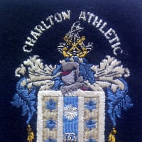
Time to change the badge?agree/disagree?
Comments
-
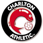
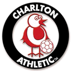
Not sure a sword is appropriate for a family club, how about one of these?
 2
2 -
i wondered when we would see those again. I actually fell for that April Fools. I can't remember being so angry before on reading an article in the programme. Especially because the badge at the bottom looked like CPFC !!0
-
Being that TJ / MS would welcome Middle Eastern investment and the sword is a popular symbol, why would TJ / MS want to change it away from something that a Middle Eastern investor would find attractive ?cafc999 said:I have a question, if the current board of directors decided to change the badge what would most of us fans do..??
Robcoll - the badge you have put on your shirt is not exactly new though is it? It is the same badge as what we had in the 70's0 -
Our sword is more like a crusaders sword though - so not sure that would exactly be popular in the middle east.vff said:
Being that TJ / MS would welcome Middle Eastern investment and the sword is a popular symbol, why would TJ / MS want to change it away from something that a Middle Eastern investor would find attractive ?cafc999 said:I have a question, if the current board of directors decided to change the badge what would most of us fans do..??
Robcoll - the badge you have put on your shirt is not exactly new though is it? It is the same badge as what we had in the 70's0 -
Disagree.0
-
I think it's more like a Roman gladius sword - much shorter than a medieval Crusader sword. If we are trying attract Middle Eastern investors should we have a scimitar instead?Off_it said:
Our sword is more like a crusaders sword though - so not sure that would exactly be popular in the middle east.vff said:
Being that TJ / MS would welcome Middle Eastern investment and the sword is a popular symbol, why would TJ / MS want to change it away from something that a Middle Eastern investor would find attractive ?cafc999 said:I have a question, if the current board of directors decided to change the badge what would most of us fans do..??
Robcoll - the badge you have put on your shirt is not exactly new though is it? It is the same badge as what we had in the 70's
0 -
No. goodbye troll0
-
Put a train in it being driven by a couple of clowns0
-
Shite idea, zero gain. Scrap decades of history for some ill-advised attempt at "modernisation"? No thanks, we're Charlton.0
-
youre having a giraffe mate...leave it!0
-
Sponsored links:
-
-
I really like it...maybe I'm too open minded.0
-
Get over yourself - it's about taste, not open or closed mindedness. You like it, a lot of others don't.maybe_baby said:I really like it...maybe I'm too open minded.
0 -
No. Whenever i see all the club badges i always think how nice clear and simple ours is.
Leave well alone0 -
I agree, the badge needs a refresh and while we are at it that stadium is shite - can we get a new one please. Also, I think green is a far better shirt colour for us now that we're a proven top 10 Championship side.
Is this the type of thread we're going to have to put up with all Summer ?0 -
I think he's onto something....
Why don't we rebrand ourselves and make up a random nickname as well?
I'm thinking the Charlton Raiders or Charlton 49ers? Or even better, the Charlton Yankees?
Instead of cheerleaders, we could go the whole hog and get one of those dancing troops?0 -
no wounder CPFC call us clowns, their's plenty on here!!!sooooooo funny
0 -
I'd like to see blood dripping from the sword ... lots of blood, human blood0
-
No0
-
Shouldn't you be ironing your black tshirt and getting the face paint ready for your 'local derby' tonight?ROBCOLL132 said:no wounder CPFC call us clowns, their's plenty on here!!!sooooooo funny
0 -
Sponsored links:
-
No Tar
Why change something thats fine ?0 -
Jesus, he's only suggesting an idea, some OTT comments.
I also think we shouldn't change it.0 -
Actually I take that back.ROBCOLL132 said:no wounder CPFC call us clowns, their's plenty on here!!!sooooooo funny
0 -
No thanks WUM. Now piss off back to Slurrey.0
-
Two things from me: first, and oddly, I was thinking just the other day that our badge was begininning to look a little tired and dated. We do have to recognise that tastes change and unless you go for the very traditional "coat of arms" style which probably has that heritage look that stands the test of time, then a logo has to be regularly refreshed. I can see that in the next few years we will all be thinking that it's time for a new badge.
Second, a badge, logo, call it what you will, needs to be readily identifiable. In my opinion the best company profiles are unfussy, either just the words or just the logo, not both. (Again it's just my opinion but the ultimate and most instantly recognisable logos have no words: Nike's swoosh; Apple's, well, Apple; the leaping Puma; and the Mercedes star.)
The Merc one is quite interesting. It's changed eight times.
Here's the 1916 one and the current one:

So, it seems that our style of logo is around 100 years out of date!0 -
Shouldn't some things be great rather than accepting just fine?leftbehind said:No Tar
Why change something thats fine ?
0 -
great comment, nice to see something thought provoking rather than keyboard warriors getting there daily trolling buzzcafcfan said:
Two things from me: first, and oddly, I was thinking just the other day that our badge was begininning to look a little tired and dated. We do have to recognise that tastes change and unless you go for the very traditional "coat of arms" style which probably has that heritage look that stands the test of time, then a logo has to be regularly refreshed. I can see that in the next few years we will all be thinking that it's time for a new badge.
Second, a badge, logo, call it what you will, needs to be readily identifiable. In my opinion the best company profiles are unfussy, either just the words or just the logo, not both. (Again it's just my opinion but the ultimate and most instantly recognisable logos have no words: Nike's swoosh; Apple's, well, Apple; the leaping Puma; and the Mercedes star.)
The Merc one is quite interesting. It's changed eight times.
Here's the 1916 one and the current one:
So, it seems that our style of logo is around 100 years out of date!0 -
Knew he was a troll when he had to post it on different threads until he got a reactionFriend Or Defoe said:
Actually I take that back.ROBCOLL132 said:no wounder CPFC call us clowns, their's plenty on here!!!sooooooo funny
0 -
Don't get the abusive reaction by everyone?? Fair enough if you dont think we should change it but it's hardly a ridiculous suggestion and some of the comments are embarrassing...
I think it looks alright, though I'd rather stick to the current one.1 -
As someone with some experience in design, branding etc I would advise leave well alone. The current CAFC logo is one of the strongest around in terms of identification, standing out from the crowd etc. A classic that more than stands the test of time.1