Attention: Please take a moment to consider our terms and conditions before posting.
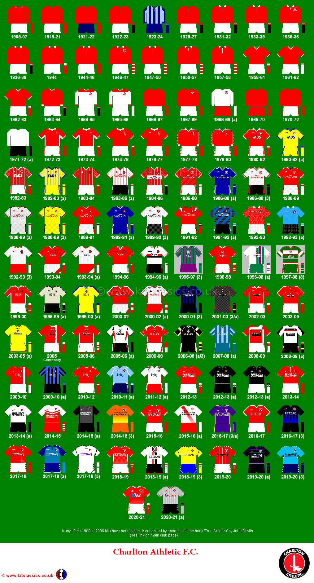
Your Best Charlton Away Colour Shirt
Comments
-
I'm with you. The Ecru was ropey. Bad colour for a football shirt.Redskin said:Seems I'm alone in this, but ecru = beige. Abomination of a shirt.
Agree with Henry, white is right,although blue/black stripes were classy.0 -
Anyone remember green and black stripes? When was that?0
-
Yellow Buckta 1970's with light blue trim.0
-
Late 60's.Henry Irving said:Anyone remember green and black stripes? When was that?
0 -
Yeah I like the ecru one too. Also the green and purple.0
-
 0
0 -
Loved the Quaser white shirt with the red and black hoop. Wore that a lot when I was backpacking around Asia and Australia. Ended up swapping it with a Perth Glory fan (She was cute). But for the superstitious, our away record last season suggests all black is the way to go.0
-
Very good Stig, hearing people's different favourites I find it hard to choose between them, as when one person says something I think yeah I liked that one , and so on and so forth.
The only thing is , as well as liking or disliking the shirt because of it being agreeable or not, it's also about the memories that go with it.
I quite like Stigs number 2 shirt , taken on it own, but the memories with it remind me of the start of our descent into League 1 and our mismanagement of the club.
Shirt 3, reminds me of 5 straight wins at the start of the season in the Premier league, perhaps thinking this could be our year to do something special.
Shirt 1 speaks of triumph , and the hopefully turning point in the clubs fortunes.
Just makes me want to see what our new shirts going to look like, and when I can get my hands on one, Stig you are a tease Sir!0 -
Number 2 kit was awful0
-
Liked the 2000/01 White shirt with Redbus in in Red.0
-
Sponsored links:
-
Stig's number two shirt is, for me personally, the worst away shirt we've ever, ever had.0
-
I consider white our 'proper' away colour but have always liked us in black. The ecru also does look great, was rewatching some stuff last week and had forgotten how brilliant the whole kit looked.0
-
Loved last years, mainly for the pleasure of being at Barnsley away though!0
-
 0
0 -
I agree with that - always thought it looked like a rugby league shirt rather than a football shirt, think is was the bands on the sleeves that did it.JiMMy 85 said:Stig's number two shirt is, for me personally, the worst away shirt we've ever, ever had.
Either ecru or the quaser white one with the red and black band across the middle (AC Milan away kit style). Stig's no. 3 choice is nearly as good, but not quite!0 -
Sponsored links:
-
Only away shirt I've owned was the white redbus one... Until my gf pointed out the "db" looked like a cock and balls. Never wore it again after that.0
-
That woolwich blue one by a country mile.
Visions of wobbly (robert lee) scoring 1-0 at wolves away in that one. Am I right?0 -
 0
0 -
Half white, half purple and green circa 96 is possibly my favourite, denim and sky hawk blue I probably wear the most, so a close second followed by the white with red and black band Viglen from 95 (Germany shirt) third. Love my Blue Woolwich shirts, the green hoop shirt and the green and purple shirts...... Really dislike the Fulham shirt and the crappy centenary black and red shirts.0
-

or 0
0 -
 1
1 -
Certainly the worst kit and sponsor combo. Horrible.Talal said:Best and worst for me...
Colours are the same but Joma got it wrong this time, in fact that surely has to be the worst home and away kit pairing we've had?

And to think of the shit that wore it.
*shakes head.0 -
I did like this shirt when used with black shorts:
 0
0 -