World Map Distortion for Last 500 Years

https://www.theguardian.com/education/2017/mar/19/boston-public-schools-world-map-mercator-peters-projection
Comments
-
I remember when this was first published. Some 30 odd years ago.
Serious geographers in the west use it. The rest of us seem to prefer Mercator's projection. Can't think why!2 -
http://thetruesize.com
You can drag and drop countries around the map to compare their true relative sizes.2 -
We've got a Peters Projection atlas in the house, which makes for a strange read, as all the pages use the same scale. Western Europe is almost on a double page and then you've got pages of Kazakhstan.0
-
I love a bit of cartography - saw a great bit on ancient aliens once about 2 maps of Antarctica. Antoneus fontaneous and Piri Reis.
2 maps of Antarctica supposedly drawn (quite accurately), prior to Antarctica being discovered
Look them up. Really interesting1 -
 6
6 -
You can't flatten out an orange peel to fit onto a rectangular piece of paper, nor can the surface of the world.
Surely all you need to do is look at a globe.1 -
Mercator Projected. A half decent album by East of Eden in 1969. The first track was entitled Northern Hemisphere.
On the album cover, the map is projected on to a naked female, which works for me.2 -
The Sahara is the size of the United States!0
-
Here is a photo from space of Earth. South America looks more like the one in the Mercator projection rather than the supposedly more accurate Peters projection. I am confused!
https://goo.gl/images/DX7Txi0 -
exactly my thoughts .. and the Sahara is expandingCardinal Sin said:The Sahara is the size of the United States!
0 -
Sponsored links:
-
The google image is three dimensional - southern South America is curving away from the viewer quite substantially. Pull it back out so it is in the same plane as say Mexico and it would look very much like the Peter's projection.Red_in_SE8 said:Here is a photo from space of Earth. South America looks more like the one in the Mercator projection rather than the supposedly more accurate Peters projection. I am confused!
https://goo.gl/images/DX7Txi0 -
They do different things. The Peters projection is more accurate for area, Mercator for shape. So, Mercator has things looking roughly like they do on the globe, but squishes the tropics and makes countries towards the poles bigger. So you get shape, but area is skewed. A lot.3
-
The problem is going from a round surface to the flat surface. The Mercator looks a lot more like the Earth does from space but land mass areas become distorted by the transition from round to flat.Red_in_SE8 said:Here is a photo from space of Earth. South America looks more like the one in the Mercator projection rather than the supposedly more accurate Peters projection. I am confused!
https://goo.gl/images/DX7Txi
There are dozens of projections and it is lazy to consider one as more accurate than other because strictly speaking all of the accepted projections are accurate but in a different way. The Mercator is more useful than the Peters for navigation, for example. Peters is the gateway map to understanding why projections differ but is by no means the best projection we have. Classrooms ought to have a globe, not a flat map. Mercator is a decent map for representing where countries are in relation to each other and smaller countries are less likely to be squished together. Perhaps teachers should be encouraged to teach students about projections and show them side by side and discuss the pros and cons of each one, or even extrapolate it into a discussion on whether you can believe everything you see, or whether two different things can both be accurate. There is a lot of opportunity for lateral thinking or critical thought and it would be a shame if schools switched from just using one map to another without a discussion on why.1 -
Dont know what would happen but try drawing South America on a roundish object, then put a thin piece of paper around the object, trace the outline and then see what the shape is when you flatten the paper out.Red_in_SE8 said:Here is a photo from space of Earth. South America looks more like the one in the Mercator projection rather than the supposedly more accurate Peters projection. I am confused!
https://goo.gl/images/DX7Txi0 -
The worlds maps looked and were better when the best part of them were coloured that nice pinkish red.
I still use a pre 1920 atlas at work, it has all the important bits including the steamer routes.3 -
0
-
The episode of the West Wing where this was brought to CJ's attention was also my introduction to the Peters map. My reaction was very similar to hers!1
-
You do realise that is quite heavily photoshopped?Red_in_SE8 said:Here is a photo from space of Earth. South America looks more like the one in the Mercator projection rather than the supposedly more accurate Peters projection. I am confused!
https://goo.gl/images/DX7Txi0 -
Wow this is a nerdy thread. Love it.
Let me just say, on behalf of America, if you want to be at the center of the map, then bloody well go out and get YOUR fast food restaurants, banks, and oil companies to conquer most of the known world!0 -
Love stuff like this, the world as we know it is skewed so heavily to the more influential, more developed western/"first" world as we know it.
And then to think that the entire population of some of these vast countries would fit into London, or Tokyo, or Mexico City, and you start to realise just how fucking mental we as a species are1 -
Sponsored links:
-
It's all about climate - how much of the world's wealth is above and below the tropics of Cancer and Capricorn?sam3110 said:Love stuff like this, the world as we know it is skewed so heavily to the more influential, more developed western/"first" world as we know it.
And then to think that the entire population of some of these vast countries would fit into London, or Tokyo, or Mexico City, and you start to realise just how fucking mental we as a species are0 -
My bit of it is....but I'm not sure how much that skews the figures?!?bobmunro said:
It's all about climate - how much of the world's wealth is above and below the tropics of Cancer and Capricorn?sam3110 said:Love stuff like this, the world as we know it is skewed so heavily to the more influential, more developed western/"first" world as we know it.
And then to think that the entire population of some of these vast countries would fit into London, or Tokyo, or Mexico City, and you start to realise just how fucking mental we as a species are0 -
The image on the Guardian article looks like somebody stretched the map on a PC screen using Paint.
I'd always heard it said Africa in reality was far bigger than shown on the maps but i'd never seen it until now either, amazing really.0 -
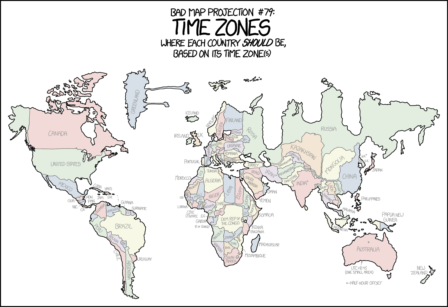
How about this map?
 0
0 -
They're all wrong.
 1
1 -
 1
1 -
http://www.ancientdestructions.com/oronteus-finaeus-map-antarctica-fineus/
My mistake - Oronteus Finaeus & Piri Reis maps were polar ice cap free maps of Antarctica0 -
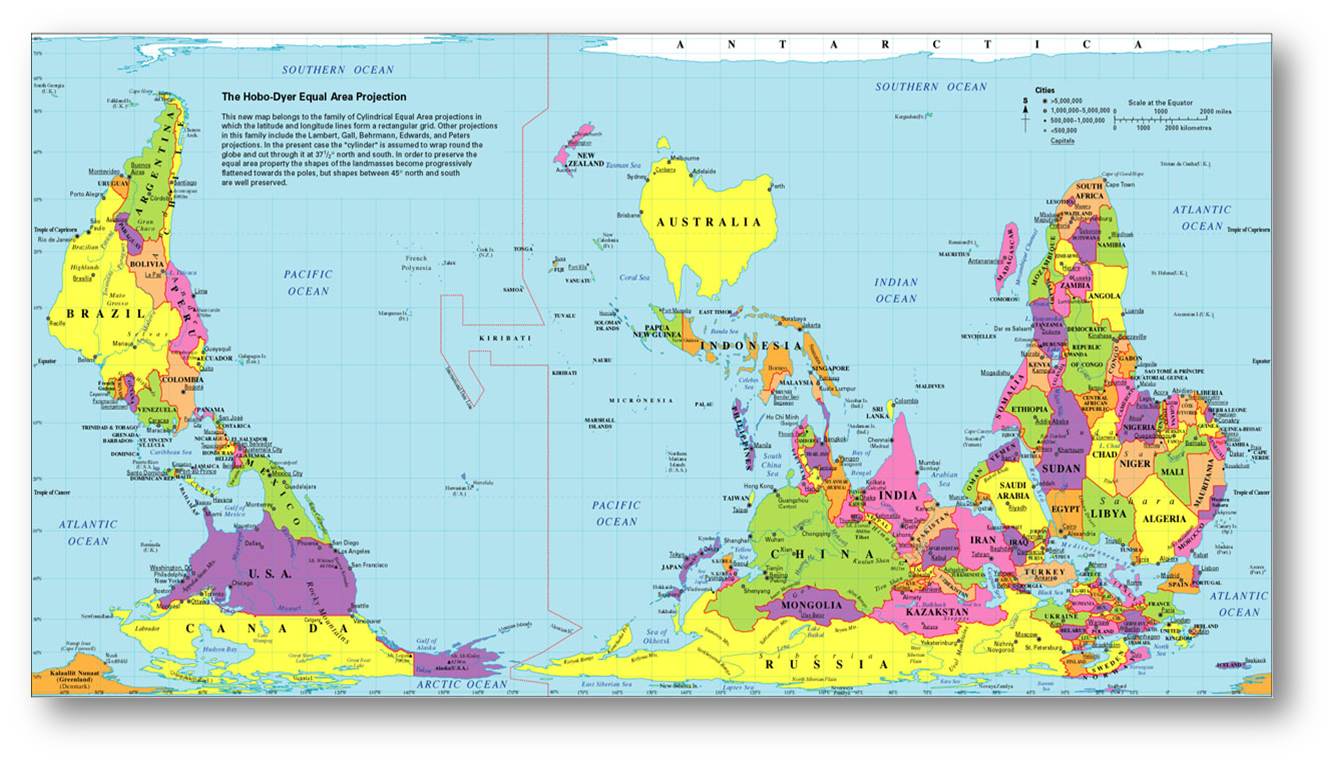
This is the map that counts:
 2
2 -
Had a look at their site expecting it to be spoof and parody... but... it actually seems genuine!Exiled_Addick said:They're all wrong.
1