Attention: Please take a moment to consider our terms and conditions before posting.
League One xG table
Comments
-
The binomial distribution assumes that p is constant whereas Xg has a different probability for each attempt.Callumcafc said:
In full awareness that I’m opening myself up for ridicule from certain quarters. If you wanted to be proper nerdy about it and distribute points based on xG… here’s what I’d do.MrOneLung said:Sorry, another question
in the xG table if in a match the xG is 1.01 versus 1.99 does that go down as a point for a 1-1 draw ?Or does the expected points give the 1.99 a ‘win’
Take Stevenage v Charlton yesterday.
Stevenage had 0.50 xG on 11 shots, averaging 0.045 per shot. Charlton had 0.16 xG on 7 shots, averaging 0.023 per shot.
You can use a Binomial distribution to figure out some percentages based on the chances that were created during the 90 mins…
Stevenage: n(shots)=11, p(probability of goal)=0.045
~60% scores 0,
~31% scores 1,
~7% scores 2,
~1% scores 3
and smaller for more…
Charlton: n=7, p=0.023
~84% scores 0,
~14% scores 1,
~1% scores 2
and smaller for more…Then multiply those percentages…
~51% of 0-0,
~26% of 1-0,
~8% of 0-1,
~4% of 1-1,
~6% of 2-0,
~1% of 2-1
and smaller for other results…
Then add up the scorelines to each result…
~33% Stevenage
~55% Draw
~8% Charlton
(yes 4% is missing - because of all the rough calculations I’ve done above)
Then allocate the points based on those outcomes…
Stevenage (3pts * 0.33 + 1pt * 0.55) = 1.54
Charlton (3pts * 0.08 + 1pt * 0.55) = 0.790 -
Yes that is correct I made an assumption to make the calculations easier.0
-
balham red said:
In what way is it under performing as an indicator, if actual and expected position are quite different?Stig said:Both of those tables are mis-named. They don't show whether teams have overperformed or underperformed at all. What they show is how good xG has been at predicting match outcomes. For some teams, Charlton is a good example, Opta's 'game outcome simulations' seem to be a pretty decent indicator of match day outcomes. Though these tables only show the overall pattern; it could be spot-on or wildly out on a match by match basis, we can't tell from this. For other teams, Exeter and Cambridge are prime examples, the xG model is underperforming as an indicator.
It's not supposed to necessarily be the same, it's not trying to mirror the league positions. It's giving us an indication of how good a team is at creating chances and preventing chances.
Don't forget, what's been presented here is not xG per se, but is the outcome of 'simulations based on individual shot xG'. The title of those charts is "Which teams have under/over-performed", I'm saying that this is wrong because we cannot say from the data presented that any of those teams have over or underperformed in any meaningful sense. They have all performed in a certain way and have taken a certain number of points; sometimes through skill, sometimes through luck, mostly through a mix of the two. The idea that any of them have over or underperformed because their results didn't match those of 'simulations' is completely wrong. It's like saying that the weather under-performed or over-performed because it didn't match what was in the weather forecast. Of course, nobody would say that because the whole notion is ridiculous; the weather, just like football teams' results is real-world stuff. The weather forecast, just like 'simulations based on individual shot xG', are not real-world stuff they are predictions which are sometimes good and sometimes not. When predictions don't match reality, that doesn't mean that reality has over or underperformed that means that the system used to make the prediction is not accurate enough. Please don't get me wrong, I'm not saying that the indicators presented here are consistently under-performing, but where there is a disparity between the red and the purple dots that is absolutely what it tells us and nothing else.
0 -
Nothing in that chart is a prediction tho. It’s an assessment of historic performance based on indicators other than results, simulated to take the form of a points table. In this case it’s based on the volume and quality of shots taken.Stig said:balham red said:
In what way is it under performing as an indicator, if actual and expected position are quite different?Stig said:Both of those tables are mis-named. They don't show whether teams have overperformed or underperformed at all. What they show is how good xG has been at predicting match outcomes. For some teams, Charlton is a good example, Opta's 'game outcome simulations' seem to be a pretty decent indicator of match day outcomes. Though these tables only show the overall pattern; it could be spot-on or wildly out on a match by match basis, we can't tell from this. For other teams, Exeter and Cambridge are prime examples, the xG model is underperforming as an indicator.
It's not supposed to necessarily be the same, it's not trying to mirror the league positions. It's giving us an indication of how good a team is at creating chances and preventing chances.
Don't forget, what's been presented here is not xG per se, but is the outcome of 'simulations based on individual shot xG'. The title of those charts is "Which teams have under/over-performed", I'm saying that this is wrong because we cannot say from the data presented that any of those teams have over or underperformed in any meaningful sense. They have all performed in a certain way and have taken a certain number of points; sometimes through skill, sometimes through luck, mostly through a mix of the two. The idea that any of them have over or underperformed because their results didn't match those of 'simulations' is completely wrong. It's like saying that the weather under-performed or over-performed because it didn't match what was in the weather forecast. Of course, nobody would say that because the whole notion is ridiculous; the weather, just like football teams' results is real-world stuff. The weather forecast, just like 'simulations based on individual shot xG', are not real-world stuff they are predictions which are sometimes good and sometimes not. When predictions don't match reality, that doesn't mean that reality has over or underperformed that means that the system used to make the prediction is not accurate enough. Please don't get me wrong, I'm not saying that the indicators presented here are consistently under-performing, but where there is a disparity between the red and the purple dots that is absolutely what it tells us and nothing else.XG is by definition not supposed to mirror historic match results. If it did it would be redundant as both a measure of performance and a forecasting indicator. We would just use results and go from there. So to say that XG is underperforming as an indicator because it isn’t matching up to results does seem to muddy the point…2 -
But this isn't xG. Have a look at the small print, they are using xG to run simulations that estimate the points that they expect teams to get. If that's not making a prediction, I don't know what is.hezzla said:
Nothing in that chart is a prediction tho. It’s an assessment of historic performance based on indicators other than results, simulated to take the form of a points table. In this case it’s based on the volume and quality of shots taken.Stig said:balham red said:
In what way is it under performing as an indicator, if actual and expected position are quite different?Stig said:Both of those tables are mis-named. They don't show whether teams have overperformed or underperformed at all. What they show is how good xG has been at predicting match outcomes. For some teams, Charlton is a good example, Opta's 'game outcome simulations' seem to be a pretty decent indicator of match day outcomes. Though these tables only show the overall pattern; it could be spot-on or wildly out on a match by match basis, we can't tell from this. For other teams, Exeter and Cambridge are prime examples, the xG model is underperforming as an indicator.
It's not supposed to necessarily be the same, it's not trying to mirror the league positions. It's giving us an indication of how good a team is at creating chances and preventing chances.
Don't forget, what's been presented here is not xG per se, but is the outcome of 'simulations based on individual shot xG'. The title of those charts is "Which teams have under/over-performed", I'm saying that this is wrong because we cannot say from the data presented that any of those teams have over or underperformed in any meaningful sense. They have all performed in a certain way and have taken a certain number of points; sometimes through skill, sometimes through luck, mostly through a mix of the two. The idea that any of them have over or underperformed because their results didn't match those of 'simulations' is completely wrong. It's like saying that the weather under-performed or over-performed because it didn't match what was in the weather forecast. Of course, nobody would say that because the whole notion is ridiculous; the weather, just like football teams' results is real-world stuff. The weather forecast, just like 'simulations based on individual shot xG', are not real-world stuff they are predictions which are sometimes good and sometimes not. When predictions don't match reality, that doesn't mean that reality has over or underperformed that means that the system used to make the prediction is not accurate enough. Please don't get me wrong, I'm not saying that the indicators presented here are consistently under-performing, but where there is a disparity between the red and the purple dots that is absolutely what it tells us and nothing else.XG is by definition not supposed to mirror historic match results. If it did it would be redundant as both a measure of performance and a forecasting indicator. We would just use results and go from there. So to say that XG is underperforming as an indicator because it isn’t matching up to results does seem to muddy the point…0 -
It's just xG put into points table form so it's easier to digest at a glance. It's still not a prediction.Stig said:
But this isn't xG. Have a look at the small print, they are using xG to run simulations that estimate the points that they expect teams to get. If that's not making a prediction, I don't know what is.hezzla said:
Nothing in that chart is a prediction tho. It’s an assessment of historic performance based on indicators other than results, simulated to take the form of a points table. In this case it’s based on the volume and quality of shots taken.Stig said:balham red said:
In what way is it under performing as an indicator, if actual and expected position are quite different?Stig said:Both of those tables are mis-named. They don't show whether teams have overperformed or underperformed at all. What they show is how good xG has been at predicting match outcomes. For some teams, Charlton is a good example, Opta's 'game outcome simulations' seem to be a pretty decent indicator of match day outcomes. Though these tables only show the overall pattern; it could be spot-on or wildly out on a match by match basis, we can't tell from this. For other teams, Exeter and Cambridge are prime examples, the xG model is underperforming as an indicator.
It's not supposed to necessarily be the same, it's not trying to mirror the league positions. It's giving us an indication of how good a team is at creating chances and preventing chances.
Don't forget, what's been presented here is not xG per se, but is the outcome of 'simulations based on individual shot xG'. The title of those charts is "Which teams have under/over-performed", I'm saying that this is wrong because we cannot say from the data presented that any of those teams have over or underperformed in any meaningful sense. They have all performed in a certain way and have taken a certain number of points; sometimes through skill, sometimes through luck, mostly through a mix of the two. The idea that any of them have over or underperformed because their results didn't match those of 'simulations' is completely wrong. It's like saying that the weather under-performed or over-performed because it didn't match what was in the weather forecast. Of course, nobody would say that because the whole notion is ridiculous; the weather, just like football teams' results is real-world stuff. The weather forecast, just like 'simulations based on individual shot xG', are not real-world stuff they are predictions which are sometimes good and sometimes not. When predictions don't match reality, that doesn't mean that reality has over or underperformed that means that the system used to make the prediction is not accurate enough. Please don't get me wrong, I'm not saying that the indicators presented here are consistently under-performing, but where there is a disparity between the red and the purple dots that is absolutely what it tells us and nothing else.XG is by definition not supposed to mirror historic match results. If it did it would be redundant as both a measure of performance and a forecasting indicator. We would just use results and go from there. So to say that XG is underperforming as an indicator because it isn’t matching up to results does seem to muddy the point…1 -
Perhaps you could explain what part of xG is a 'simulation' then? Their words, not mine.0
-
Sure. They have simulated results based on which team had the highest xG in the game.Stig said:Perhaps you could explain what part of xG is a 'simulation' then? Their words, not mine.0 -
And when those simulated results don't match the reality, it is the simulation that is wrong not the reality. And that is what the disparity between the red and purple dots is measuring.balham red said:
Sure. They have simulated results based on which team had the highest xG in the game.Stig said:Perhaps you could explain what part of xG is a 'simulation' then? Their words, not mine.0 -
Neither of them are “wrong”. They’re just showing different things. In this case, where have underlying performances differed from results.Stig said:
And when those simulated results don't match the reality, it is the simulation that is wrong not the reality. And that is what the disparity between the red and purple dots is measuring.balham red said:
Sure. They have simulated results based on which team had the highest xG in the game.Stig said:Perhaps you could explain what part of xG is a 'simulation' then? Their words, not mine.There are lots of possible explanations for those differences, but the fact they are different does not by itself show the simulation is flawed. It's not designed to match up.4 -
Sponsored links:
-
xG should not necessarily match results. If it did, then it would be pointless since we already have a results measure.Stig said:
And when those simulated results don't match the reality, it is the simulation that is wrong not the reality. And that is what the disparity between the red and purple dots is measuring.balham red said:
Sure. They have simulated results based on which team had the highest xG in the game.Stig said:Perhaps you could explain what part of xG is a 'simulation' then? Their words, not mine.
Saying xG is wrong because it doesn't match results is like saying the odds of winning the lottery being 1 in 14 million must be wrong because my mate Bob won it last year.
xG is a measure of probability, not a measure of what actually happens.1 -
I'm not saying xG is wrong. I'm saying that simulations based on xG, which is what Opta have done here, will not always be accurate. When Opta's xG based simulations do not match what happens in reality, it is wrong to describe that as teams under or over performing.
0 -

1 -
Opta has done thousands of simulations per match, leading to millions of combined simulations across all games so far.Stig said:I'm not saying xG is wrong. I'm saying that simulations based on xG, which is what Opta have done here, will not always be accurate. When Opta's xG based simulations do not match what happens in reality, it is wrong to describe that as teams under or over performing.
You can probably, in that haystack, find the needle/simulation that matches almost exactly the results we’ve seen so far. That simulation probably exists.
But you don’t pick a choose your favourite simulation or the one you think is closest and just present that, you take them in aggregate. Otherwise there’s no point doing all the simulations in the first place.0 -
I'm not querying the quantity of their data though. That doesn't alter the very nature of the beast; simulation is still simulation whether you do it once or whether you do it thousands of times. It's a qualitative issue, not a quantitative one. There is no threshold above which simulation ceases to be simulation.
We can come back to the weather analogy on this one. Meteorologists also run thousands of simulations and have millions of data points. Their ability to predict and explain has increased greatly through their use of ever more sophisticated data technology. When the outcomes of real weather situations are different to those 'most likely' scenarios that are presented to us, we never say that the weather has over or underperformed, we just accept that there are nuances in the real world that will never be picked up by modelling.0 -
We don't talk about weather over-performing or under-performing because weather doesn't perform. We a) have no direct control over it (climate change aside), and b) have no universally accepted definition of "good" and "bad" weather. Rain is good for farmers, bad for holiday lets. Sun is good for cricket, bad for cinemas, etc.
Meteorologists do however say things like "Last night in some parts of the country we saw a month's worth of rain fall in just 2 hours". Well what does that mean? What is "a month's worth" of rain, and how can it possibly still be a month's worth if it falls in one night? The answer is that someone somewhere has collected the data, and based on historic patterns for the area and time of year, has estimated what they think would fall in an average month.
Now, most people just hear this and think "that's a lot of rain", accepting that weather is sometimes a bit unpredictable. The table could be read in the same way - "wow, Cambridge have had a lot of chances for a team that are bottom of the table. This suggests they're playing better than I might expect from just looking at the league."2 -
I think we're talking about different things here. I've no idea what table you are talking about, but the ones I'm referring to (Posted by Callum on 11th October) don't contain any information about the number of chances a team has had. Nobody could look at those tables and draw the conclusions you are suggesting.0
-
It's aggregating results into a table based on the scorelines had each team taken their chances based on the sum probability of them being a goal, rounded to the nearest integer.Stig said:I think we're talking about different things here. I've no idea what table you are talking about, but the ones I'm referring to (Posted by Callum on 11th October) don't contain any information about the number of chances a team has had. Nobody could look at those tables and draw the conclusions you are suggesting.
E.g. if Charlton v Leyton Orient was 0.95 xG v 1.9 xG then the scoreline would be counted as 1-2.
If it was 0.95 xG v 1.3 xG then it would be counted as 1-1.
Yes there are caveats like, if you're winning you might shut up shop and defend, etc. And yes, some xG values seem wrong as the algorithm can't take into account everything.
Clearly it's not perfect. But on balance it's a pretty good indicator of the balance of play a team is having. And it was completely correct after a handful of games in saying that our league position of 2nd/3rd was flattering to deceive, while the dinosaurs on this thread were saying the league table is the best indicator of team strength and we were doing what we needed to. The same people who 3 weeks later were bemoaning the team for being not good enough!0 -
https://x.com/carra23/status/1853524909257105466?s=46&t=ynww82GMl7VKBjthBflU0gBrentford are the best in the PL at making the XG of a shot much better!#MNF ⚽️📊0
-
Good article on the topic of xG from over 10 years ago (!!)
https://statsbomb.com/articles/soccer/explaining-and-training-shot-quality/
0 -
Sponsored links:
-
 1
1 -
Wrexham went through a spell where they kept nicking close games with late winners. A sign of great team spirit yes, but also a sign that they're not as good as their league position suggested. Maybe they're current poor form is them reverting back to their true position?0
-
It wasn't though, was it?Henry Irving said:
Except that wasn't the measure, or to be more accurate combined measures, being used earlier in the season.Callumcafc said:Here’s a metric that reflects well on us.Best quality chances created, worst quality chances conceded. #JonesBall
Only team to average more than 0.14 xG per shot taken and less than 0.06 xG per shot conceded.
Quite encouraging that the teams that show up the best in this currently sit 2nd 3rd 4th and 5th. Who knew xG over a stretch of matches might actually be a good indicator of team strength?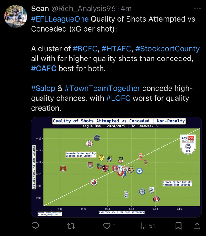
Not just XG but per shots attempted but also quality of chances conceded, which as many pointed out was a clear strength in our early games.
And the best indicator of team strength still remains the league table
(Said when we were second in the league)0