Attention: Please take a moment to consider our terms and conditions before posting.
Reebok it is then (new 3rd shirt p51)
Comments
-
A lot of the issue is the kit manufacturers have a design language and set parameters they have to follow when designing the kits.rikofold said:Bit underwhelming. Prefer many of the mock ups by far.
It's the same most years though. Is there any scope for getting people like @Nug et Al to come up with some concepts to feed into the process? Seems like we leave a lot of quality behind on fans' Photoshop storage.0 -
I hope they do a red cotton polo shirt with the club badge embroidered on it, as an alternative to the polyester team shirt.1
-
Always had a feeling the kit would be rubbish. Never ever seen a really good reebok kit for any team.A few decent ones but nothing even close to being stand-out good. Expecting more underwhelming stuff from the away and third.Still holding out hope though that all the training kits and other bits in the club shop are much better than castore1
-
All the talk of underwhelming, rubbish kit etc.
You can't even bloody see it!19 -
I'm not sure how anyone can take anything away from a couple of low res photos taken on a potato tbh8
-
Aren't they photoshopped? From old Liverpool shirts?
The originals are the Carlsberg ones. Which explains David James modelling one...2 -
Judging by who we’ve used to promote the Club recently, they’re probably Man U, QPR and Arsenal fans!! 🤷🏻♂️😉SCT1980 said:Deffo seems like some detail running down the shoulders.It looks like this is in front of the valley grove entrance to the west stand / Jimmy seed. Odd spot for a photo shoot, anyone have any idea who these three are?2 -
At least two of the three are pretty visible fans, one of them is one of the fan advocates and regularly on Charlton Live and the other is a photographer who is a fan and takes lots of photos of fansSCT1980 said:Deffo seems like some detail running down the shoulders.It looks like this is in front of the valley grove entrance to the west stand / Jimmy seed. Odd spot for a photo shoot, anyone have any idea who these three are?6 -
BrilliantElthamaddick said:don't think much of the first 3 new signings 0
0 -
“The potato camera is proof we have no money to spend on players.”BetterCallSaul said:I'm not sure how anyone can take anything away from a couple of low res photos taken on a potato tbh4 -
Sponsored links:
-
 Given the number of comments about it, looks to me like there’s no written ‘reebok’, just the old school approach of the reebok sign with a parallelogram around it, like this old Bolton shirt1
 -
The denim (long) shorts are a novel thing 😉😆0
-
6 -
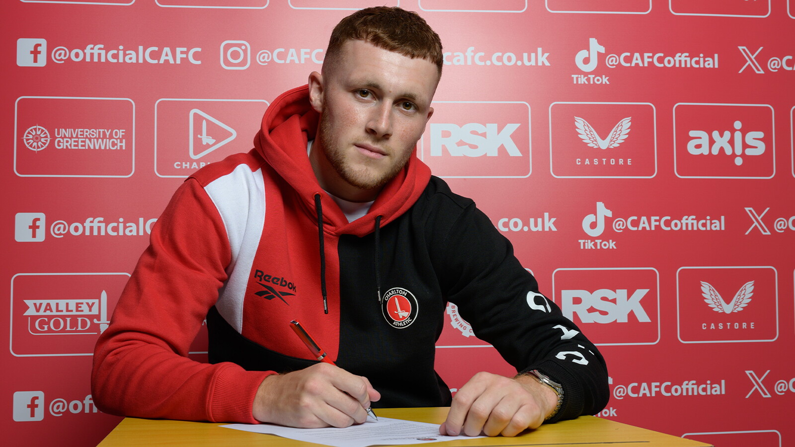
Even I’d wear that hoodie, nice!2
-
Not for me, looks like one of those half and half strips.Callumcafc said:0 -
Glad in not the only one who could see that!Dazzler21 said:0 -
That hoodie is rancid15
-
Horrible hoodie. Please let there be some reebok gear I can wear with my classics!2
-
do we know when the kits are being released?0
-
That hoody is proper naughty. Let me buy an oversized version and I can relive my hipster/skater dreams.6
-
Sponsored links:
-
Doesn’t look like it wicks enough moisture.9
-
It's like Reebok has asked ChatGPT to create a shit hoody based on our centenary shirt!5
-
That hoodie looks like something from the 90’s, what’s next a shell suit.Super_Eddie_Youds said:Horrible hoodie. Please let there be some reebok gear I can wear with my classics!2 -
Black looks shit on the end of sleeve looks nasty1
-
The absolute state of that hoodie 😳 I hope that’s not the benchmark for the Reebok deal2
-
“We will have a retail operation in Bluewater over the summer” mentioned as part of the Reebok conversation on Charlton TV.1
-
Always struck me as very strange that Castore have a store in Bluewater and never carried anything Charlton related at all5
-
A market stall next to the bloke knocking out mobile phone cases probablyCallumcafc said:“We will have a retail operation in Bluewater over the summer” mentioned as part of the Reebok conversation on Charlton TV.7 -
That hoodie!
Where is the three pointed jesters hat with bells on it?1