Attention: Please take a moment to consider our terms and conditions before posting.
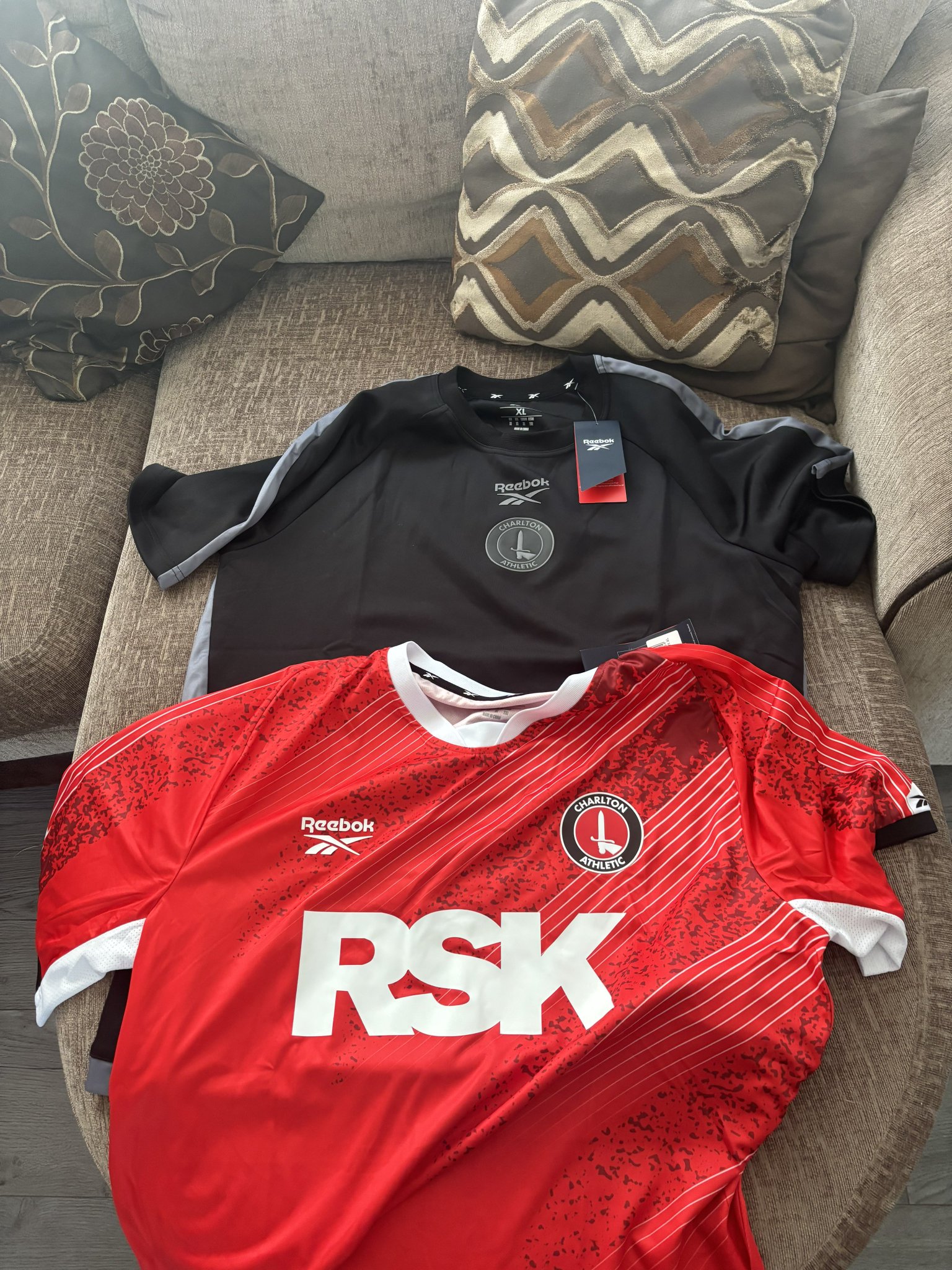
Reebok it is then (new 3rd shirt p51)
Comments
-
Would suggest the away/third kit isn't going to be black if the training gear is.0
-
3 minutes past 12, and still no Charlton shirts on the official website, Reebok out!3
-
More of a shirt launch than kit launch1
-
That’s not a cushion - it’s a fabric sample of the away kitswordfish said:
How much will you take for the cushions? 😉fenaddick said:
As you asked so nicelyshine166 said:
any chance of a screengab for us not on twitter ?fenaddick said:
That training top is lovelyButtleJR said:https://x.com/emreaygul00/status/1934556084770918577?t=vhk5TmOuyVGi12lxX55FnQ&s=19
Just seen someone post this after going to the shop, looks like they already have training wear in too.5 -
none of the new training gear is online which seems pretty silly2
-
Got it from the online shop. I love a championship kit.1
-
Anyone know how much they're flogging the training gear for?0
-
Is anyone finding a size missing in the infant kits. Jumps from 2 - 3 years to 4 - 5 years? No 3 - 4?2
-
Would love to see a GK top0
-
The fabric choice looks interesting, in the video it seems slightly shimmery, changes depending on the light?
or is that just AI?0 -
Sponsored links:
-
Sponsors want their logo in your face, it is what they are paying for.ElliotCAFC said:
Yeah you might be right there, I just don’t like the huge block of white that’s created by the RSK logo. At least with other sponsors it’s less in your face.fenaddick said:
Imagine how much busier it would look with two patterns, three colours and all that extra text. Would cover the same amount of space but much less cleanlyElliotCAFC said:Not that I care but all of our kits look rubbish with three massive letters right on the front. That’s got to be the largest shirt sponsor I’ve ever seen.Bang University Of Greenwich on the front and that’s a lovely kit.3 -
U get a pair of 3D goggles with each top - depends what setting u useEugenesAxe said:The fabric choice looks interesting, in the video it seems slightly shimmery, changes depending on the light?
or is that just AI?1 -
There's always this debate about a kit reveal. Is it just me that doesn't really care what the kit looks like as long as the shirt is red with the club badge on and the shorts are white? It's a football kit, not a fashion parade!1
-
I like a polo top but just NOCafc53 said: 0
0 -

13 -
Infant seems to be up 4-5 and then junior goes straight to 7-8.bromdog said:Is anyone finding a size missing in the infant kits. Jumps from 2 - 3 years to 4 - 5 years? No 3 - 4?0 -
Maybe they'll coincide it with the away kit launch?buckshee said:Made a big thing about the Bluewater store yet it’s not open until later this month, surely common sense would’ve said to open it to coincide with the kit (shirt) launch.0 -
Shorts and socks

5 -
Will they have a setting for watching games too!DOUCHER said:
U get a pair of 3D goggles with each top - depends what setting u useEugenesAxe said:The fabric choice looks interesting, in the video it seems slightly shimmery, changes depending on the light?
or is that just AI?0 -
Sponsored links:
-
I notice there's a 'Retro Range' tab on the club shop that's not working yet.0
-
That was used for the last retro shirts.The Red Robin said:I notice there's a 'Retro Range' tab on the club shop that's not working yet.0 -
What on earth is going on with the sword on the back of the socks...?!The Red Robin said:
Shorts and socks
 3
3 -
 It's like it's been created with AI and no-one's checked it 5
 -

Quite like that jacket.4 -
I like it. Reebok really went the extra mile to connect with our full spectrum of supporters.
According to an inside source, the white lines are inspired by the designer’s trips to the Covered End toilets.23 -
By the way, VG discount is automatically applied online, first time ive seen that.1
-

Corrrrrrr15 -

This is nice!!!3


