Attention: Please take a moment to consider our terms and conditions before posting.
Other team's new kits
Comments
-
MI6 must be really desperate for funds, if Q is reduced to opening a casino.1
-
Think the sponsor looks like a at home print, making it seem fake to mePelling1993 said:
Can't put my finger on it, but it looks like a fake shirtMrOneLung said: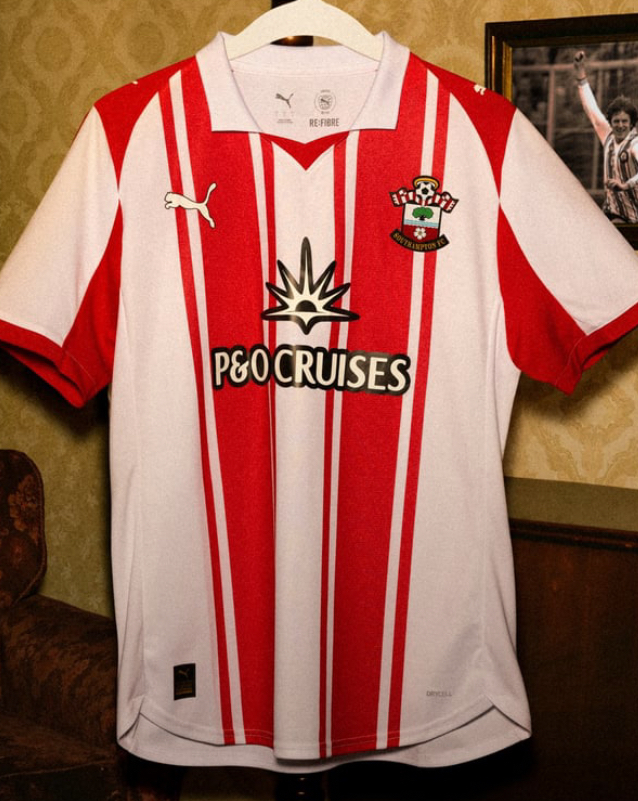 Southampton’s home kit. 2
 -
It’s probably at the maximum size allowed by EFL rules, and it’s fine, if you think Spud Boy in the same space is better, then, no helping availableMrOneLung said:
it is just too big - reduce the font by 25% and would be much betterRothko said:Honestly don't get what the issue is with RSK on the shirts, owned by a Charlton supporter, simple, not a gambling firm, ticks all the boxes0 -
Casino Royalekillerandflash said:MI6 must be really desperate for funds, if Q is reduced to opening a casino.2 -
no I don't think Spud Boys is a better logo, but doesn't mean I cannot think our shirt would look better with smaller letteringRothko said:
It’s probably at the maximum size allowed by EFL rules, and it’s fine, if you think Spud Boy in the same space is better, then, no helping availableMrOneLung said:
it is just too big - reduce the font by 25% and would be much betterRothko said:Honestly don't get what the issue is with RSK on the shirts, owned by a Charlton supporter, simple, not a gambling firm, ticks all the boxes0 -
I think the RSK is fine as is, could be green like the actual logo0
-
I seriously doubt anyone actually minds where the sponsor is based and who they are. I think everyone would agree that it's a positive that it is a Charlton fan sponsoring and not a dodgy sponsor.Rothko said:Honestly don't get what the issue is with RSK on the shirts, owned by a Charlton supporter, simple, not a gambling firm, ticks all the boxes
The sponsor logo just doesn't look good, it is a bad looking logo. It would even look better with something as simple as a black outline/trim around the RSK and reduce the size. It would pop more and not be an eye sore on the shirt.
1 -
Genuinely one of the worst kit sponsors I've ever seen, luckily for Watford fans, their club agree:ForeverAddickted said:
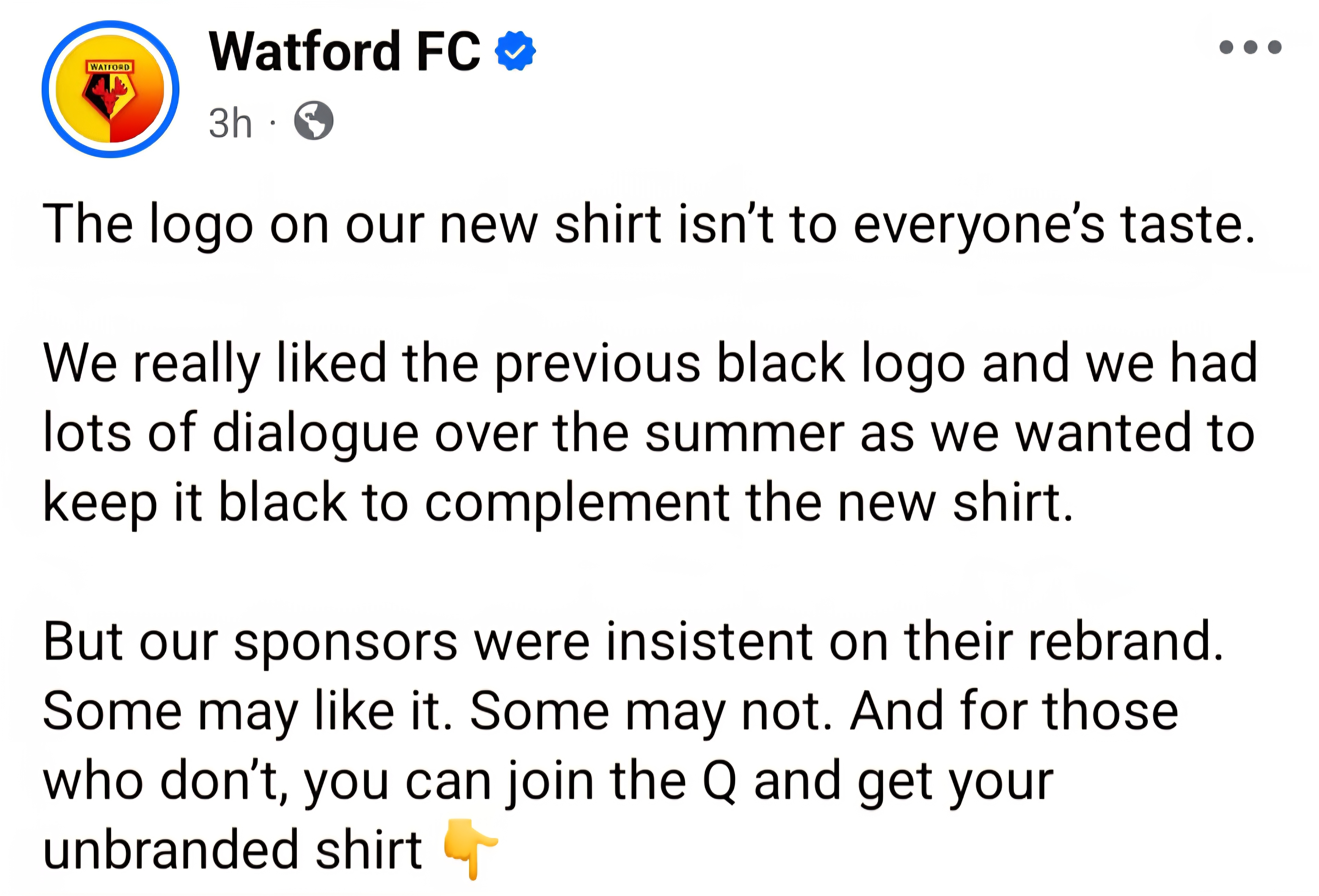
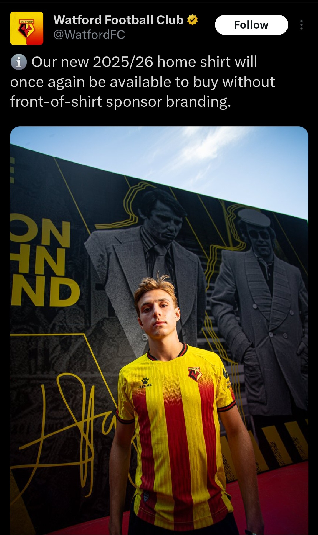
10 -
Rothko said:Honestly don't get what the issue is with RSK on the shirts, owned by a Charlton supporter, simple, not a gambling firm, ticks all the boxesI would say the general view is the lettering is too big.**Edit, @MrOneLung beat me to it.0
-
Look a whole lot better without that sponsor on it…ElfsborgAddick said:
Very retro from the late 70's early 80's.MrOneLung said: Southampton’s home kit.
They'll sell bundles of these.2 -
Sponsored links:
-
Think they'll be looking for a new sponsor after that post , although I totally agree with them.Braziliance said:
Genuinely one of the worst kit sponsors I've ever seen, luckily for Watford fans, their club agree:ForeverAddickted said:


Don't know if the Championship is going to be covered by the ban on gambling sponsors from next season??1 -
Moody Far Eastern gambling firms look shit on shirts, I know the EFL were one of the biggest campaigners against a gambling ban2
-
Why would anyone buy the branded one 😂Braziliance said:
Genuinely one of the worst kit sponsors I've ever seen, luckily for Watford fans, their club agree:ForeverAddickted said:

 0
0 -
That's really nice.Braziliance said:Really like Norwich's new kit.
https://x.com/NorwichCityFC/status/1941044307449840035?t=kcETZGpA3ugFvvfBVhxkGg&s=19
Very simple, has a collar and the crest & manufacturer are embroided on.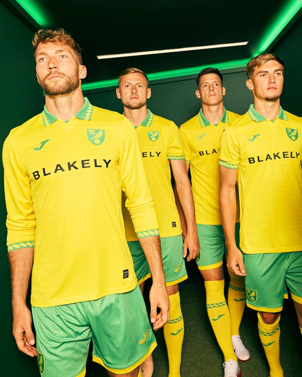
Watford and Southampton's above are both awful.0 -
I've always liked the Norwich canary yellow, bright green and the 'pretty' badge .. however, what is the point of a collar on a garment that is essentially a T shirt ?Braziliance said:Really like Norwich's new kit.
https://x.com/NorwichCityFC/status/1941044307449840035?t=kcETZGpA3ugFvvfBVhxkGg&s=19
Very simple, has a collar and the crest & manufacturer are embroided on. 0
0 -
Removing the logo from Watfords shirt don't help it. Southampton's one looks cheap. Norwich have nailed theirs though!
Edit...haha...I just watched the launch video. Very well played Norwich.
1 -
It's the blue and white clash with the yellow/red/black of the kit that makes it even worse. Doesn't look terrible if done in suitable colours.
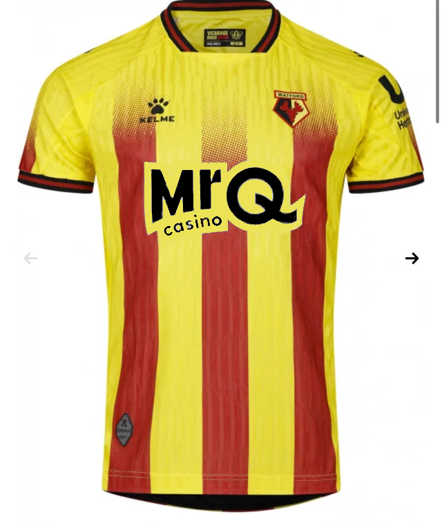
2 -
like the Preston shirt with the sponsors name/logo in a bright contrasting colour. This really brings attention to the sponsor's name, more bang for yer buck so ter speakrandy andy said:It's the blue and white clash with the yellow/red/black of the kit that makes it even worse. Doesn't look terrible if done in suitable colours. 0
0 -
True, but if the fans actively hate it and end up all buying blank tops, it could be argued you're losing as much as you gain from the contrast. Also, as a sponsor you want the fans of the team you're sponsoring to use your services, so making them instantly dislike your brand isn't a smart moveLincsaddick said:
like the Preston shirt with the sponsors name/logo in a bright contrasting colour. This really brings attention to the sponsor's name, more bang for yer buck so ter speakrandy andy said:It's the blue and white clash with the yellow/red/black of the kit that makes it even worse. Doesn't look terrible if done in suitable colours.
2 -
agreed, after all there are great marketing depts, good ones, bad ones and terrible onesrandy andy said:
True, but if the fans actively hate it and end up all buying blank tops, it could be argued you're losing as much as you gain from the contrast. Also, as a sponsor you want the fans of the team you're sponsoring to use your services, so making them instantly dislike your brand isn't a smart moveLincsaddick said:
like the Preston shirt with the sponsors name/logo in a bright contrasting colour. This really brings attention to the sponsor's name, more bang for yer buck so ter speakrandy andy said:It's the blue and white clash with the yellow/red/black of the kit that makes it even worse. Doesn't look terrible if done in suitable colours. 1
1 -
Sponsored links:
-
North Lower Neil said:
That's really nice.Braziliance said:Really like Norwich's new kit.
https://x.com/NorwichCityFC/status/1941044307449840035?t=kcETZGpA3ugFvvfBVhxkGg&s=19
Very simple, has a collar and the crest & manufacturer are embroided on.
Watford and Southampton's above are both awful.As with most Norwich home tops, this one is very nice, particularly that the shirt manufacturer and club badge are embroidered.This coupled with not an overpowering sponsor logo covering the shirt.1 -
Have the massives announced their kit yet?0
-
.0
-
Even though i agree with them it's a strange post from the club though. They've basically said 'we agree our sponsors logo looks shit, we wanted it to be black, we know you hate it so please buy a shirt without it'.Braziliance said:
Genuinely one of the worst kit sponsors I've ever seen, luckily for Watford fans, their club agree:ForeverAddickted said:


The sponsor reading that must be pretty angry.1 -
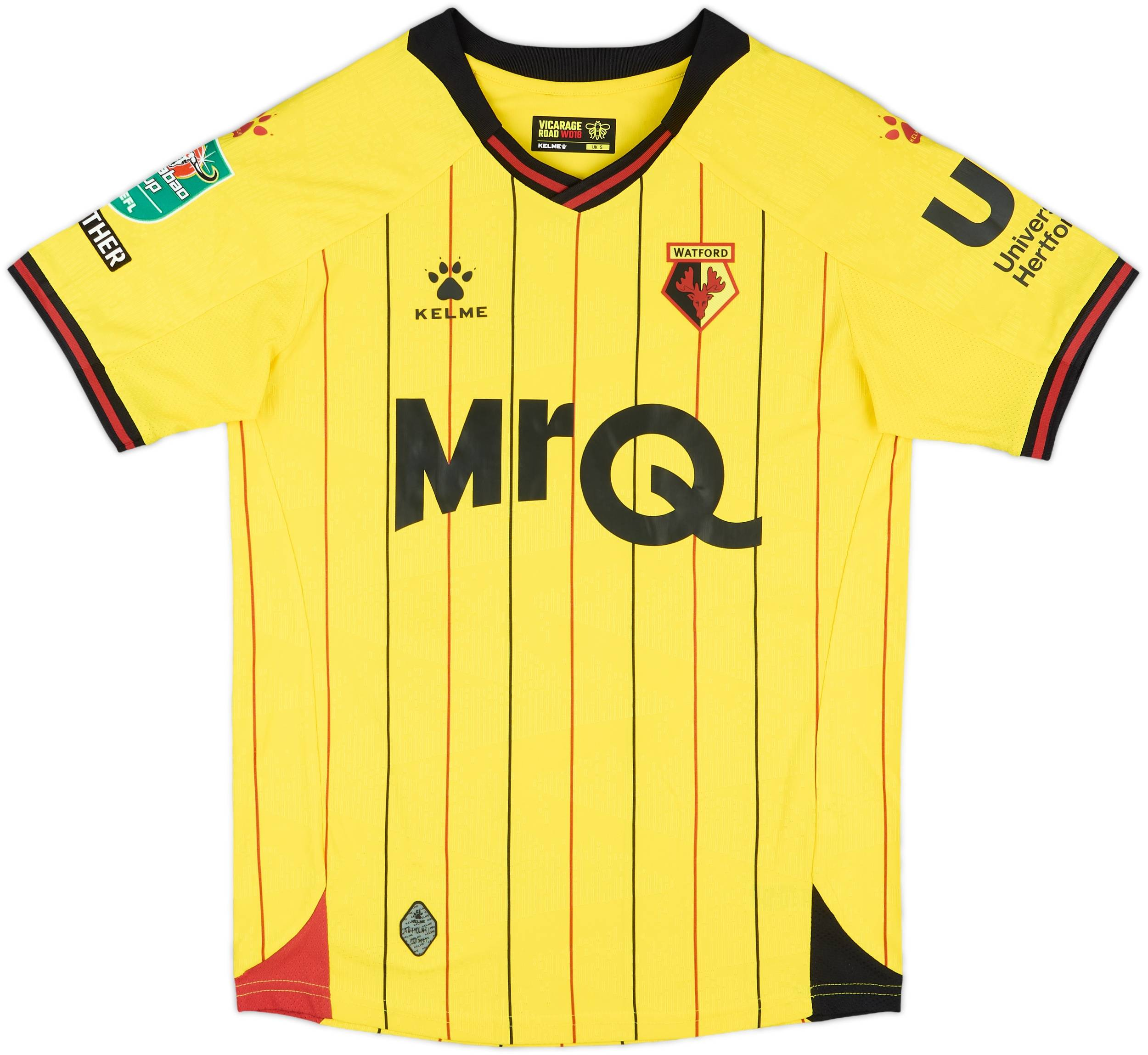 They had a black sponsor for the last 2 seasons with MrQ and now they've rebranded to blue and it just doesn't work. 0
 -
-
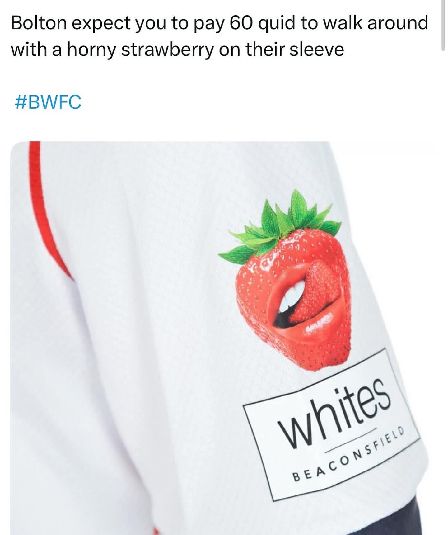
Whites Beaconsfield make teeth whitening products. I expect all the Bolton fans to have Instagram smiles this season

https://whitesbeaconsfield.co.uk/0


