Attention: Please take a moment to consider our terms and conditions before posting.
***PLEASE READ: New Charlton Life look and feel coming...
Comments
-
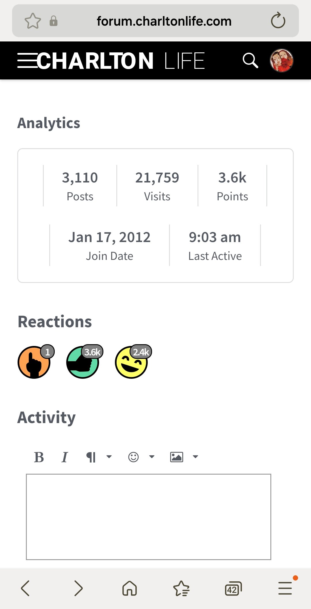
Probably in a minority here, but you used to be able to hover over the likes and LOL's on the profile page and find an acurate figure, but that seems to have vanished now...🤷♂️0
-
Perhaps it's not wider than before and it's just the fact it's different, but it does seem wider and more 'in your face' than before. An option to minimize it would be good but if not then it's not exactly going to ruin my life.aliwibble said:
@Chris_from_Sidcup can you screenshot what you're seeing? I don't think it's much wider than when the menu was on the LHS. To my knowledge I don't think hiding it's currently an option.Chris_from_Sidcup said:Is there an option to hide or minimize the panel on the right hand side so it doesn't take up a third of my screen?
1 -
@KiwiValley There is a way to do this, but from looking at my test user it appears it's functionality that only the mods have at the mo. I'll add it to the Issues List as a "nice to have" but it may take a while to get around to.KiwiValley said:Awesome effort so far thanks for your work.
Constructive feedback/question:
I can't seem to see who has liked or loled one of my posts on mobile? The hover over when visiting on my computer works as before. In the past on my phone i would switch to desktop on my phone and would be able to see then who has engaged. But that doesn't work as an option now.
This is critical to know who's letter box not to shit in.2 -
Looks a bit washed out to me.
Plus la change4 -
@charscot can you do a screen shot of what you're seeing please? The space on the RHS is due to us shifting the menu to the other side, but there shouldn't be an issue on the left. You may need to clear your cache down to get the most up to date version of the site settings.0
-
The Product manager in me wants to come out, and go, it's great, but couple of little tweaks, and they are about font, it's this weird grey at the moment, couple of shades darker will improve readability, and and the weight of the font seems a little too light, don't know if that's tweakable11
-
OMG This is going to take some getting used to. Thought my eyes had gone funny.3
-
When you click on your picture how do you track down the number of likes or lol’s you have?0
-
On the mobile version the layout doesn’t seem
To resize proportionally if you increase text size.0 -
Sponsored links:
-
-
Is there a way to get the yellow highlighting back indicating how many new posts there are in a thread? That was very helpful in the old format.4
-
I'll second that, was good to know if something had kicked off.EpsomAddick said:Is there a way to get the yellow highlighting back indicating how many new posts there are in a thread? That was very helpful in the old format.
Thanks to all involved for running this site.. .1 -
EpsomAddick said:Is there a way to get the yellow highlighting back indicating how many new posts there are in a thread? That was very helpful in the old format.

It's still there, just more subtle1 -
Oh yes, thanks, excellent.0
-
I don’t like change4
-
I get that - I just preferred it with the yellow highlighting because it stood out more.fenaddick said:EpsomAddick said:Is there a way to get the yellow highlighting back indicating how many new posts there are in a thread? That was very helpful in the old format.
It's still there, just more subtle2 -
It's not as though they've got anything better to do with their time.BrentfordAddick said:
I'll second that, was good to know if something had kicked off.EpsomAddick said:Is there a way to get the yellow highlighting back indicating how many new posts there are in a thread? That was very helpful in the old format.
Thanks to all involved for running this site.. .2 -
When you click on anyones Avatar it gives the day and month that you joined the forum……however not the year, which is a bit odd…..mine just shows the number 2 instead of the year?
Also think a little subtle colour or two on the thread reading pages might be welcomed, just to make it look a little less institutional, if that’s possible.
1 -
Fancy!0
-
Sponsored links:
-
Looks ok to me, but can we have page numbers at top as well as bottom.
When I go to the thread it starts on page 2 and I have to go to the bottom as I have discovered to put it to page 1. Thanks2 -
This mute button… is it just for threads you don’t want to read or can you click on a user and mute them also?? Out of interest..4
-
The worst thing is the CHARLTON LIFE logo at the top of the page (desktop version), which looks a bit squashed


0 -
Search button now works, saves going to Google to find old threads0
-
Looks fine on mine.killerandflash said:The worst thing is the CHARLTON LIFE logo at the top of the page (desktop version), which looks a bit squashed1 -
I expected to wake up to a dumpster fire!Looking through your comments, this is not bad.I found myself agreeing with most of the suggested tweaks or at least having an explanation or fix in mind. I’ll go through each a little later and update here in turn.I think we’ll all survive!9
-
Just stops you getting notifications when someone has tagged you in a thread.Bedsaddick said:What does the “mute” button actually do ?1 -
@Weegie Addick For inbox messages you should be getting email notifications anyway, if not DM me and I'll take a look. As for the display issue, not sure right now, but I'll add it to the list.Weegie Addick said:A much cleaner look on mobile and no blue (apart from the Roland Out button!!) - thanks so much for all the hard work.
One question / suggestion: will there be a more obvious notification visible on the main page to show if you have inbox messages? I rarely click on my profile so could end up missing these for days on end?1 -
It functions just like it should, no issue with that at all. I think I'd just like a bit more colour; darker overall font and some colour on the new posts notification and especially the number of likes and LOLs on a post to make them stand out a bit more would be nice2
-
You've got more than 34,000 likes and 11,000 LOLs. Does the accurate figure really matter?eastterrace6168 said:Probably in a minority here, but you used to be able to hover over the likes and LOL's on the profile page and find an acurate figure, but that seems to have vanished now...🤷♂️0