Attention: Please take a moment to consider our terms and conditions before posting.
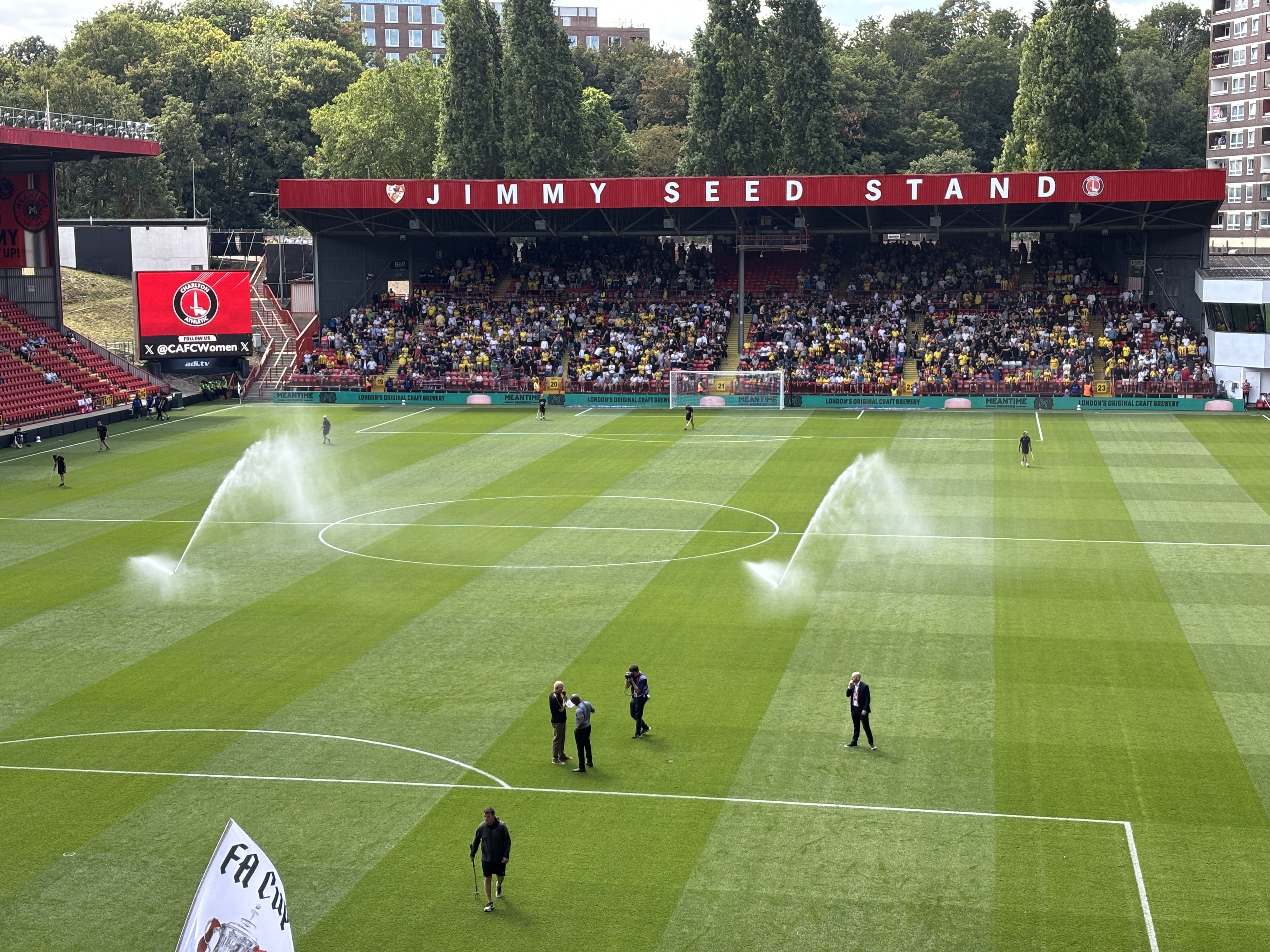
Jimmy Seed stand gets a refresh
Comments
-
The stand looks like it's grown up a bit. Perhaps we should call it the Jimmy Sapling Stand.
") 4
4 -
As an aside, it feels a little odd to see such correspondence in 1943, in the middle of the war.Henry Irving said:Bromley were not too happy when Croker eventually signed for us but being from Bromley they were too well brought up and polite to say it directly. 2
2 -
Yeah, but not as weird as 'Navy Blue Knickers'. Sounds like the U11 netball team.killerandflash said:
As an aside, it feels a little odd to see such correspondence in 1943, in the middle of the war.Henry Irving said:Bromley were not too happy when Croker eventually signed for us but being from Bromley they were too well brought up and polite to say it directly.1 -
It’s a well known fact that most people from Bromley swerved the warkillerandflash said:
As an aside, it feels a little odd to see such correspondence in 1943, in the middle of the war.Henry Irving said:Bromley were not too happy when Croker eventually signed for us but being from Bromley they were too well brought up and polite to say it directly.10 -
I love the mix of the old and the new. Never forget your roots and history.Fumbluff said:Not sure the badges are adding much really3 -
Navy Blue knickers are a bit kinky though eh?Henry Irving said:Bromley were not too happy when Croker eventually signed for us but being from Bromley they were too well brought up and polite to say it directly.1 -
Part of the war effort, teams would often play in their wives and girlfriends knickers as part of the "make do and mend" attitude prevalent at the time. Palace continued to wear their mum's blouses right up to the end of rationing in the 50s.Stig said:
Yeah, but not as weird as 'Navy Blue Knickers'. Sounds like the U11 netball team.killerandflash said:
As an aside, it feels a little odd to see such correspondence in 1943, in the middle of the war.Henry Irving said:Bromley were not too happy when Croker eventually signed for us but being from Bromley they were too well brought up and polite to say it directly.9 -
"Knickers" was the common term for football shorts then.
For evidence see the Charlton letter that refers to "white knickers" and "red jerseys"2 -
The museum should start selling replica white knickersHenry Irving said:"Knickers" was the common term for football shorts then.
For evidence see the Charlton letter that refers to "white knickers" and "red jerseys" 2 -
Correct!Henry Irving said:"Knickers" was the common term for football shorts then.
For evidence see the Charlton letter that refers to "white knickers" and "red jerseys"
I remember giggling like child when I saw it in old football programmes from the 50s.
Oh wait, I WAS a child.
Just to add to my childish glee, football socks were referred to as stockings back then.
6 -
Sponsored links:
-
Also the FA Cup Final Programme. Though they were black knickers then.Henry Irving said:"Knickers" was the common term for football shorts then.
For evidence see the Charlton letter that refers to "white knickers" and "red jerseys"0 -
Are Palace fur coat and no knickers3
-
4
-
Good work Ben.
PS My mum had almost identical handwriting.3 -
mascot88 said:
That's much better! 👍0 -
Paul actually.JamesSeed said:Good work Ben.1 -
With the new feature on the jimmy seed, i did notice last week end the red fascia on the north and west do look quite shabby and worn out now, are there any plans to spruce that up a little?1
-
The Jimmy Seed looks great from the covered end. Lots of complaints from Watford fans on the interior though - urinals overflowing, beer running out long before KO etc (possibly to prevent any further overflows).0
-
To be fair, it seems to have been just as bad in the Covered End, so you can't accuse us of discriminating against away fansJints said:The Jimmy Seed looks great from the covered end. Lots of complaints from Watford fans on the interior though - urinals overflowing, beer running out long before KO etc (possibly to prevent any further overflows). 0
0 -
I thought the lettering was a bit wonky myself.0
-
Sponsored links:
-
There are massive and inconsistent gaps in the lettering ..0
-
I think it looks great. In this money orientated age it’s nice that it’s still The Valley, and not The Red Bull Valley, and the JS and AC stands, rather than sponsored version South and East stands. .I read a really good article a few years back by a journalist who read his name on the stand and, having never heard of him, did some research, and wrote a really insightful piece.I know it didn’t end well for JS here, but I’m sure he’d be really chuffed that he’s still so fondly remembered.
 13
13 -
Valleysarr said:
It's a massive upgrade on what was there previouslyThere are massive and inconsistent gaps in the lettering ..7 -
Wrong shade of red.0
-
SporadicAddick said:Can I be the first to say that the scale of the lettering relative to the stand and relative to the other fascias (AC Stand / West Stand) is all wrong, as is the kerning.
BUT, beauty is in the eye of the beholder...
A massive improvement on what was there before so good work - having some pride in the state of the ground is a good sign.
4 -
surely it should have been done in his own handwriting? Henry where were you?1
-
The more I look at it the better I feel about it. The slightly darker red and the massive lettering, combined with the central support pole really gives it a retro feel, in a good, nostalgic way1