NEW CAFC BADGE?????
Comments
-
We have , its called the Woolwich ferry .As Greenwich becomes a royal borough this year , and if i have read right we are the only club to be based in a royal borough , would be nice to have the new coat of arms on the opposite side to the club badge to represent this .
Only if we get a free yatch
http://www.greenwich.gov.uk/info/200064/local_history_and_heritage/1053/greenwichs_royal_crest
0 -
I have a Charlton tattoo too! BTW, Has anybody noticed that on the Joma shirts and merchandise we had 'TM' on the badge but not on the Macron stuff. Is thier a reason for this?0
-
it's no secret, it's at the top of my left breast.
I know where it isI too have charlton tatt have no desires to get it altered.
Ok, I'll ask. Where is it?
0 -
I'm happy with ours as it is, it's simple but strong at the same time. but I would be happy for someone to put forward perhaps a modern slant of the hand and sword, I wouldn't want anything other than that.0
-
I'm happy with ours as it is, it's simple but strong at the same time. but I would be happy for someone to put forward perhaps a modern slant of the hand and sword, I wouldn't want anything other than that.
I'm the same our logo is great the way it is but it is nice on some 'non replica' shirts etc to have just the hand and sword in black or white, plain, simple, smart.
0 -
I'm happy with ours as it is, it's simple but strong at the same time. but I would be happy for someone to put forward perhaps a modern slant of the hand and sword, I wouldn't want anything other than that.
How about this ? the Charlton sword of justice. : )
0 -
It's upside down
 ( 0
( 0 -
 0
0 -
Just to the side of your bellybutton in twenty years or so!
it's no secret, it's at the top of my left breast.I too have charlton tatt have no desires to get it altered.
Ok, I'll ask. Where is it?
I know where it is
:-)
0 -
I'm in the tattooed Addicks fraternity so for the sake of my skin I'll say leave it as it is. I love the badge!0
-
Sponsored links:
-
I'll ask what everyone is thinking, photos?
it's no secret, it's at the top of my left breast.
I know where it isI too have charlton tatt have no desires to get it altered.
Ok, I'll ask. Where is it?
XoD0 -
I can't remember seeing any announcement about it, but I think the club have done an excellent job of upgrading the badge. So excellent in fact that it appears to have gone unnoticed. Getting rid of that horrible TM sign is a major plus, and the shading on the sword and the surround to give it a 3D effect works really well.
 0
0 -
Not sure about the bit of string though3
-
that is a classic badge, not just cos they are my one and only, just a great club badge.1
-
Wash your mouth out. Not allowed to say anything good about the club now, not since God was sacked.Stig said:I can't remember seeing any announcement about it, but I think the club have done an excellent job of upgrading the badge. So excellent in fact that it appears to have gone unnoticed. Getting rid of that horrible TM sign is a major plus, and the shading on the sword and the surround to give it a 3D effect works really well.
 0
0 -
Brilliant in its simplicity, but I always think the hand looks slightly deformed.
As an aside, I wish we had plain white nets,not red & white ones.0 -
The TM went about five years ago. The graphic designers are always playing around with the badge at the margins, but it hasn't changed officially.0
-
Amazing. All that time and I've not noticed it before. I honestly thought it was new this season. Must get some new glasses.0
-
Small sword or big hand? More like a gladiators dagger than a big eff off proper English sword IMO0
-
Sponsored links:
-
Can we afford Graphic Designers? Or have we got the kid on the switchboard playing about with MS Paint?Airman Brown said:The TM went about five years ago. The graphic designers are always playing around with the badge at the margins, but it hasn't changed officially.
0 -
PMSLOff_it said:
Wash your mouth out. Not allowed to say anything good about the club now, not since God was sacked.Stig said:I can't remember seeing any announcement about it, but I think the club have done an excellent job of upgrading the badge. So excellent in fact that it appears to have gone unnoticed. Getting rid of that horrible TM sign is a major plus, and the shading on the sword and the surround to give it a 3D effect works really well.

0 -
Was not the sword a design done by a fan...... when we had the idea of calling us Valiants, late 60s/70s.....
As a designer I cannot see the need for a new badge, as the airman has stated it get's 'modified'
We seem to have a photoshop 'sky' type of phase at present, with slight shadow cast to give it a 'gloss' type of look...... bit dated the sort of thing David Hillman from Pentagram was doing years ago...... but I am sure the art critic's on here will correct me!
Of course if you want to spend a load of cash, changing all your letter heads, and brand identity, and confuse people fine.......0 -
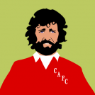
Found these on the web and thought they were quite amusing. Obviously it was our one that got my attention, but I think the Wendies one is brilliant.
http://miniboro.com/branded-football4 -
Ok, I'll ask. Where is it?sadiejane1981 said:I too have charlton tatt have no desires to get it altered.
I know where it is
it's no secret, it's at the top of my left breast.
It's a nice tattoo!0 -
I know where it isElfsborgAddick said:
Ok, I'll ask. Where is it?sadiejane1981 said:I too have charlton tatt have no desires to get it altered.
it's no secret, it's at the top of my left breast.
It's a nice tattoo! 0
0 -
That is very goodStig said:Found these on the web and thought they were quite amusing. Obviously it was our one that got my attention, but I think the Wendies one is brilliant.
http://miniboro.com/branded-football0 -
Surely he could do one based on this:stonemuse said:
That is very goodStig said:Found these on the web and thought they were quite amusing. Obviously it was our one that got my attention, but I think the Wendies one is brilliant.
http://miniboro.com/branded-football 2
2 -
Or perhaps this:

Or maybe this:
Homespun and think, I get. Quick, I'm not so sure about.0
