Attention: Please take a moment to consider our terms and conditions before posting.
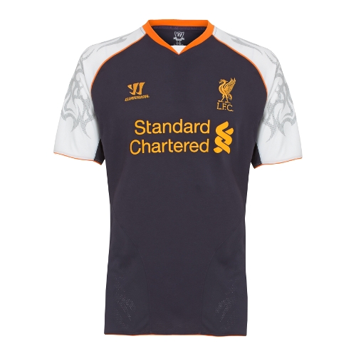
Liverpool's New 3rd Kit - Possibly the worst kit ever?

Bedsaddick
Posts: 25,230
What do you think?


0
Comments
-
that cant be real0
-
To be fair that picture has been brightened up to a ridiculous degree! But it is a shocking kit all the same.0
-
My eyes!!!!!!!!!!!0
-
Oh my word.0
-
Thats fake.0
-
betfair official page posted it on facebook0
-
*Ouch*0
-
 0
0 -
Fairer depiction here...
http://www.football-shirts.co.uk/fans/official-liverpool-third-shirt-1213_162740 -
Thats not it.
The third kit is Black and silver
0 -
Sponsored links:
-
"Ancient tribal warrior markings have been set along the outer sides of the sleeves and side panels – a design (sic) first for the Club."
Hot Tuna surf shorts used to look like that - in 1982.
0 -
Never heard of 'Warrior' before?0
-
Mainly make Lacrosse kits - american company.0
-
Warrior are owned by New Balance0
-
The manufacturer is also owned by Fenway Grp I think.0
-
The real one actually looks pretty nice.0
-
This is the official picture ( the one i posted was what Betfair posted on facebook ) but it's still bloody horrible.
 0
0 -
What colour is the body of the shirt ?
0 -
I wouldn't trust their official pictures. Their home kit looked a lot darker in the first official pictures (using similar lighting/posses as this pic) than in real life.0
-
A dark Purple . It's certainly not black.0
-
Sponsored links:
-
why havent we got ancient tribal warrior markings on our kit!0
-
It's called nightshade apparently. Like I said on another website, not only is the purple with white sleeve combo wrong, they go and put orange into the mix as well. They add some tribal crap just to push the taste boundaries further, before rounding it all off with yellow badges and sponsor. The yellow is just the right shade to clash with the orange, whilst the tribal stuff should be left to appear on an MMA athlete's biceps, it doesn't belong on a football shirt0
-
I saw a picture in the paper where only the torso was visible, I thought it's a bit like Fiorentina, what's the problem. Seeing THAT at the top of the page, well must have been designed by a particularly vindictive Man U fan. In the same league as some of David Seamans goalie shirts which looked like the designer had honked up six pints and a pizza onto a photocopier, scanned it and sent it off to the factory for a laugh.0
-
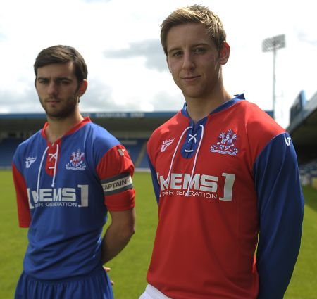
You obviously haven't seen this:

I don't know whats worse but both kits are disgusting.0 -
This is the official picture ( the one i posted was what Betfair posted on facebook ) but it's still bloody horrible.
Interesting ;s 0
0 -
Why does any team need a third kit?0
-
In case both their home and way kit clash with another teams. Remember our home kit was red last year and the away was white , when we played Exeter or Brentford whose kits are both red and white we would clash with them. If designers were sensible they would make an away kit a random colour which no other team wears as both a home and away kit, but they like the cash a third kit generates , at least we don't have one every year.0
-
haha so true
Hot Tuna surf shorts used to look like that - in 1982.0 -
I like the kit myself0
-
Those tribal sleeves are the thin end of the wedge.
As an aside, one day football kits will be a skin-tight,one-piece affair much like athletes used to wear. Let's hope Crouch is still playing by then.0


