League One Kits 2016/17
Comments
-
Let's hope all the Ultras get the clap.MrLargo said:
Having previously worn direct copies of Bayern Munich and Barcelona kits. There is just nothing original about that club whatsoever. Just you wait until the Holmesdale Ultras start copying that Icelandic clapping thing next season, that is going to make me so so angry, so so livid you just cannot imagine.sam3110 said:Off topic, but the Palarse kit this year is awful IMO, looks like a knock off PSG kit
1 -
Just been on the Palace site to look at the kit.
It has this as part of the description 'The single thicker central stripe will become many when the players line up in a row, evoking a spirit of togetherness and symbolises the whole being greater than the sum of its parts'
What a load of marketing bollocks.10 -
Is it mandatory that when you wear the Port Vale kit, you have to also wear a parker coat and tell everyone how 'mad for it' you are?
Shockingly bad football kit and even worse hair cut.2 -
Like Oxfords.0
-
Charlton don't do Football Managers.shine166 said:Jealous of Wimbledon having FM as the kit sponsor
3 -
They've got plenty of previous for that. Anyone remember their Groupon ads, still don't know what a "buzz cut strike" is.iaitch said:
What a load of marketing bollocks.
http://www.forum.charltonlife.com/discussion/46014/crystal-palace-on-groupon/p10 -
I suppose we could have "interim head coach"The Red Robin said:
Charlton don't do Football Managers.shine166 said:Jealous of Wimbledon having FM as the kit sponsor
4 -
any club that labels there "ultras" end as "the wall" deserves to be ridiculed for a very long time - i dont even hate them i just think there the gift that keeps on giving, we have been a shambles of late but i would rather be in league 1 then being a part of that circus.MrLargo said:
They've got plenty of previous for that. Anyone remember their Groupon ads, still don't know what a "buzz cut strike" is.iaitch said:
What a load of marketing bollocks.
http://www.forum.charltonlife.com/discussion/46014/crystal-palace-on-groupon/p14 -
Imagine Cruising.
Ho hum.2 -
There's some absolute shockers in there. Bradford, Walsall and Coventry's kits are almost war crimes.
The worst thing about this thread though is it's reminded me we'll be playing Port Vale and Fleetwood this season. Bloody hell4 -
Sponsored links:
-
It's a Parka.ValleyGary said:Is it mandatory that when you wear the Port Vale kit, you have to also wear a parker coat and tell everyone how 'mad for it' you are?
Shockingly bad football kit and even worse hair cut.
And I rather like the home kit and yellow away. The claret and blue I'm definitely not 'mad for'
1 -
Tbh that sounds like my success at FMricky_otto said:
I suppose we could have "interim head coach"The Red Robin said:
Charlton don't do Football Managers.shine166 said:Jealous of Wimbledon having FM as the kit sponsor
1 -
Someone has admitted to visiting the Palace site, and hasn't been flagged. What's going on?1
-
It's necessary sometimes mate, especially in these dark days when Charlton are an absolute disaster. I like to have a sneaky look on the Palace message board, just for a few minutes, but long enough to be able to say to myself afterwards, "well I might be a f*%king loser, but at least I'm not a c£#t." It helps me to retain my sense of superiority over them, even when we're two divisions below.Ben18 said:Someone has admitted to visiting the Palace site, and hasn't been flagged. What's going on?
3 -
That Coventry kit is the worst sky blue kit I've ever seen. Total shite.2
-
I must be well out of touch with football as I don't have a clue who any of those City players are.killerandflash said:Elsewhere
Preston have also chosen the same template as us for their home shirt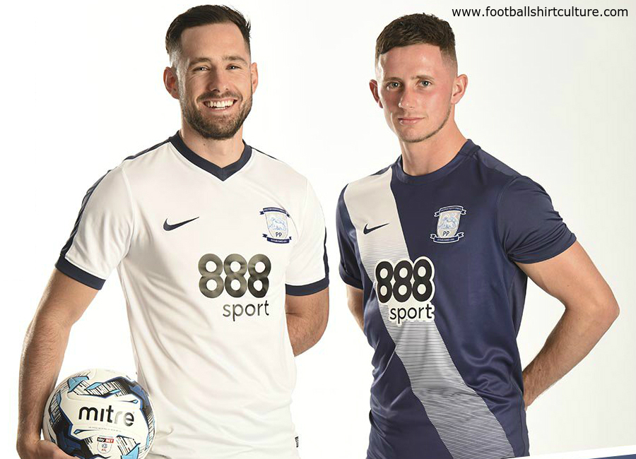
Man City have been given the new Nike style kit design as used in the Euros, I'm surprised they don't have something more bespoke 14
14 -
They've missed the F off the sponsors name on the spanners shirt.0
-
I think all their big names bunked off from the photo shoot!Talal said:
I must be well out of touch with football as I don't have a clue who any of those City players are.killerandflash said:Elsewhere
Preston have also chosen the same template as us for their home shirt
Man City have been given the new Nike style kit design as used in the Euros, I'm surprised they don't have something more bespoke
Is the one sitting down Iheancho?0 -
Boooooo.Fiiiiiish said:Like the style of Errea, produced some decent kits.
Bradfords kit looks tragic and I think Port Vales looks the smartest.
I think all the Bradford tops are great.0 -
Let's all just imagine cruising for a moment.3
-
Sponsored links:
-
The geezer on the left is Shaun Goater.Talal said:
I must be well out of touch with football as I don't have a clue who any of those City players are.killerandflash said:Elsewhere
Preston have also chosen the same template as us for their home shirt
Man City have been given the new Nike style kit design as used in the Euros, I'm surprised they don't have something more bespoke 2
2 -
No, that's Colin BellElfsborgAddick said:
The geezer on the left is Shaun Goater.Talal said:
I must be well out of touch with football as I don't have a clue who any of those City players are.killerandflash said:Elsewhere
Preston have also chosen the same template as us for their home shirt
Man City have been given the new Nike style kit design as used in the Euros, I'm surprised they don't have something more bespoke 0
0 -

Maybe a clue to our away kit there.....0 -
Does every club now get a new kit every season? It seems like a lot more do go for one-offs.
A few more £££ off supporters I suppose, though.1 -
Liking the Wimbledon kits, didn't know Admiral were still going1
-
Yeah they've just given me a great deal on my Car InsuranceNug said:Liking the Wimbledon kits, didn't know Admiral were still going
3 -
There must be something wrong with my screen, because it seems to be showing three utterly hideous kits for Port Vale, contrary to the consensus on here.2
-
Which is your favourite then?Gillis said:There must be something wrong with my screen, because it seems to be showing three utterly hideous kits for Port Vale, contrary to the consensus on here.
0 -
Oh, you want me to make a positive comment about something, rather than just moaning about everything? Sorry, that's not really my style. I am a Charlton fan after all.ForeverAddickted said:
Which is your favourite then?Gillis said:There must be something wrong with my screen, because it seems to be showing three utterly hideous kits for Port Vale, contrary to the consensus on here.

I'm not particularly taken with any of them, to be honest. I quite like the Swindon kit, but it is, unfortunately, ruined a little by having IMAGINE CRUISING on the front of it in massive letters. Not even a logo to indicate that it's the name of a company, and not just a bizarre command. The Sheffield United kit is alright, but has weird socks.
If I have to be positive, what I will say is kudos to our comms team for, 1) being able to take a decent photo of a football kit, and 2) managing to take that photo on grass, so that the players modelling the kit can wear football boots, not trainers or socks.3 -
Whatever you do don't sit on the fence.Gillis said:
Oh, you want me to make a positive comment about something, rather than just moaning about everything? Sorry, that's not really my style. I am a Charlton fan after all.ForeverAddickted said:
Which is your favourite then?Gillis said:There must be something wrong with my screen, because it seems to be showing three utterly hideous kits for Port Vale, contrary to the consensus on here.

I'm not particularly taken with any of them, to be honest. I quite like the Swindon kit, but it is, unfortunately, ruined a little by having IMAGINE CRUISING on the front of it in massive letters. Not even a logo to indicate that it's the name of a company, and not just a bizarre command. The Sheffield United kit is alright, but has weird socks.
If I have to be positive, what I will say is kudos to our comms team for, 1) being able to take a decent photo of a football kit, and 2) managing to take that photo on grass, so that the players modelling the kit can wear football boots, not trainers or socks.1


