Attention: Please take a moment to consider our terms and conditions before posting.
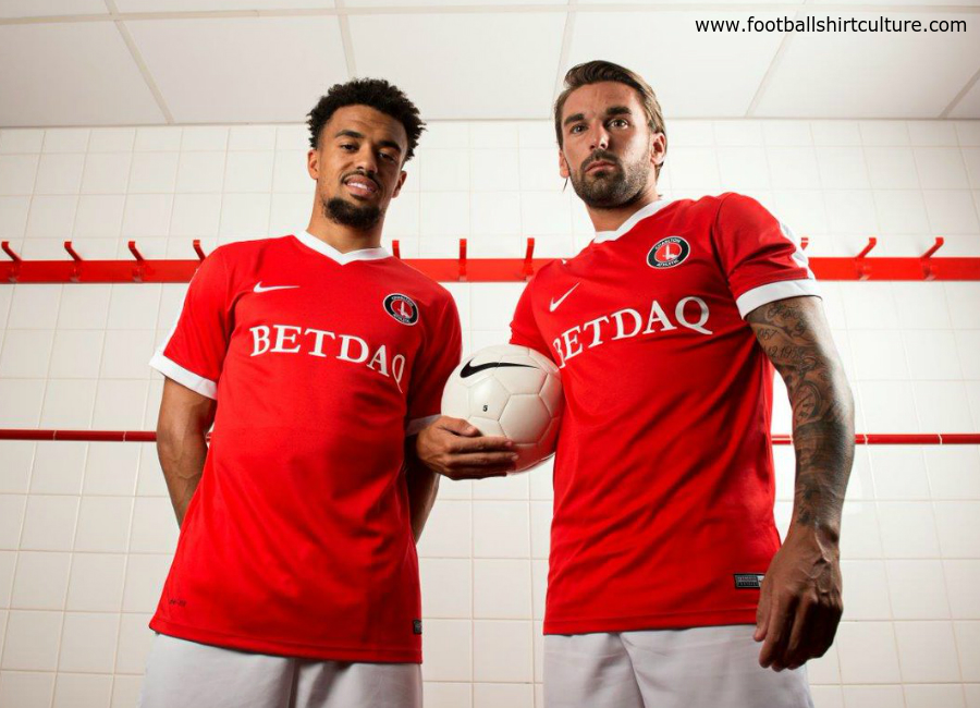
New Kit 18/19 season
Comments
-

Think it's good15 -
Not keen - looks cheap.1
-
OK shirt - wouldn't look so bad up against white shorts. (especially ones pulled up to your chest). Also the sponsor just ruins most modern shirts.1
-
Think it’s nice, one of the best away kits we’ve had since the blue and black one. Given it’s inspired by a 90’s kit, I hope our home one is too, and is similar to our 1991-92 kit0
-
Not sure but first impressions no thanks , hopefully Roland keeps the club then I won’t have to buy 4 of the dodgey tops for sons .
Hopefully home and 3rd will be an improvement0 -
It'll do.0
-
Until we get a yellow and blue away kit ...
But it’s decent and a positive in these generally depressing times of following Charlton. Nothing to complain about.0 -
cafc-west said:
Best thing about having Fosu in the new kit picture is that I hope it means he is staying...they wouldn't pick someone leaving would they...?

(To be fair Holmes stayed this season, so my joke sucks)10 -
Not sure was my first reaction but I’m not really that bothered. Always kind of surprised how big these threads get every year.
Much rather have kits designed for us that are unique than Nike templates like in recent years. I like that they consider our history and past kits as well. The home kit is usually fairly plain so it’s good to have something different when it comes to the away and third kits.3 -
I like it.
0 -
Sponsored links:
-
I like it, modern design with a hint of our traditional away colours.
Now we need a 3rd kit for Sunderland0 -
Bit ropey but you can take a flyer on the away kit. Please don’t piss about with the home. Plain is best there.
That minging white strap across the shoulder thing we had a few years ago was truly shocking3 -
Quite like it
Will never buy it1 -
It's growing on me.0
-
Like it very much0
-
I like it, too old for kits myself though but will get one for my son once the Roland has left0
-
I think it’s ok, pointless comparing it to the Quasar kit as it isn’t meant to be a remake.
I’m expecting to buy my son the home kit but if that’s awful, this’ll do0 -
Personally I think this is the best of the three kits this season but it's an opinion and it's just an away kit.0
-
Only three? Have they cut back on kits for the goalkeepers?Henry Irving said:Personally I think this is the best of the three kits this season but it's an opinion and it's just an away kit.
0 -
First glance, thought it was horrendous... Like it more each time I see it3
-
Sponsored links:
-
The sponsors name dominates the badge because the badge is central now.
If the home shirt is on the same lines my personal opinion is that it is a diminution of our identity.
I wonder if it is actually a Charlton fan who signs off on this type of thing.4 -
I think it's a pretty dreadful looking design but also I don't really care. I'm definitely not buying a kit while Roland's in charge, and I'd rather not buy one with a betting sponsor on so I guess it doesn't affect me either way. I'm glad some people seem to like it2
-
Does anyone know what the kids shirt sponsor is this year?1
-
Mothercare.cafcdave123 said:Does anyone know what the kids shirt sponsor is this year?
0 -
Like th style, but the badge shouldn't be in the centre, looks like the work experience person stuck it in the wrong place on the computer
 0
0 -
Do we play in white now ?
Come on you reds.0 -
We do away from homeValiantphil said:Do we play in white now ?
Come on you reds.1 -
I've been printing the away/training kit for the U18 team I joint manage for next season. I've gone for the badge in the middle as it is easier for me to line up when you have to print over 20 of them, but not sure Hummel have the same problems! I think the red and white stripes should be more to the right with the badge and the Hummel words on the left in black on its own.0
-
Who was consulted and told Hummel that was a ‘classic’ away Kit?
I had that shirt so I liked it, but a classic?
Ummmm0 -
Didn’t against Pompey last season.stackitsteve said:
We do away from homeValiantphil said:Do we play in white now ?
Come on you reds.0


