Attention: Please take a moment to consider our terms and conditions before posting.
Colour of our new shirts.
Comments
-
@ollywozhere what do you say boss?0
-
FFS - it’s a red shirt. It’s what the players wearing it do that matters, not the fact that it doesn’t match a 486 bus. Imagine if Vincent Tan took over.6
-
Pffffff!ricky_otto said:FFS - it’s a red shirt. It’s what the players wearing it do that matters, not the fact that it doesn’t match a 486 bus. Imagine if Vincent Tan took over.0 -
Is the 486 bus the same red as the 53?ricky_otto said:FFS - it’s a red shirt. It’s what the players wearing it do that matters, not the fact that it doesn’t match a 486 bus. Imagine if Vincent Tan took over.4 -
Even with "University of Greenwich" on the frontChippycafc said:
Ditto...wore it at Bournemouth once when we lost 1-0 loads of people on the sea front thought it was cool and from a euro country and assumed we were on holiday. Always take it to Spain and enjoy other fans asking about it. Similar to Barcelona one around the same time.NorthheathAddick said:
😬…I actually quite liked that top,made a great summer hols shirt & got a fair bit of attention…no one who asked me about the mighty Addicks had a bad thing to say about it….Karim_myBagheri said:yeah it reminds me of this abomination..
well not to me face anyways…🤔😂😂
Llanera would have been a suitable sponsor to create that illusion though!0 -
Also do great shampoo.stop_shouting said:I always thought Pantone was a type of Italian bread. You learn something new every day.3 -
Agreed - this one was too dark... surely as a general rule the red in the centre of the badge should match the red of the shirt!killerandflash said:Looks fine to me. The only shirt in recent years that was clearly the wrong shade was the first Nike shirt, the dullest of dull pub team catalogue shirt. 3
3 -
No new signings then I gather 🙂2
-
I'm too old to care about pantone.0
-
Four so far, with more to follow...chill🍺valleynick66 said:No new signings then I gather 🙂 0
0 -
Sponsored links:
-
.0
-
Or a bike racing term?stop_shouting said:I always thought Pantone was a type of Italian bread. You learn something new every day.0 -
Charlton FC & Charlton AFC have always played in orangey red kits from the very start (mid last week). I’m not sure about AFC Charlton though.2
-
we are on the verge of signing an experienced colourist .. and not before timevalleynick66 said:No new signings then I gather 🙂 2
2 -
Racist !Lincsaddick said:
we are on the verge of signing an experienced colourist .. and not before timevalleynick66 said:No new signings then I gather 🙂 0
0 -
At least it's red and looks like a football shirt.
Unlike being white and looking like a rugby league shirt .....
1 -
Pantones are for colour printing not materials.Rothko said:
As you’re in the trade, shouldn’t the club just say the shirt needs to be say 485c (London Bus Red) and be done with it, and everything within the club is set to that?shine166 said:As someone that uses colour for a living, almost every single devise you view it on, will look different than it does in the flesh.
I Really would wait before passing too much judgement.
Colour images on computer screens and phones vary according to the settings.
Get to Dartford next Saturday and hopefully they'll be wearing the new kit.1 -
Have a feeling we will be in the away kit for the Dartford match as part of the ongoing release marketing campaigns.Crusty54 said:
Pantones are for colour printing not materials.Rothko said:
As you’re in the trade, shouldn’t the club just say the shirt needs to be say 485c (London Bus Red) and be done with it, and everything within the club is set to that?shine166 said:As someone that uses colour for a living, almost every single devise you view it on, will look different than it does in the flesh.
I Really would wait before passing too much judgement.
Colour images on computer screens and phones vary according to the settings.
Get to Dartford next Saturday and hopefully they'll be wearing the new kit.0 -
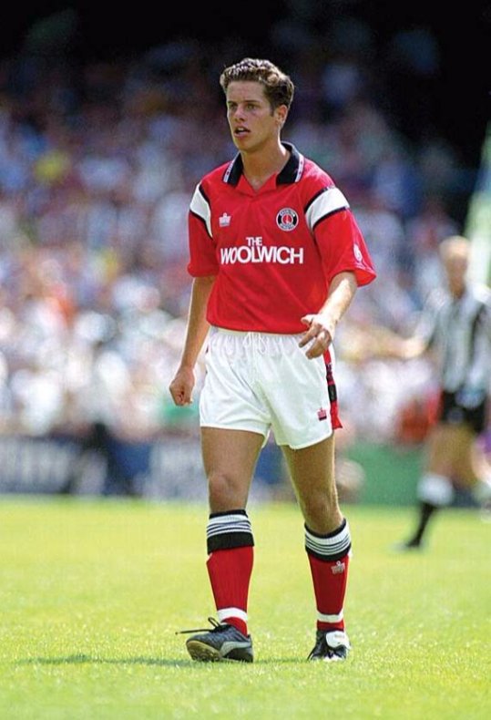
yeah its close to the colour scheme as those admiral woolwich shirts but its definitely got more orange in them.Henry Irving said:The pantone should be based on the red on the Adidas Fads shirt in the museum as Castore borrowed it for that reason.
Whether they got it right I don't know but I suggest reserving judgement until seeing it in the flash.
It looks closer to the red of the 90/91 Woolwich Admiral shirt
My favourite one which i bought from yourself/the museum a few years back, this bad boy...
4 -
Sponsored links:
-
Looking at the Sessengnon gallery this morning and have to agree that in sunlight they do look very Orange!
Have we been Tango’d?5 -
Lighting does make a difference, e.g. with these 2 photos of one of my favourite kits.


1 -
They’re also taken about 30 years apartkillerandflash said:Lighting does make a difference, e.g. with these 2 photos of one of my favourite kits.
 0
0 -
It's also the kit the current one is loosely based on0
-
I realise there are some of you who this doesn’t bother and I agree there are far more things that we need to concern ourselves about than the colour of our shirts.
However, some of us are real old school diehard traditionalists , possibly the older one gets the more you are resistant to change.
For example…..I first heard The Red Red Robin in early 1958 when I was 10. I wasn’t that impressed with it then and to this day I can’t say I really like it.
Having said that, I would be wholeheartedly against any consideration to change it…..it may be a rather old fashioned slightly dopey song…..BUT it’s “our old fashioned slightly dopey song” and long may it be so.
Our shirts have in all my time been as near as damn it London Bus Red (with very slight deviation on a couple of unfortunate occasions) and likewise may it long be so.
Several posters have said that lighting and colour settings can make a big difference……let’s wait and see, I hope that turns out to be the case.
I am not about making a huge hoo-har but if it is the case I will let it be known to the club that I for one don’t like it.
From SoundAsa£, an old school diehard traditionalist. 🫠3 -
I make a rather tasty cocktail that looks a bit like that.Karim_myBagheri said:yeah it reminds me of this abomination.. 0
0 -
I often get “Cheltenham?”.BR7_addick said:
I bought this, Barcelona had the exact same kit the season before. I remember having the same conversation about it with strangers several times on holiday in Spain.Karim_myBagheri said:yeah it reminds me of this abomination..
”Ah, Barcelona”
”nah mate Charlton”
”is not Barcelona?”
”nah Charrrllllton”
”Ahhh, Chelsea!”4 -
That’s very interesting Callum…..thanks very much.Callumcafc said:
Let’s wait and see what it looks like in the flesh…..so to speak.0 -
I thought you were 20 in 1958.SoundAsa£ said:I realise there are some of you who this doesn’t bother and I agree there are far more things that we need to concern ourselves about than the colour of our shirts.
However, some of us are real old school diehard traditionalists , possibly the older one gets the more you are resistant to change.
For example…..I first heard The Red Red Robin in early 1958 when I was 10. I wasn’t that impressed with it then and to this day I can’t say I really like it.
Having said that, I would be wholeheartedly against any consideration to change it…..it may be a rather old fashioned slightly dopey song…..BUT it’s “our old fashioned slightly dopey song” and long may it be so.
Our shirts have in all my time been as near as damn it London Bus Red (with very slight deviation on a couple of unfortunate occasions) and likewise may it long be so.
Several posters have said that lighting and colour settings can make a big difference……let’s wait and see, I hope that turns out to be the case.
I am not about making a huge hoo-har but if it is the case I will let it be known to the club that I for one don’t like it.
From SoundAsa£, an old school diehard traditionalist. 🫠1


