Attention: Please take a moment to consider our terms and conditions before posting.
***PLEASE READ: New Charlton Life look and feel coming...
Comments
-
Polls will work, soon.2
-
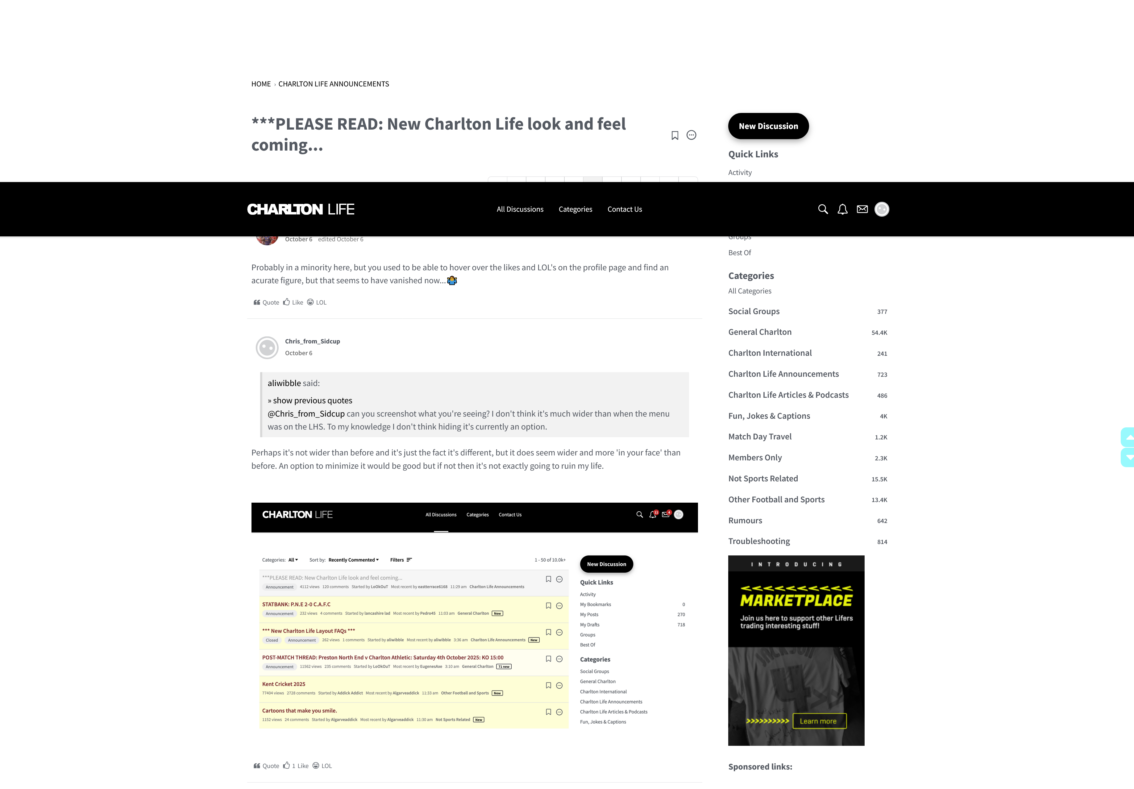
Already picked up the double scroll bar thing as an issue, but in the mean time there's a workaround. If you bookmark https://forum.charltonlife.com/discussions (or https://charltonlife.vanillacommunity.com/discussions depending on which version of the site you prefer to log in to) that version of the discussions page doesn't have the categories or who's online, so the scrolling issue doesn't materialise.Er_Be_Ab_Pl_Wo_Wo_Ch said:More from me, this time android tablet, chrome.
Does the menu on the right of the screen need to be a separate component and have separate scrolling than the rest of the page? Not something I've considered before, but just noticed on a tablet I scroll up and down websites more with my right thumb but it's not working well with right thumb landing on that menu and scrolling it up and down, instead of the content on the page. Gotta be a leftie for scroll up and down webpage content with the current arrangement.
[snip]1 -
Also, just on the scrolling with the right thumb thing @Er_Be_Ab_Pl_Wo_Wo_Ch: The sidebar is a couple hundred pixels in width meaning, if you move your thumb closer to the edge to scroll, you’ll scroll the page, and if you move into the couple of hundred pixels of the sidebar, you’ll scroll that. So, you don’t have to reach over more to the left, just scroll the page from the far right.1
-
Can I have my money back please.1
-
To those asking where are my comments this was put by me on page four, so maybe think twice about clicking the ignore button to my posts … …oohaahmortimer said:
Found them got to click on name on right hand side , not profile pic up topoohaahmortimer said:‘My posts’ is my discussions
where are my previous comments
fuming Of Epping
still fuming of epping ….. just cos2 -
aliwibble said:@charscot can you do a screen shot of what you're seeing please? The space on the RHS is due to us shifting the menu to the other side, but there shouldn't be an issue on the left. You may need to clear your cache down to get the most up to date version of the site settings.Yep, this is what I get (cleared cache first).
0 -
🤷♂️4
-
 I’m loving the new website! Very clean. However, I wonder if the navigation bar for the mobile site could have more options? I think there should be at least an option for the first page and I used to like navigating in increments of 2 or 3 sometimes. Maybe something like <, 1, 3,4,5,6,7,9,>? Or simply <,1,5,9,>. Just a thought.2
 -
Jondon said:I’m loving the new website! Very clean. However, I wonder if the navigation bar for the mobile site could have more options? I think there should be at least an option for the first page and I used to like navigating in increments of 2 or 3 sometimes. Maybe something like <, 1, 3,4,5,6,7,9,>? Or simply <,1,5,9,>. Just a thought.
Just spent 5 minutes clicking on the screenshot of the navigation bar. Fuming.10 -
Loving the mute function, can see that coming in very handy0
-
Sponsored links:
-
Boooooo. The old one was better 😔3
-
Didn’t you ask this yesterday and have answered 🤷♂️eastterrace6168 said:Sorry to be a pain, but will the running totals for like and LOL reappear please, really appreciate it if they can, 🤞2 -
Did Neil post something?Alwaysneil said:Loving the mute function, can see that coming in very handy2 -
Yeah, but how do you use the Quote button?AFKABartram said:
Didn’t you ask this yesterday and have answered 🤷♂️eastterrace6168 said:Sorry to be a pain, but will the running totals for like and LOL reappear please, really appreciate it if they can, 🤞
😉0 -
Already looking a lot better now new posts and announcements stand out 👍1
-
Er, yes and no…AFKABartram said:
Didn’t you ask this yesterday and have answered 🤷♂️eastterrace6168 said:Sorry to be a pain, but will the running totals for like and LOL reappear please, really appreciate it if they can, 🤞1 -
The new layout is very neat and tidy. Thank you for smooth transition.1
-
Must admit I find this a bit strange. It's not that drastic a change and the most important thing - the people, the posters, are the same. Give it a few weeks and the old layout will be forgotten about.Fanny Fanackapan said:Not sure that I'll be on here as much as before, sadly.
Don't like change ( old dog, new tricks! )
The Tingle is currently sulking.....3 -
A couple of questions. Sorry if they have already been asked.1 how can you move to the end of the page list? The >> normally means go to end of pages while > means go on one page. I often want to get to the last comment rather than scroll through all (prob why I missed the answer to this question!)
2 what do the various shades of yellow that highlight threads mean?
btw a much better, more contemporary look and feel so well done.2 -
Is it me or can you not scroll to the newest comment without having to flick through the pages individually?
1 -
Sponsored links:
-
Search function is massively improved but then opens on a random page in a thread. For example, I searched "summer" to find the rumours thread and the link it found opened about 50 pages back. I think it was searching the comments rather than the thread titles0
-
How do you know when someone has sent you a DM?0
-
The side bar on the right should be move to the left.1
-
Looks very good. Typeface is more legible. Nice and clean.1
-
My comments option is unnecessarily awkward to select.
It’s my go to feature whenever I use the forum, why is it not set up to be instantly visible and selectable, without any faffing around.😕
I am using Safari on an Apple iPad.
I realise this question has already been answered but the solution is far from satisfactory IMHO!
0 -
Interesting point, not sure I’m understanding. are you saying your main point of coming to the forum is to read your own previous comments?SoundAsa£ said:My comments option is unnecessarily awkward to select.
It’s my go to feature whenever I use the forum, why is it not set up to be instantly visible and selectable, without any faffing around.😕
I am using Safari on an Apple iPad.
I realise this question has already been answered but the solution is far from satisfactory IMHO!0 -
You’ve two ways. You click occasionally on your icon in the top right to see if you have any notifications, or you can additionally set your notifications preferences to receive an email alert if someone sends you a DM.Nadou said:How do you know when someone has sent you a DM?1 -
Could the page change be made a bit bolder?
Looks a bit lost at the bottom there and not instantly easy to find
0 -
No of course not……..it’s how I instantly find threads that I am currently involved with.AFKABartram said:
Interesting point, not sure I’m understanding. are you saying your main point of coming to the forum is to read your own previous comments?SoundAsa£ said:My comments option is unnecessarily awkward to select.
It’s my go to feature whenever I use the forum, why is it not set up to be instantly visible and selectable, without any faffing around.😕
I am using Safari on an Apple iPad.
I realise this question has already been answered but the solution is far from satisfactory IMHO!
I’m pretty sure many users use this option.0