Attention: Please take a moment to consider our terms and conditions before posting.
***PLEASE READ: New Charlton Life look and feel coming...
Comments
-
Try using the bookmarks option, it will do the same and is easy to accessSoundAsa£ said:
No of course not……..it’s how I instantly find threads that I am currently involved with.AFKABartram said:
Interesting point, not sure I’m understanding. are you saying your main point of coming to the forum is to read your own previous comments?SoundAsa£ said:My comments option is unnecessarily awkward to select.
It’s my go to feature whenever I use the forum, why is it not set up to be instantly visible and selectable, without any faffing around.😕
I am using Safari on an Apple iPad.
I realise this question has already been answered but the solution is far from satisfactory IMHO!
I’m pretty sure many users use this option.1 -
Comments nowhere to be seen?
Android. Mobile
0 -
I preferred the old site on mobile. The thread view is ok but the front page theme would best be described as piss stained.3
-
Click on your user name from that screen, and it will appear at the bottom...should do anyway...🤷♂️carly burn said:Comments nowhere to be seen?
Android. Mobile 1
1 -
Cheers that worked.eastterrace6168 said:
Click on your user name from that screen, and it will appear at the bottom...should do anyway...🤷♂️carly burn said:Comments nowhere to be seen?
Android. Mobile
Little odd to be able to go straight to your posts from the initial screen but a trip around the houses to find your comments?3 -
Well said.carly burn said:
Cheers that worked.eastterrace6168 said:
Click on your user name from that screen, and it will appear at the bottom...should do anyway...🤷♂️carly burn said:Comments nowhere to be seen?
Android. Mobile
Little odd to be able to go straight to your posts from the initial screen but a trip around the houses to find your comments?0 -
Easy when you know how. Thanks aliwibblealiwibble said:ross1 said:
I found them at the top of page 2, thanks.aliwibble said:ross1 said:Looks ok to me, but can we have page numbers at top as well as bottom.
When I go to the thread it starts on page 2 and I have to go to the bottom as I have discovered to put it to page 1. Thanks@ross1 They are?You might want to clear down your cache and then refresh the page to see if that helps.
I know I am being vain, but I used to click on to my name at the top to see how many likes and LOLs I have, where are they nowYou need to scroll down to the bottom of your profile page to the Reactions section. If you want to see which specific posts are LOL'd, click on the smiley face. 0
0 -
Woah, that is impressively borked. No idea what's going on there. What browser and OS are you using?charscot said:aliwibble said:@charscot can you do a screen shot of what you're seeing please? The space on the RHS is due to us shifting the menu to the other side, but there shouldn't be an issue on the left. You may need to clear your cache down to get the most up to date version of the site settings.Yep, this is what I get (cleared cache first).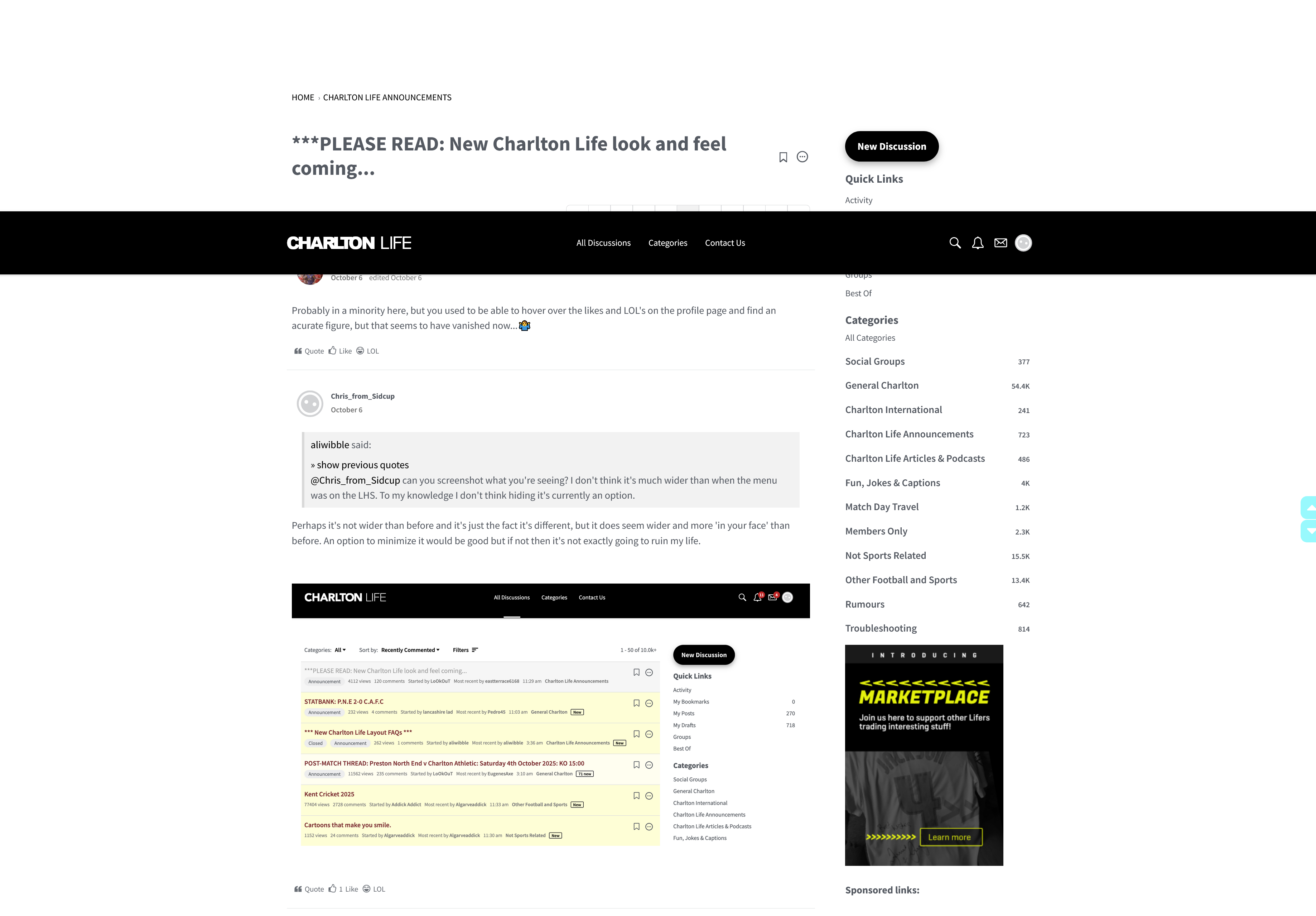 0
0 -
Stuart_Learys_Boots said:A couple of questions. Sorry if they have already been asked.1 how can you move to the end of the page list? The >> normally means go to end of pages while > means go on one page. I often want to get to the last comment rather than scroll through all (prob why I missed the answer to this question!)
2 what do the various shades of yellow that highlight threads mean?
btw a much better, more contemporary look and feel so well done.1 not sure, will add it to the Issues list.2 deeper yellow is a thread you've not read before, pale yellow is one you've been reading that has new comments on it, and white is one you've read completely.0 -
The comments page is still to be fully updated. So reserve comments on any issues/improvements to do with pagination at the bottom of a comments page or the quote and reaction tools until those updates are made in a week or so. And then once those updates are introduced, we can tweak and improve based on feedback.4
-
Sponsored links:
-
You've inspired me @SoundAsa£! There's now a My Comments link in the sidebar. Try it out and let me know if there's any issue.SoundAsa£ said:
No of course not……..it’s how I instantly find threads that I am currently involved with.AFKABartram said:
Interesting point, not sure I’m understanding. are you saying your main point of coming to the forum is to read your own previous comments?SoundAsa£ said:My comments option is unnecessarily awkward to select.
It’s my go to feature whenever I use the forum, why is it not set up to be instantly visible and selectable, without any faffing around.😕
I am using Safari on an Apple iPad.
I realise this question has already been answered but the solution is far from satisfactory IMHO!
I’m pretty sure many users use this option.1 -
What happens when you mute a thread?
0 -
You don't get notifications for it.0
-
0
-
Looking at all the stuff I am muting I don't know why I post on here
 1
1 -
I'm with you on this, the overall colour scheme on the old mobile version was a lot cleaner and easier to see what threads I needed to catch up on etc. The varying degrees of yellow isn't aesthetically pleasingJac_52 said:I preferred the old site on mobile. The thread view is ok but the front page theme would best be described as piss stained.1 -
-
Its on quick links, very easy to findfenaddick said:
Try using the bookmarks option, it will do the same and is easy to accessSoundAsa£ said:
No of course not……..it’s how I instantly find threads that I am currently involved with.AFKABartram said:
Interesting point, not sure I’m understanding. are you saying your main point of coming to the forum is to read your own previous comments?SoundAsa£ said:My comments option is unnecessarily awkward to select.
It’s my go to feature whenever I use the forum, why is it not set up to be instantly visible and selectable, without any faffing around.😕
I am using Safari on an Apple iPad.
I realise this question has already been answered but the solution is far from satisfactory IMHO!
I’m pretty sure many users use this option.0 -
Ok, but can you then select it in order to go to the thread and location of your comment…..if so I can’t see how you do that?Alwaysneil said:
Its on quick links, very easy to findfenaddick said:
Try using the bookmarks option, it will do the same and is easy to accessSoundAsa£ said:
No of course not……..it’s how I instantly find threads that I am currently involved with.AFKABartram said:
Interesting point, not sure I’m understanding. are you saying your main point of coming to the forum is to read your own previous comments?SoundAsa£ said:My comments option is unnecessarily awkward to select.
It’s my go to feature whenever I use the forum, why is it not set up to be instantly visible and selectable, without any faffing around.😕
I am using Safari on an Apple iPad.
I realise this question has already been answered but the solution is far from satisfactory IMHO!
I’m pretty sure many users use this option.
You need to be able to see the comment in it’s actual location in order to follow up with replies from other posters etc.0 -
YES! Just click the link I made for you in the sidebar (My Comments). Then click on the Discussion Title of the comment you want, just as before.0
-
Sponsored links:
-
Ok, that’s great Looky……you obviously have seen there WAS a problem.LoOkOuT said:YES! Just click the link I made for you in the sidebar (My Comments). Then click on the Discussion Title of the comment you want, just as before.
However it’s a become a lot of faffing around and button pressing, nothing like as simple and straightforward as previously.
Maybe you can simplify this at some point going forward as I’m guessing right now you’re up to your neck in it.🤞🤞🤞1 -
@SoundAsa£ Please read again and try it. It really, really couldn't be any simpler. And I went back to the old setup and looked and it was more steps than it is now.
Sidebar > My Comments > Click on your comment to go straight to it.
2 -
This looks good thanks for updating.LoOkOuT said:@SoundAsa£ Please read again and try it. It really, really couldn't be any simpler. And I went back to the old setup and looked and it was more steps than it is now.
Sidebar > My Comments > Click on your comment to go straight to it.3 -
aliwibble said:
Woah, that is impressively borked. No idea what's going on there. What browser and OS are you using?charscot said:aliwibble said:@charscot can you do a screen shot of what you're seeing please? The space on the RHS is due to us shifting the menu to the other side, but there shouldn't be an issue on the left. You may need to clear your cache down to get the most up to date version of the site settings.Yep, this is what I get (cleared cache first). Latest version of firefox (tried chrome - which I hate and it looked the same). Windows 10 (refusing to upgrade).Probably more to do the wide screen than the browser I imagine (as it is the same on both browsers).0
 -
Yeah I messed about with the aspect ratio and the size of the browser in respect of the screen to try ad improve the layout but frankly whilst I can get most of the space to reduce a bit I don't want to for one site when the extra space is of use on many other sites.Appreciate the replies, think I am just stuck with it, no doubt I will get used to it eventually :-)0
-
@charscot Sorry, I meant to pick up on your issue earlier and failed! From the screenshot, it looks like there's an issue with your browser and the "sticky" navigation bar. So, the nav bar at the top is supposed to be anchored to the top and then the content on the page below is supposed to scroll underneath it: meaning the nav bar is always accessible. It looks like your browser is having trouble with rendering that, so it renders the nav bar too far down the page. I'm guessing, when scrolling, the page moves underneath the nav bar still? It has to be a browser issue/your machine config as I haven't been able to reproduce the issue and have had no other reports. If I had to guess, Windows 10 doesn't support some aspect of the html/javascript we're using. Other than updating your browser to the absolute latest your OS can support, I'm not sure. Nevertheless, I'll keep my thinking cap on and let you know if there's some workaround or accommodation (a separate stylesheet).0
-
I'm having a problem with the banner, it's not configured correctly. Is there something I can do my end please? The page also loads up to big, so I have to manually decrease the size each time. Running on a Samsung phone using Chrome.

0 -
The majority of this thread makes me feel such a luddite, can't understand most of what you are on about.
Just glad it's working ok for me.
Cracking job all involved. 👍4 -
Please ignore. I fixed it by using a different link that was posted by someone earlier. Charltonlife.vanillacommunity.com works fine.ozaddick said:I'm having a problem with the banner, it's not configured correctly. Is there something I can do my end please? The page also loads up to big, so I have to manually decrease the size each time. Running on a Samsung phone using Chrome. I 1
1


