Attention: Please take a moment to consider our terms and conditions before posting.
***PLEASE READ: New Charlton Life look and feel coming...
Comments
-
@ozaddick First step, clear your browser cache. Maybe this will help:
https://www.cnet.com/tech/mobile/clearing-out-your-android-phone-browsers-cookies-cache-removes-junk-files-fast/
You don't need to clear all browser data, just the "Cookies, cache, and other browsing data" if you have the option to be selective.
Once you do that, log back in and, fingers' crossed, the issues will be gone. If not, let me know.2 -
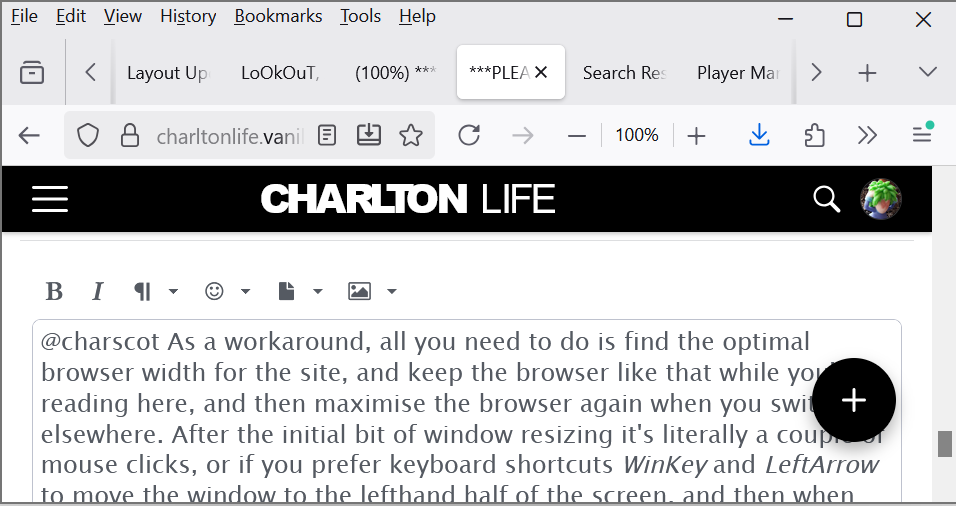
@charscot As a workaround, all you need to do is find the optimal browser width for the site, and keep the browser like that while you're reading here, and then maximise the browser again when you switch elsewhere. After the initial bit of window resizing it's literally a couple of mouse clicks, or if you prefer keyboard shortcuts WinKey and LeftArrow to move the window to the lefthand half of the screen, and then when you're done WinKey and UpArrow and WinKey and UpArrow again to restore it to the full screen area (if you only do it once you end up with the window just in the top lefthand corner of the screen which looks a bit silly)
 0
0 -
Do you mod's ever get any sleep?0
-
LoOkOuT said:@charscot Sorry, I meant to pick up on your issue earlier and failed! From the screenshot, it looks like there's an issue with your browser and the "sticky" navigation bar. So, the nav bar at the top is supposed to be anchored to the top and then the content on the page below is supposed to scroll underneath it: meaning the nav bar is always accessible. It looks like your browser is having trouble with rendering that, so it renders the nav bar too far down the page. I'm guessing, when scrolling, the page moves underneath the nav bar still? It has to be a browser issue/your machine config as I haven't been able to reproduce the issue and have had no other reports. If I had to guess, Windows 10 doesn't support some aspect of the html/javascript we're using. Other than updating your browser to the absolute latest your OS can support, I'm not sure. Nevertheless, I'll keep my thinking cap on and let you know if there's some workaround or accommodation (a separate stylesheet).Thanks for the reply. My browser is the latest version available for anyone as firefox fully supports windows 10 so no update is possible at present as I have the latest version.Yep, the page does still move underneath the navbar as intended.Thanks, if you can think of a suitable stylesheet option that would be great, if not no problem.0
-
aliwibble said:@charscot As a workaround, all you need to do is find the optimal browser width for the site, and keep the browser like that while you're reading here, and then maximise the browser again when you switch elsewhere. After the initial bit of window resizing it's literally a couple of mouse clicks, or if you prefer keyboard shortcuts WinKey and LeftArrow to move the window to the lefthand half of the screen, and then when you're done WinKey and UpArrow and WinKey and UpArrow again to restore it to the full screen area (if you only do it once you end up with the window just in the top lefthand corner of the screen which looks a bit silly)
 Thanks, not really much of an option as I jump between tabs all the time without clicking etc and even a couple of mouse clicks would result in a slower browsing experience than I want as I jump back and forth between different sites.Thanks again though :-)0
 -
LoOkOuT said:@ozaddick First step, clear your browser cache. Maybe this will help:
https://www.cnet.com/tech/mobile/clearing-out-your-android-phone-browsers-cookies-cache-removes-junk-files-fast/
You don't need to clear all browser data, just the "Cookies, cache, and other browsing data" if you have the option to be selective.
Once you do that, log back in and, fingers' crossed, the issues will be gone. If not, let me know.LoOkOuT said:@ozaddick First step, clear your browser cache. Maybe this will help:
https://www.cnet.com/tech/mobile/clearing-out-your-android-phone-browsers-cookies-cache-removes-junk-files-fast/
You don't need to clear all browser data, just the "Cookies, cache, and other browsing data" if you have the option to be selective.
Once you do that, log back in and, fingers' crossed, the issues will be gone. If not, let me know.
Thanks Ali. I've done this. It seems the issue is the site won't auto adjust to fit the page when I use the zoom function to increase the text, so I can read it more easily.0 -
FYI It's just the header banner that doesn't automatically adjust.ozaddick said:LoOkOuT said:@ozaddick First step, clear your browser cache. Maybe this will help:
https://www.cnet.com/tech/mobile/clearing-out-your-android-phone-browsers-cookies-cache-removes-junk-files-fast/
You don't need to clear all browser data, just the "Cookies, cache, and other browsing data" if you have the option to be selective.
Once you do that, log back in and, fingers' crossed, the issues will be gone. If not, let me know.LoOkOuT said:@ozaddick First step, clear your browser cache. Maybe this will help:
https://www.cnet.com/tech/mobile/clearing-out-your-android-phone-browsers-cookies-cache-removes-junk-files-fast/
You don't need to clear all browser data, just the "Cookies, cache, and other browsing data" if you have the option to be selective.
Once you do that, log back in and, fingers' crossed, the issues will be gone. If not, let me know.
Thanks Ali. I've done this. It seems the issue is the site won't auto adjust to fit the page when I use the zoom function to increase the text, so I can read it more easily.0 -
For me its two clicks (now at least). My comments ans then click the 'in Whatever the thread title is i posted in' text and I'm there. Couldn't be simplerSoundAsa£ said:
Ok, that’s great Looky……you obviously have seen there WAS a problem.LoOkOuT said:YES! Just click the link I made for you in the sidebar (My Comments). Then click on the Discussion Title of the comment you want, just as before.
However it’s a become a lot of faffing around and button pressing, nothing like as simple and straightforward as previously.
Maybe you can simplify this at some point going forward as I’m guessing right now you’re up to your neck in it.🤞🤞🤞0 -
I've been getting confused by a lot of this because the forum didn't look for me like what other people were seeing. Eventually figured out that I have the forum bookmarked as forum.charltonlife.com/discussions to open direct in the old page that showed all threads sorted by most recent post. The actual forum homepage looks massively better than what I was seeing.
On my screen, the different shades of yellow to identify threads I've already looked at are quite easy to tell apart.1 -
There used to be a Category of Recent Discussions, where you could look at discussions recently made in many categories, is this going to be added. I found this useful, rather than having to go through many categories.0
-
Sponsored links:
-
Or is this now All Discussions?0
-
AFKABartram said:
You’ve two ways. You click occasionally on your icon in the top right to see if you have any notifications, or you can additionally set your notifications preferences to receive an email alert if someone sends you a DM.Nadou said:How do you know when someone has sent you a DM?
How do I set notification preferences - I can't find that? It certainly was easier before when there was a little sign at the top of the page to say you had a message.0 -
Lazy question as it's probably already been asked - Can you still get desktop site on your mobile?
👍1 -
The pale grey text takes a bit of getting used to but that aside it all looks fine and seems to work0
-
But are you using Safari on an Apple iPad?Alwaysneil said:y
For me it’s two clicks (now at least). My comments ans then click the 'in Whatever the thread title is i posted in' text and I'm there. Couldn't be simplerSoundAsa£ said:
Ok, that’s great Looky……you obviously have seen there WAS a problem.LoOkOuT said:YES! Just click the link I made for you in the sidebar (My Comments). Then click on the Discussion Title of the comment you want, just as before.
However it’s a become a lot of faffing around and button pressing, nothing like as simple and straightforward as previously.
Maybe you can simplify this at some point going forward as I’m guessing right now you’re up to your neck in it.🤞🤞🤞0 -
Sorry if I got this wrong, but I thought if I mute articles I am not interested in, I would not get any more comments on it0
-
It’s most often the easiest way of following on from where you left off.AFKABartram said:
Interesting point, not sure I’m understanding. are you saying your main point of coming to the forum is to read your own previous comments?SoundAsa£ said:My comments option is unnecessarily awkward to select.
It’s my go to feature whenever I use the forum, why is it not set up to be instantly visible and selectable, without any faffing around.😕
I am using Safari on an Apple iPad.
I realise this question has already been answered but the solution is far from satisfactory IMHO!2 -
Unless I’m misreading you, that’s the home page (All Discussions).altrinchamaddick said:There used to be a Category of Recent Discussions, where you could look at discussions recently made in many categories, is this going to be added. I found this useful, rather than having to go through many categories.
The Categories page is for delving into Discussions (Posts) one Category at a time. It’s working now but it still has some development to go (there is a bug we’re working on). So if that’s not working the way you expect it’ll be a little more time before it’s fixed and you can evaluate then.0 -
Ahhhhhh. That explains a few things with a handful of others. Never thought of that possibility, thanks for posting your use case and resolution. Very helpful!Swindon_Addick said:I've been getting confused by a lot of this because the forum didn't look for me like what other people were seeing. Eventually figured out that I have the forum bookmarked as forum.charltonlife.com/discussions to open direct in the old page that showed all threads sorted by most recent post. The actual forum homepage looks massively better than what I was seeing.
On my screen, the different shades of yellow to identify threads I've already looked at are quite easy to tell apart.1 -
Sponsored links:
-
No, muting only affects notifications of posts. And because Categories are not fully working yet, it’s a “moot” point. It will make more sense and function better in the next week or so.ross1 said:Sorry if I got this wrong, but I thought if I mute articles I am not interested in, I would not get any more comments on it
But it’s not a blocking tool, it’s a notifications thing.1 -
Still getting used to the mobile view. I liked how compact it used to be. There feels like a lot of weird unused space between posts now.1
-
Space is good! Helps relax the eyes ;-)3
-
In Space, no one can hear you scream 😱LoOkOuT said:Space is good! Helps relax the eyes ;-)5 -
I hesitate to say this as you mods have done fantastic work in overseeing this update but it has to be said this pale grey is really not good for people with poor or low vision. In a prior working life, I worked in the disability field for a few years and we certainly would not have been allowed to use this colour.Billy_Mix said:The pale grey text takes a bit of getting used to but that aside it all looks fine and seems to work
Indeed, as a simple AI overview says "a pale gray typeface is bad for eyesight because it provides insufficient contrast against a light background, which causes eye strain and reduces readability. The lower the contrast between the text and its background, the harder your eyes have to work to distinguish the letters.This is a problem for all users, but particularly for those with low vision, colour blindness, or older adults. This design trend has become so prevalent that it has been referred to as making "the web unreadable".
Are we stuck with this colour or can it be changed?4 -
Of course the colour can be changed, but which grey are we talking about? The text within comments and posts, or the grey on the All Discussions page? If you have concern about any aspect, screenshots are helpful if you can so we know we're on the same page.1
-
Currently viewing on a desktop and looking at the comments on the individual threads.
These are the ones that are in this pale grey.0 -
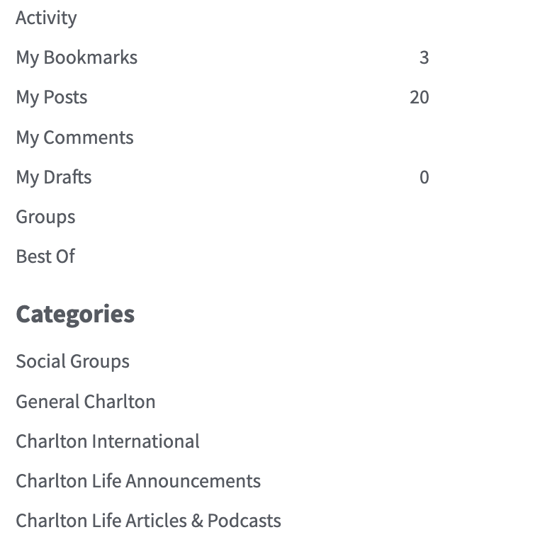
It's all text on a white background, it would be much more visible if it was actually black. These screenshots are your comment and then bar on the side of the All Discussions pageLoOkOuT said:Of course the colour can be changed, but which grey are we talking about? The text within comments and posts, or the grey on the All Discussions page? If you have concern about any aspect, screenshots are helpful if you can so we know we're on the same page.

0 -
Not really an issue as it existed on the other version, but just what is the point of the 'Best of' section?
It's all a bit random. Who or what dictates if it's 'best of'?
For example, there's a post on there with 1 LOL?
Never understood it me.
Does anyone actually use it?3 -
Ditto . Never understood it either . I initially liked the new look but I’ve come to realise it’s just too Vanilla and it’s kind of put me off visiting as much as usually did . It needs more colour and I really don’t like the tiny Promote , like and lol emoji’s .carly burn said:Not really an issue as it existed on the other version, but just what is the point of the 'Best of' section?
It's all a bit random. Who or what dictates if it's 'best of'?
For example, there's a post on there with 1 LOL?
Never understood it me.
Does anyone actually use it?1


