Attention: Please take a moment to consider our terms and conditions before posting.
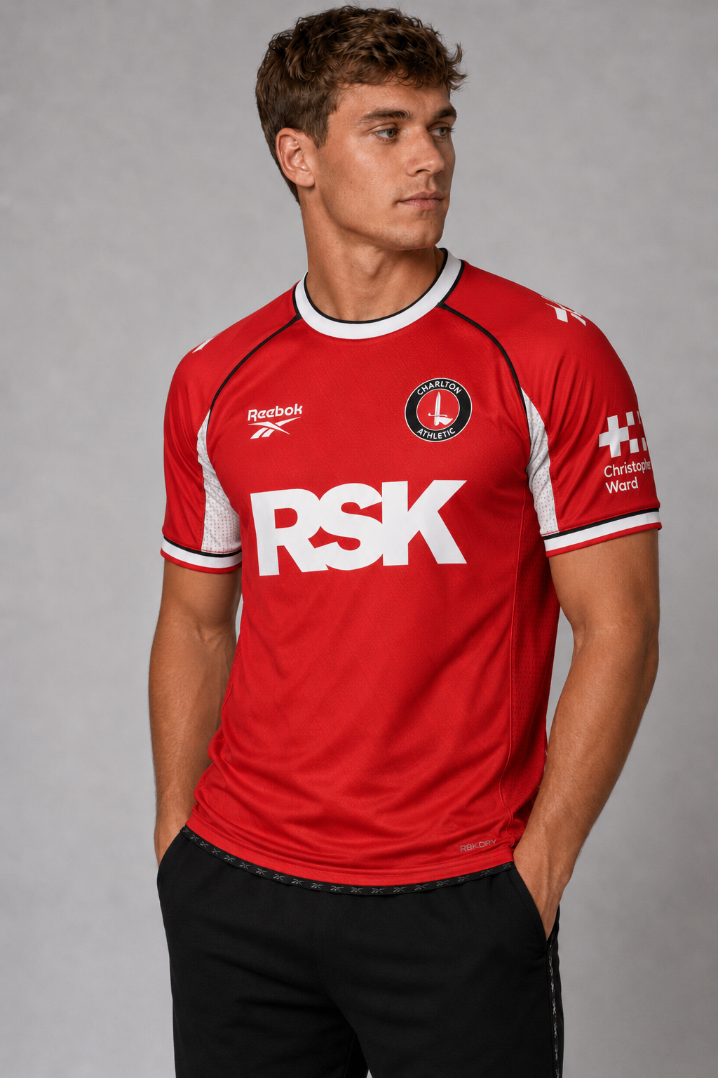
Reebok it is then (new 3rd shirt p51)
Comments
-
Macron did the same. Still one of my favourites.fenaddick said:It’s fine, better than last years effort but the reebok logo on the shoulders looks naff2 -
Not a fan myself.
A fan consultation would have told Reebok to ditch the logos on the shoulders4 -
Is it me or is the badge wonky?robroy said: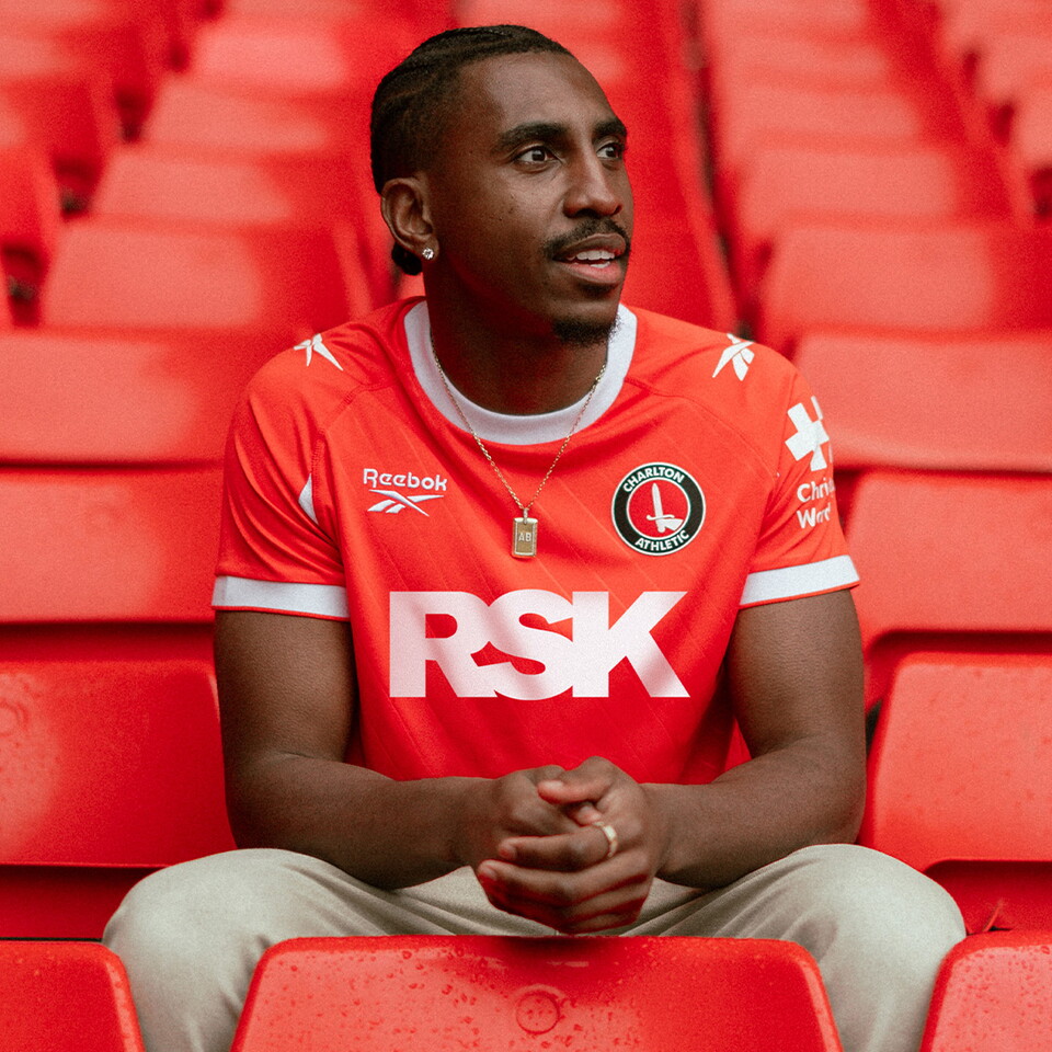 3
3 -
Wrong red......
4 -
A nice, clean home kit. They've dropped the red, white, and black theme, it seems, which did look a tad busy.3
-
It's the way he is sat with his arms. The Reebok is slightly wonky toostackitsteve said:
Is it me or is the badge wonky?robroy said:2 -
Amarii’s badge is wonky isn’t it? Other than that I like it.0
-
The orangeness in the pics seems to have been boosted looking at the rest of the stadium, it isn't usually that orangecafc4life said:a darker red and it would be nice. Too orange for me.0 -
Design is nice, I'm a fan of the simplicity.
Shame that the badge isn't embroidered and the logo on the shoulders is another element that will peel off after 5 washes. But it's an improvement on the eyesore that we had last year.2 -
Better than last years but still got the weird diagonal lines that I don’t like, but at least they’re less prominent.0
-
Sponsored links:
-
The shorts look a bit long2
-
Well chatgpt looked at the proofs for me this morning and gave me this - which is miles off!
2 -
Wrong shade of red , bring back Hummel.0
-
No I don’t think soWSS said:Is that Tutu at the end of the launch video?0 -
.0
-
Like it. Love a round collar.3
-
Instagram tooThe Red Robin said:.1 -
I really like it. Simple with red and white. Thick white collar and sleeve looks good. The Reebok shoulder logos look a bit odd, but other than that big fan on initial look.3
-
On the app now too. I like the white under the arms.stackitsteve said:
Instagram tooThe Red Robin said:.0 -
Sponsored links:
-
Nothing to really get excited about but it's not awful. As usual better ai mock ups made.1
-
I’m not moaning as aware I’m out of touch with how much branded stuff costs these days, but the shirt and other merchandise prices have shocked me for this season.0
-
It looks good, needs to pass the red test in the flesh0
-
Bit different to what the kit was with the other sponsor!2
-
OK shirt. Hate the collar.4
-
Likewise - I like a bit of white around the arms .... that was the Arsenal reference.... not full on sleeves, but a touch. I always liked a bit of black piping on kits in the past as well. Think the video shows it off much better than the stills.The Red Robin said:
On the app now too. I like the white under the arms.stackitsteve said:
Instagram tooThe Red Robin said:.0 -
Its pretty average, not a fan of the shoulder logos, extra short, short sleeves or the badge being plastic when the reebok logo isnt and £59 is crazy money.
It's a pass from me.1 -
Great . My very own stalker .TelMc32 said:
Having read some of your posts, I can confirm that you are very definitely “sad enough” 🤷🏻♂️Bedsaddick said:
Yes but I’m not sad enough to search for sponsors web sites . I’ll leave that to youTelMc32 said:
You do know that you’re on the internet when you read and comment on here don’t you?Bedsaddick said:
That clears that up then .DamoNorthStand said:
They are an environmental consultancy / sustainability solutions business. I have always said front of shirt is the wrong asset for them…. They are B2B. They should be stadium partners and then build a big activation around the carbon footprint of the valley.jose said:I have no idea what RSK sell.
Never have.
However it is fun to speculate.
An ‘i’ and a ’y’ would make speculation risky.
As those letters are in the club shop, they might mean ‘remove sneaky kleptomaniacs’.
Front of shirt doesn’t make any senseI still have no idea what they do.
https://rskgroup.com/ 1
1 -
Shirts don’t get much blander than that but i guess im not the target market .0