Attention: Please take a moment to consider our terms and conditions before posting.
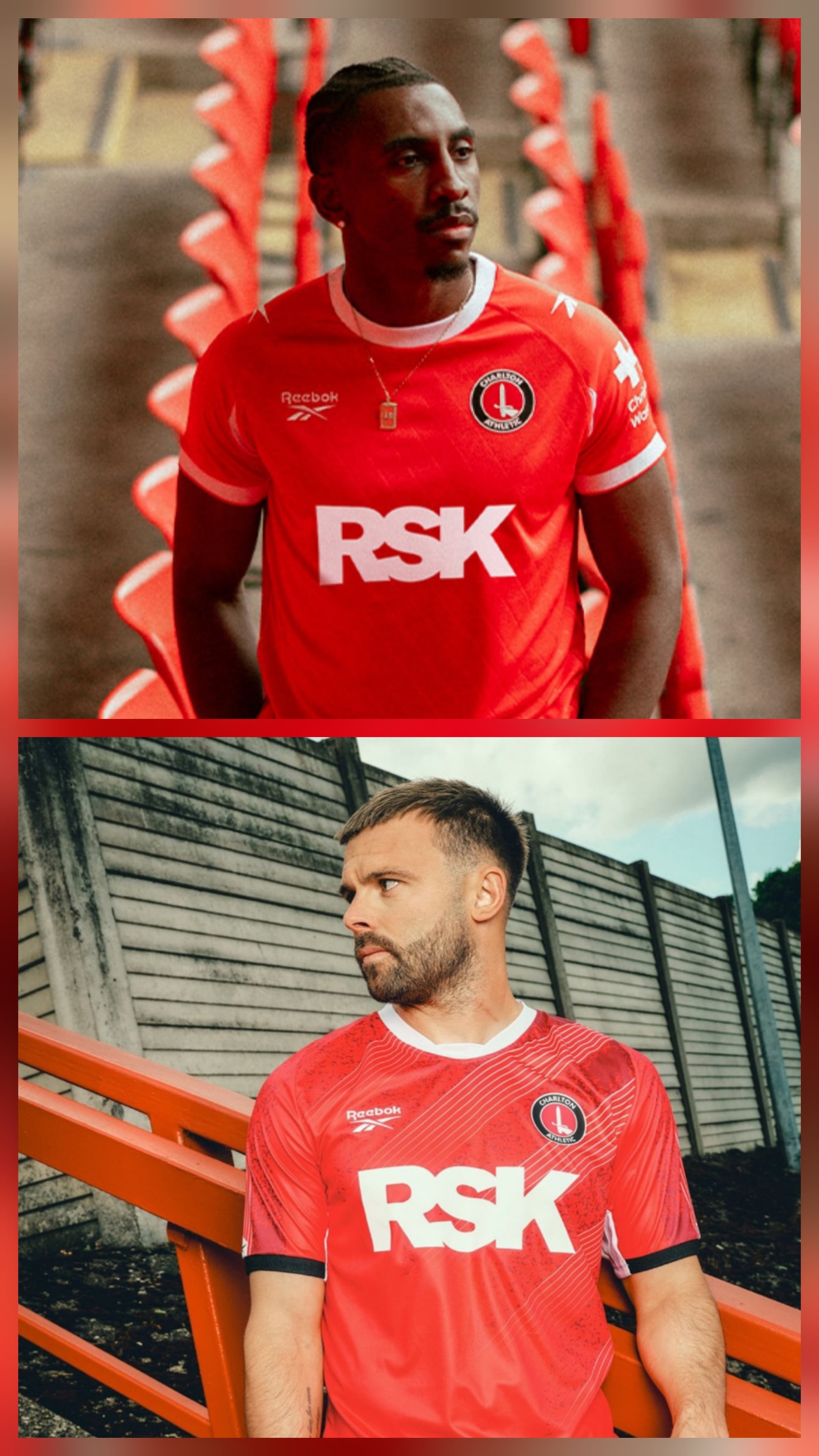
Reebok it is then (new 3rd shirt p51)
Comments
-
It’s red so fine…shoulder logos make it look those East Stand pidgins have been busy.3
-
Looks very much like the home shirt from 2 years ago2
-
Not a fan of all the bulky sponsors plastered all over it, I’ll pass1
-
Has the RSK font got smaller?
1 -
It's red and white and not too fussy although it doesn't need the extra logos or the white armpits imho.
People who buy shirts will buy it and the club will make money.
2 -
I don’t know why it’s so hard to publish pictures of the shorts and socks on the day of launch. Didn’t we have genAI generated images of those last year on the shop?1
-
Standard, inoffensive home shirt that in a few years time I’d struggle to remember which season we wore it in.
Now hoping for a slightly more interesting away shirt in any of our traditional away colours, and after that a completely mental third kit.10 -
Sponsored links:
-
Last seasons home kit was too Jackson Pollock for me, this is better.0
-
Anyone who wants one will get one.15
-
Exactly how I feel , it's a pretty run of the mill kit and hopefully there's some interesting stuff to come with the away and third.Scoham said:Standard, inoffensive home shirt that in a few years time I’d struggle to remember which season we wore it in.
Now hoping for a slightly more interesting away shirt in any of our traditional away colours, and after that a completely mental third kit.0 -
Are there any pics of the back? in the bumf it mentions referencing the club crest on the back.
Also: "Inspired by The Valley’s Covered End, the new red home shirt features a distinctive 34‑degree lean, matching the rake of SE7’s iconic home end, brought to life through a bold embossed vertical stripe pattern."5 -
Boring.3
-
Bland and not a fan of round necks or very short sleeves. I guess we have to wait for the other two kits for anything remotely interesting.2
-
Blackpool FC1
-
What I see is essentially a PDF proof - which perhaps can be misleading but looked like the white was more visible on the sleeve (rather than armpit) and a bit more pronounced black piping where the white issammy391 said:
Was it a totally different kit, or just different sponsor?DubaiCAFC said:Bit different to what the kit was with the other sponsor!0 -
Bit bored now.0
-
EugenesAxe said:Are there any pics of the back? in the bumf it mentions referencing the club crest on the back.
Also: "Inspired by The Valley’s Covered End, the new red home shirt features a distinctive 34‑degree lean, matching the rake of SE7’s iconic home end, brought to life through a bold embossed vertical stripe pattern."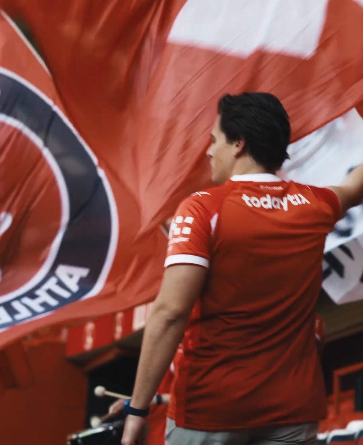
It’s very subtle if it’s on there1 -
Sponsored links:
-
Thanks, yes subtle to the point of invisibility?fenaddick said:EugenesAxe said:Are there any pics of the back? in the bumf it mentions referencing the club crest on the back.
Also: "Inspired by The Valley’s Covered End, the new red home shirt features a distinctive 34‑degree lean, matching the rake of SE7’s iconic home end, brought to life through a bold embossed vertical stripe pattern."
It’s very subtle if it’s on there5 -
That is a a good thing.Leeds_Addick said:Design is nice, I'm a fan of the simplicity.
Shame that the badge isn't embroidered and the logo on the shoulders is another element that will peel off after 5 washes. But it's an improvement on the eyesore that we had last year.3 -
That waffle about the stripe angle matching the rake of the seating is pretty desperate, even by the standards of kit launch puff.EugenesAxe said:Are there any pics of the back? in the bumf it mentions referencing the club crest on the back.
Also: "Inspired by The Valley’s Covered End, the new red home shirt features a distinctive 34‑degree lean, matching the rake of SE7’s iconic home end, brought to life through a bold embossed vertical stripe pattern."7 -
Yeah that's what I thoughtkillerandflash said:
That waffle about the stripe angle matching the rake of the seating is pretty desperate, even by the standards of kit launch puff.EugenesAxe said:Are there any pics of the back? in the bumf it mentions referencing the club crest on the back.
Also: "Inspired by The Valley’s Covered End, the new red home shirt features a distinctive 34‑degree lean, matching the rake of SE7’s iconic home end, brought to life through a bold embossed vertical stripe pattern."0 -
Nice simple design, like the white armpits, two logos on the shoulders are unnecessary and cheapen it a bit, not that I ever buy one, decent enough though.0
-
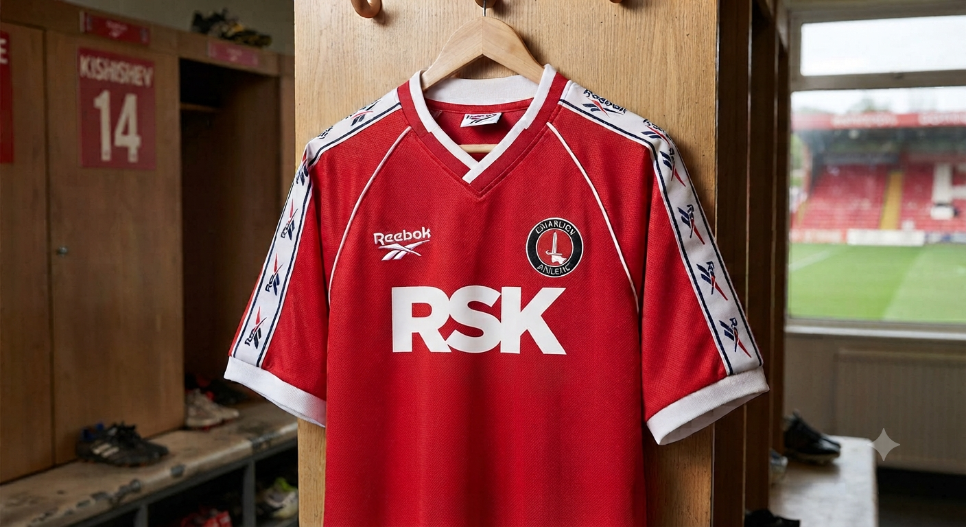
Should've gone full on Le Coq style sleeves from 98, no half measures

12 -
102 notes for an adult full kit wanker! Jeez!!!2
-
A major improvement on last year's abomination, but that doesn't make it any good. Frankly it's just a bit dull.
1