Attention: Please take a moment to consider our terms and conditions before posting.
Big Screen

Nadou
Posts: 1,784
Big screen, tiny unreadable player numbers, incredibly slow substitution info.
19
Comments
-
Agreed.0
-
2 other gripes from me.
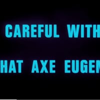
The clock. It'd alignment changes every time a number changed in the time (so every second). Instead of the : in the middle of the time being aligned centre and the numbers moving around it the whole lot changed alignment every second. Really ground my gears.
Also the fecking pulsing Charlton badge during added time when we wall wanted to know how long was left. Piss off.9 -
The fecking pulsating badge when we just need to know who’s been subbed on/off. Players had been on the pitch for ages by the time the subs had been shown on the screen.8
-
it was pulsating like my April in injury time.2
-
It was piss poor today.4
-
Is it still controlled by some bloke in Preston?0
-
I wasn't impressed with how the screen was presented today.
The score and clock were visible from space but I doubt I could've read the players' names and numbers if I'd been standing by the corner flag.
I had to resort to using the Sky Sports Scores app to match the number to the player.3 -
I thought the Derby subs etc looked terrible in the grey, looked like an old black & white TV!!0
-
We couldn't read the player names from the CE.1
-
Sponsored links:
-
Came across to me that the wifi that it must be connected to wasn’t working and the image they were trying to transmit kept buffering (the pulsing badge rather than the clock)0
-
No fish for a chant of “feesh”.6
-
The pulsing badge which a few have mentioned i'm sure is done purposely while the big screen is being updated likely manually, if we didn't have the pulsing badge we'd probably see a cursor and names manually being entered onto the big screen.
The big screen just didn't look right today and it's something that irritates me from a professional point of view that it appears nobody ever seems to test how stuff looks on the big screen.
It's all very well when someone updates the software for the screen on someone's laptop but they are sat right in front of the screen so it likely looks very readable to whoever is updating it. But please if anyone from the club is reading this, please proof check how the big screen looks from somewhere in the Covered Upper. I'm sure the museum guys could help with testing if needed with a simple thumbs up or down from distance with whether stuff on the big screen looks good or not.
And the other thing that still needs addressing is the ratio of the pre-match This is The Valley video. The video does not work in the widescreen mode, think it's currently set to 16:9 when using the whole big screen when what they need to do is create a 4:3 version across the middle panel of the screen only which I think is what the old screen size was which the video fit perfectly.2 -
Couldn't read the players names from the North stand, mind you I do have eyesight akin to Mr Magoo.1
-
I had my cataracts done in March and was pleased the i was able to read the players names without glasses for the last couple home games of the season. I was confused yesterday when i could not read the players names (seat halfway up NWQ) glad it was not just me.1
-
No attendance said on screen.2
-
I couldn’t read the names on the screen from the lower west stand near the covered end, had to take a photo and then zoom into that. Also from when we scored the 2nd goal until the 87 minute (about 6 mins) it seemed to me that the time didn’t reappear on the screen because of the screen refreshing / ridiculous new subs announcements graphics and screen trying to refresh.0
-
The graphics round the stadium for next up for CAWFC were pretty illegible against a grey / patterned background1
-
Why have SO many things been tampered with since the end of last season ?
Catering & screen to name just 2.
Too many cooks ( except in the catering dept!) ? No CEO ? Departmental staff with no clear remit ? Strong management structure/not square pegs in round potholes ? Lack of overall planning with the average fan in mind on matchdays ? Too many "amazing" ideas to show how ready our club is to join the Big Boys ie trying to run before we can walk ?
In fact, was Katrien correct, as it seems we are now merely "customers " ! At least she had thoughts about the matchday experience
Some common sense urgently required methinks ...and can't be too soon for the faithful.
5 -
I actually think the leadership are doing quite a good job and from what I hear its becoming a much better place to work, people have a clear expectation of whats expected from them.
As for the board I am sure there is a reason why it was changed maybe its suits the majority of people more. Also bear in mind there will always be teething issues at beggining of season as they rely on suppliers, I remember nightmares even during premier league years4 -
Sponsored links:
-
Email sent to the club asking for the font on both sets of players to be bigger in future6
-
Id prefer this is in place before the big screen issues, if I could choose as a supporter.Radostanradical said:I actually think the leadership are doing quite a good job and from what I hear its becoming a much better place to work, people have a clear expectation of whats expected from them.
As for the board I am sure there is a reason why it was changed maybe its suits the majority of people more. Also bear in mind there will always be teething issues at beggining of season as they rely on suppliers, I remember nightmares even during premier league years3 -
Weird how they can have got it so wrong yesterday, when the screen has been there since last season, and road testing fonts in advance to see they work is hardly difficult.1
-
Looked ok to me
34 -
The production team in Preston weren’t at their best, the idea they can’t mix two different screens together properly is just weird, and the clock not being kept inline made my old events managers self really twitchy
1 -
I’d really love for a clock to be put on the quadrant in the south west corner.It’s a real struggle to see it for us in the AC stand.0
-
2 -
I did so several times last season. Nothing changed.shirty5 said:Email sent to the club asking for the font on both sets of players to be bigger in future
As I understand it the supplier has layout templates that most clubs use. Not Charlton. Whoever does the layout for the Valley doesn't understand that there needs to space around the characters.
The latest screen at the Oval is much the same size but so much easier to read. Upper and lower case letters are easier to read.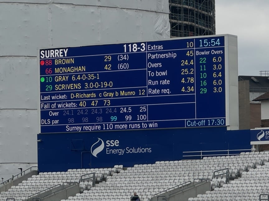
1 -
Hadn’t really thought about it till I saw this thread but must admit I do look to see who opposing players are sometimes during the game and I couldn’t read any of them yesterday. Such a simple thing to get right really if you know what you’re doing, legible typeface, right spacing, contrasting colours and job done.I know a lot of people hate The Hundred on here but their graphics are superb.2
-
Struggled to read players from NW yesterday. Been really disappointed with the new screen as I expressed on the previous thread about it… shouldn’t be that hard to get this stuff right!1