Attention: Please take a moment to consider our terms and conditions before posting.
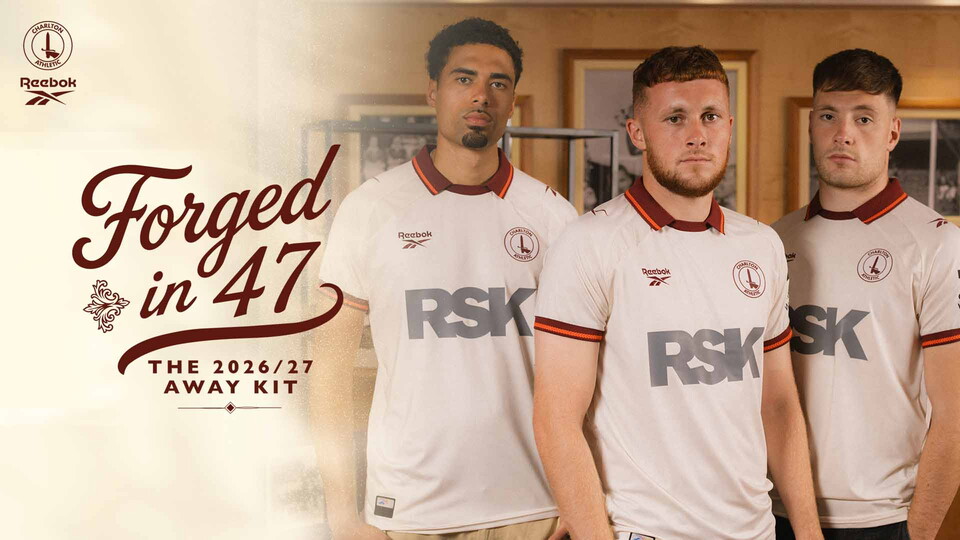
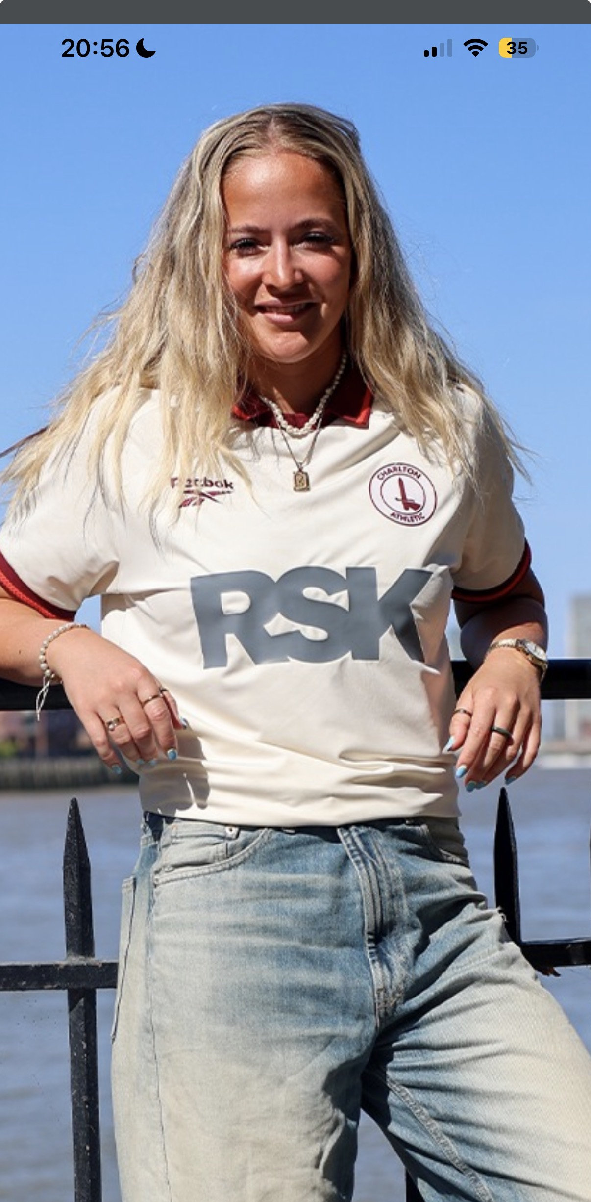
Reebok it is then (new 3rd shirt p51)
Comments
-
Very nice. Love it.0
-
I think the RSK logo ruins most kits tbh, just always looks clunky and cheap the way it's on the shirt.
Appreciate they're our sponsor and grateful someone is, but it peels off of every shirt and makes almost every kit look worse.
At the very least it could be stitched on, would genuinely look ten times better3 -
Does look better than a big blue Q thoughBraziliance said:I think the RSK logo ruins most kits tbh, just always looks clunky and cheap the way it's on the shirt.
Appreciate they're our sponsor and grateful someone is, but it peels off of every shirt and makes almost every kit look worse.
At the very least it could be stitched on, would genuinely look ten times better7 -
I really like that, would have been a nice touch to just have RSK in a slightly darker ecru than the shirt.4
-
Give it 10 washes and that wont be a issue.Braziliance said:I think the RSK logo ruins most kits tbh, just always looks clunky and cheap the way it's on the shirt.12 -
Really nice kit.0
-
I get why it’s so in our faces, but feel like it should be about the club and shirt, not about the sponsor and make it less obvious. I do wonder how much businesses benefit financially by sponsoring a shirt ? Those ITK, is it substantially more?, I guess they wouldn’t do it otherwise🤷🏻♂️ I personally don’t particularly look for a sponsor on a shirt, not consciously anyway.Braziliance said:I think the RSK logo ruins most kits tbh, just always looks clunky and cheap the way it's on the shirt.
Appreciate they're our sponsor and grateful someone is, but it peels off of every shirt and makes almost every kit look worse.
At the very least it could be stitched on, would genuinely look ten times better2 -
I think thats why 'The Woolwich' worked so well, was a big logo, but the font wasnt too big.Sword65pf said:
I get why it’s so in our faces, but feel like it should be about the club and shirt, not about the sponsor and make it less obvious. I do wonder how much businesses benefit financially by sponsoring a shirt ? Those ITK, is it substantially more?, I guess they wouldn’t do it otherwise🤷🏻♂️ I personally don’t particularly look for a sponsor on a shirt, not consciously anyway.Braziliance said:I think the RSK logo ruins most kits tbh, just always looks clunky and cheap the way it's on the shirt.
Appreciate they're our sponsor and grateful someone is, but it peels off of every shirt and makes almost every kit look worse.
At the very least it could be stitched on, would genuinely look ten times better1 -
Agree on the RSK logo, it’s kind of ugly and oversized. Looks extra bad on this one because it’s weirdly in an additional colour used nowhere else on the kit.
Would be great to be able to opt to buy replica kits without the sponsors logos, (for a bit extra, of course), although get why that probably won’t ever happen.
Without the logo this one would probably be smart enough to wear to the office on a dress down day. Kind of awkward for me to wear it to the office though as RSK are a direct competitor of the firm I work for!3 -
Cannot stress this enough, wash it inside out on a cold wash (I forget what that is in Celsius, just pick the coldest one) inside out and hang dry it. It'll keep the logos on I promise. That being said, I did get a Championship badge last year because we were back in the Championship and that has peeled off part way. But I swear by my cold wash system.shine166 said:
Give it 10 washes and that wont be a issue.Braziliance said:I think the RSK logo ruins most kits tbh, just always looks clunky and cheap the way it's on the shirt.7 -
Sponsored links:
-
-
Have washed our boys kits tons of times on 30 or 40 degrees and no issues. Long as turned inside out they seem to be fine.SDAddick said:
Cannot stress this enough, wash it inside out on a cold wash (I forget what that is in Celsius, just pick the coldest one) inside out and hang dry it. It'll keep the logos on I promise. That being said, I did get a Championship badge last year because we were back in the Championship and that has peeled off part way. But I swear by my cold wash system.shine166 said:
Give it 10 washes and that wont be a issue.Braziliance said:I think the RSK logo ruins most kits tbh, just always looks clunky and cheap the way it's on the shirt.2 -
Edit: kit looks to be the same, aspects much clearer in the daylight/sun!
whoops0 -
You're right, I meant either way but didn't word it well.boggzy said:
Or vice-versa. Think the RSK would have been better in black. Didn't really notice that it was grey in the leak - now seeing it in full makes it look a bit cheap/disappointing. Really like it apart from that.Talal said:Nice shirt, though the sleeve sponsor would've looked better in the same colour as RSK imo.0 -
Not for me tbh0
-
-
Liking it, can’t wait to see the shorts and socks.0
-
think the reebok stuff is mainly shite but i quite like that - might invest0
-
Like the shirt, don’t like the absolute b*****s trying to shoehorn link it to 1947.I suppose better than the guff about the stitching mirroring the Greenwich skyline the other year. That was a belter when it comes to guff10
-
Sponsored links:
-
i'm glad the word guff has become popular - i knew it would4
-
Can we just put "The Orion Arm of the Milky Way is ours", OR "Founded in 1246"?4
-
Well done to @JamesSeed of this parish. Well done on the video and photo shoot!14
-
Love the kit. Don’t get the not even tenuous link to 1947 but if you are going to do it why 26th 1947? Surely you can squeeze in 04 or even April otherwise it makes no sense at all. If most even got the link to the FA Cup win they’d think it meant 26th May 1947. Who sanctions this nonsense?5
-
What colour was our sponsor's logo in 1947?boggzy said:
Or vice-versa. Think the RSK would have been better in black. Didn't really notice that it was grey in the leak - now seeing it in full makes it look a bit cheap/disappointing. Really like it apart from that.Talal said:Nice shirt, though the sleeve sponsor would've looked better in the same colour as RSK imo.4 -
The colours are based on the ticket, as the blurb says.It’s right there in the vid.
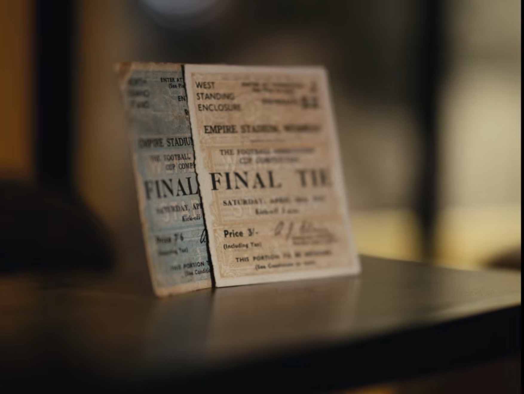 4
4 -
Charlton Athletic FCAll of the 1947 memorabilia on show comes courtesy of, and can be found on display in, the🤝
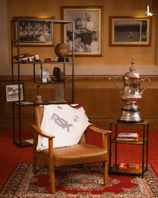 15
15 -
White on a white shirt in the cup final.CaptainRobbo said:
What colour was our sponsor's logo in 1947?boggzy said:
Or vice-versa. Think the RSK would have been better in black. Didn't really notice that it was grey in the leak - now seeing it in full makes it look a bit cheap/disappointing. Really like it apart from that.Talal said:Nice shirt, though the sleeve sponsor would've looked better in the same colour as RSK imo.5 -
The RSK sponsor on the front, the sleeve sponsor, and the sponsor on the back are 3 different colours 😂Talal said:Nice shirt, though the sleeve sponsor would've looked better in the same colour as RSK imo.1 -
That’s another homage to the 47 cup final, for people who were watching on the 📺Rufus is a dogs name said:
The RSK sponsor on the front, the sleeve sponsor, and the sponsor on the back are 3 different colours 😂Talal said:Nice shirt, though the sleeve sponsor would've looked better in the same colour as RSK imo.2