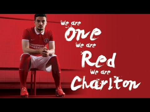
New kit next season (picture on Page 36)
Comments
-
None at all? Didn't get into the club shop today.Callumcafc said:Any hints on away or third yet?
0 -
So did I.iainment said:Looks good to me. I prefer a shirt with a collar.
In 1992.
Dated and bland IMO. Like the all red. Sponsor logo is simply to be as clear as possible. The other font want show up from a distance.0 -
At least the penny has finally dropped1
-
This. Gets my vote. Only question will be sizing, which will no doubt mean no purchase unless something amazing happens and I drop a few sizes in the coming weeks...Henry Irving said:Proper Charlton kit.
3 -
Would look better with a pair of black boots.Paddy Powell said:3 -
Does look a bit Fred Perry, I agree - but a vast improvement on last season.1
-
It doesn't matter what kit they out out there. This thread will always have the same comments in (with variations on collar opinions).1
-
just a quick one, dunno if i missed it but did they announce who won the kit yesterday?0
-
Red, white and red, job done. Looks smart, not too fancy and will hopefully sell a considerable amount.
Just pleased that common sense has prevailed and we didn't end up with a home shirt that would have caused heated debates on Internet forums, Facebook groups and social media.0 -
Red shirt with small but well-judged bits of white trim, white shorts, red socks. It's simple, has our badge, the manufacturer's badge, the sponsor's logo in all the right places and at the right sizes.
I'm a fan, it looks like a normal kit basically.3 -
Sponsored links:
-
Still think they should have just gone for a plain white sword1
-
Like it.0
-
guinnessaddick said:
Would look better with Yann in it wearing a pair of black boots.Paddy Powell said:3 -
It's exactly the same as Mainz's kit this season.
Quite like it though.0 -
Too boring, there should be some design to the shorts and socks, hooped socks and a red band down the shorts and it would look a bit more put together, instead we have shorts and socks that could be the own brand 1.50 jobs from sports direct and a golf shirt for the kit.1
-
Love it. Standard (as in traditional not Liege) Charlton and it's classy. Might actually think of buying it. Thought this season's was shocking.4
-
Looks like Charlton, which based on the last few efforts is an achievement6
-
Some people really don't understand how teamwear contracts work.1
-
Are we seriously getting the Man City purple kit as our third strip this season? Or is that a hilarious joke? I hope it is a joke because it's purple and fluorescent green. It looks like something a child would colour in while they waited for a table at Harvester6
-
More pics here. Very nice kit. Best in years actually.
football-shirts.co.uk/fans/official-charlton-athletic-2015-16-nike-home-kit_317060 -
Sponsored links:
-
Where have you heard that?Garrymanilow said:Are we seriously getting the Man City purple kit as our third strip this season? Or is that a hilarious joke? I hope it is a joke because it's purple and fluorescent green. It looks like something a child would colour in while they waited for a table at Harvester
0 -
Valley11 said:
More pics here. Very nice kit. Best in years actually.
football-shirts.co.uk/fans/official-charlton-athletic-2015-16-nike-home-kit_31706 2
2 -
Nug mock up from April 2014Nug said:In the style of @oohaahmortimer - 55% shirt number 1, 40% shirt number 2, 5% our own bespoke nike kit.

Not a bad guess from 13 months ago5 -
That kit was the very essence of relegation, distilled into red and white polyester!Valley11 said:
You're having a laugh....Red_in_SE8 said:At least it is Red Shirt /White Shorts.
Hate the collar. And the white rim on the sleeves. Looks like a red Fred Perry shirt.
But this season's kit is by a long way the worst in living memory.
Also it evoked Bernie Slaven era Middlesbrough. No real problem with that, but it wasn't Charlton0 -
I do not usually like collars on football shirts but this is a nice kit .. back to the old red and white after a season of the whites and reds1
-
I think the sponsor is a lot more legible like that. Also it matches the 'old school' feel of the shirt.newyorkaddick said:
Agree, it looks bloody awfulcolthe3rd said:Still disappointed the sponsor looks cheap on there. Why haven't they used the Uni's logo and font again?
It's the best kit we've had for ages, but then again I quite like a Fred Perry!0 -
For anyone wanting to see the new Charlton Third Kit, pop Sky Sports 1 on and have a gander at Man Shitty0
-
Anyone know when its out, wanted It for the 28th May for littluns birthday - the first kit0
-
January 2016razil said:Anyone know when its out, wanted It for the 28th May for littluns birthday - the first kit
4 -
I can't wait for the kit to come out, anyone know when it will?0


 https://www.youtube.com/watch?v=EBLxqCx41Lw


