Attention: Please take a moment to consider our terms and conditions before posting.
Other team's new kits
Comments
-
Forest's shirts are class too.
Simple but quality.2 -
We should have had a Birmingham-style away kit in tribute to Roland
0 -
Leeds aren't having a sponsor this season. Both kits are quite nice tbfsam3110 said:The Leeds and Forest kits will get sponsors on them soon
 2
2 -
I like the idea of the no sponsor but it just makes them look like the generic designs for the unlicensed teams on Pro Evo.0
-
Is it just me or does peter wittingham look like Colin Murrays long lost brother0
-
Everyone else has pretty decent kits to be fair, the exceptions being MK dons 3rd (McDonalds colors are atrocious)
Preston Away (They think they're Shrewsbury)1 -
Boro home kit is the best by a mile.
Leeds look like they should be playing down Hall Place in them kits.1 -
It's interesting seeing the photos that the richer clubs issue, with expertly created images of the players in moody and dramatic shots
And then you see Rotherham's. Done by Sid from the local paper!7 -
Sponsored links:
-
Looking at some of the disastrous kits in our division this season makes me like ours even more!1
-
Newcastle's is appalling. Incorporating the discredited Wonga blue into the immortal black and white stripes is corporate vandalism. Presumably NUFC are getting extra for this but it just shows what a money grubber Ashley is. Glad to hear that many of their fans refusing to buy. Good on them.0
-
Oh this is so true. I get a little irritated when an away kit has any of the home kit colours on, especially as a colour blind FIFA player.North Lower Neil said:Any decent offerings or horrors this year people have seen?
Norwich are the worst I've seen so far, not only are all 3 kits horrible, the worst being the 3rd kit:
But they have gone home - yellow and green halves, away - green with yellow stripes, and 3rd kit - yellow and green hoops.
Defeats the object of any away kit doesn't it?
And holy sweet Mary mother of god is that an ugly shirt.1 -
Semedo's legs are the most MASSIVE thing about the MASSIVES0
-

Looks like he just farted and got more than he bargained for.7 -
-
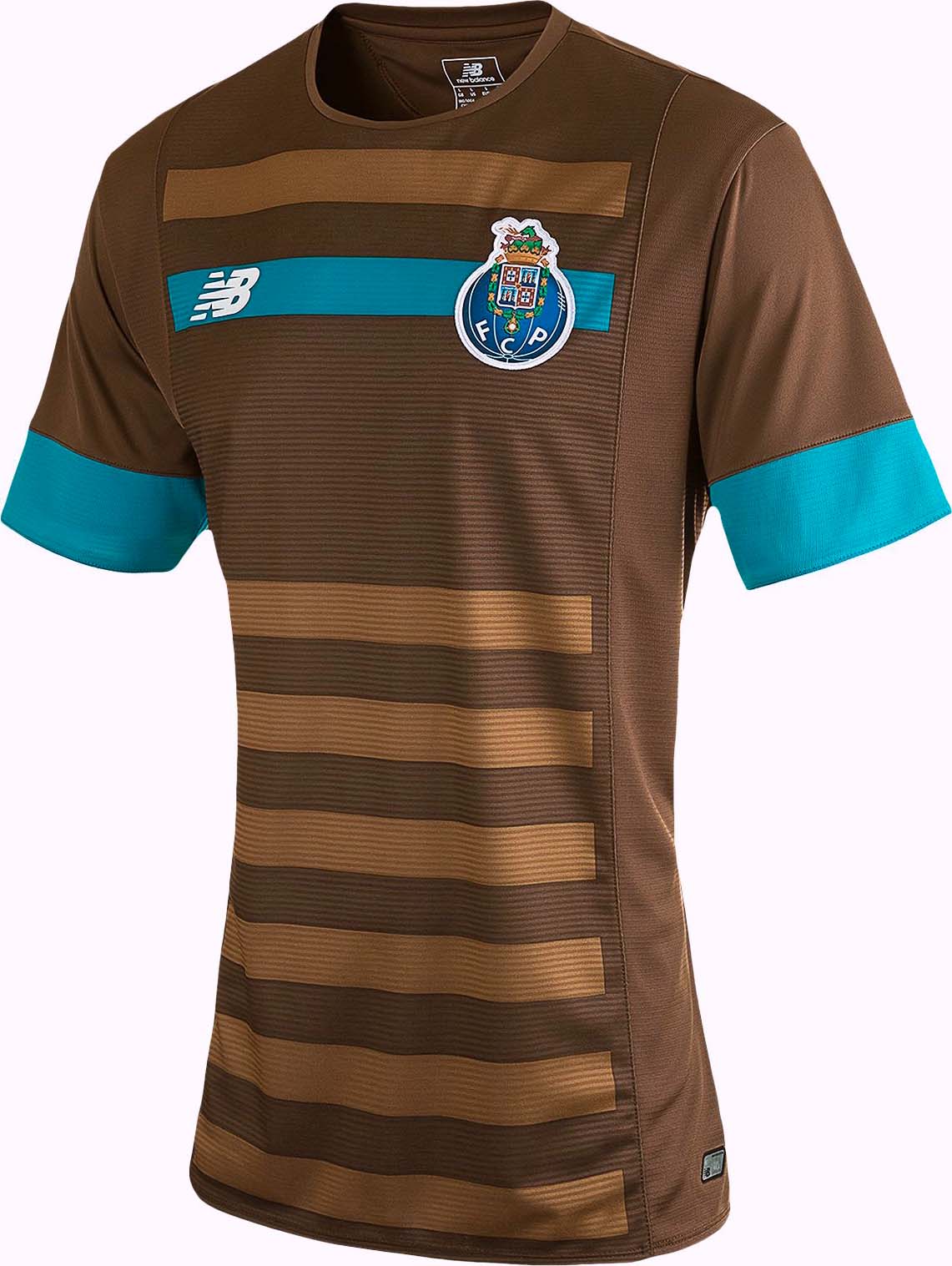
Porto's shit brown away monstrosity takes some beating.0
-
Sponsored links:
-
If anyone EVER complains about a Charlton shirt I'm going to post this... Were Porto watching the FA Cup Highlights and saw the Coventry kit and thought... HmmmAlgarveaddick said:Porto's shit brown away monstrosity takes some beating.
 1
1 -
That is appaling!!1
-
If we had Adidas I wouldn't mind that as a template.DamoNorthStand said:
Looks like he just farted and got more than he bargained for.3 -
I like that Porto away strip.............2
-
Surely that's an ice cream?ForeverAddickted said:
If anyone EVER complains about a Charlton shirt I'm going to post this... Were Porto watching the FA Cup Highlights and saw the Coventry kit and thought... HmmmAlgarveaddick said:Porto's shit brown away monstrosity takes some beating.

1 -
I can recommend a good therapist GGA? Or maybe an optician would suffice?GretnaGreenAddick said:I like that Porto away strip.............
 0
0 -
Same here, I've decided the shitter the better.GretnaGreenAddick said:I like that Porto away strip.............
0 -
Birmingham away kit is like the Belgian flag. That should be our home kit.0
-
Forest and Leeds kits look the best.0
-
Forest and Leeds kits look the best.0


