Attention: Please take a moment to consider our terms and conditions before posting.
New Kit 18/19 season
Comments
-
Yeah looks good. Well done Hummel once again.
That's 4/4 for them from me. Only qualm is on the away shirt I think the sponsor is too big, which kind of throws off the balance off the whole shirt, including the intersection where the crest is. I don't know that there's anything Hummel can do about the size of the sponsor, but apart from that I like everything they've done. And it's cool that we have bespoke kits.0 -
Too much white on the sides , home top should be red , no gimmicky bits and bobs to justify a change here and there , boring I know but I like a solid tradition and we don’t help ourselves with bits of white chucked over it every so often6
-
I liked the hooped socks.Sillybilly said:Bucking the trend a little I’m afraid I really don’t like the white on the sides. Otherwise it’s great and we’ve avoided the dreaded hooped socks.
5 -
I think they misunderstood Roland when he said use one of the old kits.16
-
I’m not joking here, but @ElfsborgAddick has a camouflage pair of those that he wears when he is hiding in bushes watching dogging.cantersaddick said:What are those???
2013 wants their footwear back.0 -
How about boycotting buying the new kit.
Or is that too much to ask of fans whose club is day by day going further round the U- bend?0 -
That looks very nice to be fair. Good work all involved.0
-
Watching?ricky_otto said:
I’m not joking here, but @ElfsborgAddick has a camouflage pair of those that he wears when he is hiding in bushes watching dogging.cantersaddick said:What are those???
2013 wants their footwear back.0 -
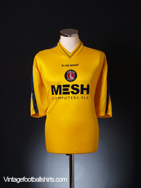
when's the yellow and blue 3rd kit out then ?0
-
That's quality to be fair!0
-
Sponsored links:
-
22
-
I wonder if the third kit could be inspired by one of these...

 1
1 -
Nice touch. That shirt looks hideous though! I always wonder why fans of teams like Watford, Norwich and Blackpool buy away shirts? Their home shirts are so iconic, and the aways never really get an airing.0
-
Really nice touch by Watford #properclub #propernetworkCallumcafc said:Good stuff at Watford
3 -
Nice clips of the museumThe Red Robin said:4 -
Shame about the old duffer lurking therein....Henry Irving said:
Nice clips of the museumThe Red Robin said:2 -
Yeah, where did they drag him up from?Fumbluff said:
Shame about the old duffer lurking therein....Henry Irving said:
Nice clips of the museumThe Red Robin said:0 -
Probably Beckenham, or PengeHenry Irving said:
Yeah, where did they drag him up from?Fumbluff said:
Shame about the old duffer lurking therein....Henry Irving said:
Nice clips of the museumThe Red Robin said:0 -
What game were the filming for their to be such full stands?The Red Robin said:0 -
Sponsored links:
-
Penge? That's a below the belt comment.Fumbluff said:
Probably Beckenham, or PengeHenry Irving said:
Yeah, where did they drag him up from?Fumbluff said:
Shame about the old duffer lurking therein....Henry Irving said:
Nice clips of the museumThe Red Robin said:1 -
Just had a look online and realised you can view our player list on the club shop...
0 -
Shrewsbury play-off gameCroydon said:
What game were the filming for their to be such full stands?The Red Robin said:1 -
The youtubers matchCroydon said:
What game were the filming for their to be such full stands?The Red Robin said: 0
0 -
Probably the YouTubers game.Croydon said:
What game were the filming for their to be such full stands?The Red Robin said:0 -
Like both kits. Would have preferred the stripes on the away kit to be offset to one side and both kits should have hooped socks.2
-
Steady on, I'm a Penge dweller. It's up and coming don't you know.Henry Irving said:
Penge? That's a below the belt comment.Fumbluff said:
Probably Beckenham, or PengeHenry Irving said:
Yeah, where did they drag him up from?Fumbluff said:
Shame about the old duffer lurking therein....Henry Irving said:
Nice clips of the museumThe Red Robin said:0 -
-
It's close to the 72-73 kit. I love it.0
-
Dazzler21 said:
Just had a look online and realised you can view our player list on the club shop...
5


 https://www.youtube.com/watch?v=iIVn8CjhItk&app=desktop


