Attention: Please take a moment to consider our terms and conditions before posting.
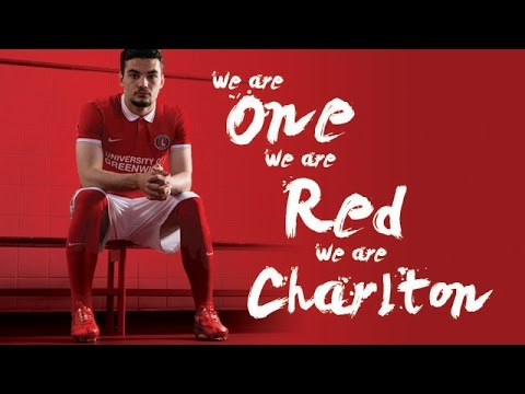
New kit next season (picture on Page 36)
Comments
-
Am I the only person that doesn't like the collar?0
-
Not a big fan of the collar so I probably won't buy it but it's red and it has white shorts as it should0
-
That's the kit Chartlon had when I first supported Charlton back in 1993/1994, I was 13 so really like the new Charlton shirt as it reminds me of those days, seeing Charlton with the white collars feels more like Charlton to me, so really pleased with the new shirt and having white shorts back.Peter_G said:Thought it looked familiar.
3 -
-
Best Nike one so far.8
-
Retro tastic!
1992/93 is long enough ago to be considered as retro, right?6 -
Like it. Wouldn't have button done up at top but nice choice from the templates.
If we have to have the slash away kit hope it is the yellow and black one.2 -
Sorry Nike but that's a boring horrible kit! But at least our lovely badge remains2
-
I approve. Undecided as to whether I'll buy one or not but it's the right colours in the right proportions and is a bit more interesting than just a plain polo shirt like the first Nike kits.
Seems someone at the club is listening which has to be a good thing.2 -
Sponsored links:
-
It does absolutely nothing for me.
Very generic and dull.3 -
Proper Charlton kit.11
-
Some will never be pleased. This the best we could've got and we got it.4
-
At least it is Red Shirt /White Shorts.
Hate the collar. And the white rim on the sleeves. Looks like a red Fred Perry shirt.
But this season's kit is by a long way the worst in living memory.2 -
Red shirts? Tick
White shorts? Tick
The rest doesn't matter.
Although Im not sure I'd be happy with a palace away kit
2 -
I really can't get excited by a kit. It's red and white that will do for me.2
-
Bland.1
-
Still disappointed the sponsor looks cheap on there. Why haven't they used the Uni's logo and font again?6
-
Agree, it looks bloody awfulcolthe3rd said:Still disappointed the sponsor looks cheap on there. Why haven't they used the Uni's logo and font again?
1 -
After a few seasons of not liking the kit I like this one. Might even buy it!
Pleased we'll be back to wearing white shorts0 -
Sponsored links:
-
Decision of the sponsor.colthe3rd said:Still disappointed the sponsor looks cheap on there. Why haven't they used the Uni's logo and font again?
0 -
Looks good to me. I prefer a shirt with a collar.1
-
I'm having that.1
-
Like this one. Classy. And plain socks!!!!! Yippee.2
-
If I were to buy a shirt it would be this one. Generic Charlton. A shirt for all seasons.
I will buy my son one.6 -
It's no where near as shite as this seasons so a step in the right direction.
I like it actually.4 -
Looks fine to me0
-
You're having a laugh....Red_in_SE8 said:At least it is Red Shirt /White Shorts.
Hate the collar. And the white rim on the sleeves. Looks like a red Fred Perry shirt.
But this season's kit is by a long way the worst in living memory.
5 -
Back to basics. Like it.1
-
I like it. Not sure that Jordan and Tony have modelled it particularly well. Fortunately I think it will look better on me.10


 https://www.youtube.com/watch?v=EBLxqCx41Lw