It’s not similar, it’s exactly the same isn’t it? In design.Afternoon Delight said:In red and white would be nice, albeit similar to what we've had before.
Attention: Please take a moment to consider our terms and conditions before posting.
New kit and sponsor (P108, 2021 new 3rd kit)
Comments
-
That is a bold collar, quite like it. Not so keen on the chevron overload.2
-
Always prefer Southampton in the red and white stripes... But yeah agree with you on the collar and chevrons Talal1
-
No chevrons on the shoulders but in the main material instead, different0
-
Interesting reading the comments on the Southampton twitter account... Seems its plain on the back as the Premier League dont allow stripes there making the numbers difficult to read anymore0
-
They're on the shoulders.killerandflash said:No chevrons on the shoulders but in the main material instead, different0 -
Imagine setting up a rule like that and ending up with that stupid font that our league used last season.ForeverAddickted said:Interesting reading the comments on the Southampton twitter account... Seems its plain on the back as the Premier League dont allow stripes there making the numbers difficult to read anymore2 -
Based on the late 80s Hummel Southampton shirt

2 -
Massive fan of that Southampton kit.
I'm sure they're relieved as their Under Armour shirt this year was terrible.0 -
Really don't like the collar on it. Way too big. Actually quite like the chevrons in the stripes1
-
I don't mind how the chevrons look, just not really a fan of excessive branding.AllHailTheHen said:Really don't like the collar on it. Way too big. Actually quite like the chevrons in the stripes0 -
Sponsored links:
-
I don't think it's a real collar, I think it's just a pattern on the shirt. Similar to what Hummel did with our home shirt this season. Looks like a folded down collar, but it's not.AllHailTheHen said:Really don't like the collar on it. Way too big. Actually quite like the chevrons in the stripes0 -
keep the hummel logo in shades of red and I think we have a winnerDazzler21 said:SCT1980 said:If they could brighten the red up a few tones would be a fan of something like this for us from Hummel.

the sponsor's logo (a Sandgaard company brand?) in white across the chest will be all the decoration this needs
plain white shorts with subtle hummel branding in the fabric and similarly plain red socks
Proper classy
the 2nd and 3rd kits can be as splashy multicoloured and garish as they like cos we won't have to tolerate them at the Valley
As for retro, that's just so last year - a get out for the creatively bereft0 -
Southampton chevrons pointing downwards in the stripes.
Nailed on for relegation9 -
That Southampton v neck looks like the reverse neckline on some of this season’s Nike kits - ie Liverpool’s.
I thought it looked too big on the LFC kit and now Southampton have a massive version on the front.
To be fair I’m a fifty something and don’t play football so it may well be that that’s a really comfortable design and the players love it.
Still looking forward to our kit and hoping TS has managed to sway them towards a Denmark style as I really like, as do many others on here it seems, what Hummel are putting out for the Euros.1 -
Blue stripe is niceTalal said:2 -
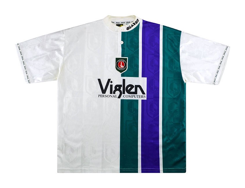
all three of those kits with blue/green/purple are awesomeTalal said:
I'm probably one of the few people that prefer it to the fully green/purple one. Though the hooped one of 97/98 is my favourite.se9addick said:
I think that might be the all time worst Charlton kit, topped off with the badge being placed on a green shield!ForeverAddickted said:
The other away version with a modern day feel that I'd absolutely love is thisTalal said:
Think a lot of people would but for me it's just a copy then. Prefer something slightly different.ForeverAddickted said:Would be happy with them, would prefer that blue one to replicate the Green and Purple stripes from 1995/97 2
2 -
Dark green one is awesomeForeverAddickted said:VfL Wolfsburg's kit for next season... 0
0 -
Sponsored links:
-
Snake?! Just look how much he seems to be loving the Club, fans, etc0
-
 In red and white would be nice, albeit similar to what we've had before. 1
 -
Is that shirt giving her nipple rash?7
-
It’s not similar, it’s exactly the same isn’t it? In design.Afternoon Delight said: In red and white would be nice, albeit similar to what we've had before.0
 -
No our pinstripes were different, our badge was full colour, collar was different.Callumcafc said:0 -
I'd like to see the return of monochrome badges. Last regularly worn in the 1980s, making one brief appearance on the 19/20 away shirt.3
-
Looks like she can't get Radio X on hers!Afternoon Delight said: In red and white would be nice, albeit similar to what we've had before.1
 -
agreed! Looks very smart when done properly.PopIcon said:I'd like to see the return of monochrome badges. Last regularly worn in the 1980s, making one brief appearance on the 19/20 away shirt.
The ecru kit we had in our first season in the prem had a monochrome badge2 -
You may, or may not like the 3rd shirt...Rufus is a dogs name said:
agreed! Looks very smart when done properly.PopIcon said:I'd like to see the return of monochrome badges. Last regularly worn in the 1980s, making one brief appearance on the 19/20 away shirt.
The ecru kit we had in our first season in the prem had a monochrome badge2


