Attention: Please take a moment to consider our terms and conditions before posting.
***PLEASE READ: New Charlton Life look and feel coming...
Comments
-
With me on my iphone, i go to "Attach Image > "insert an image" >"choose files" > that gives me to choice to go to photo library, where i can insert a photo from my library?...any helpAddicksAddict said:
How do you navigate to your pictures from the 'add file' option - it takes me to where my files are stored, not where my pictures are stored?.robroy said:I have discovered the work around on an iPhone, rather than clicking on the picture logo to add a pic, instead click on the add file and it gives you the option to add pictures.0 -
These are the options I get when I press file.
Strangely the picture icon has now started working.0 -
iPhone 17 latest iOS couldn’t down load photo (screenshot I took on phone )
managed to do it from iPad latest iOS0 -
Still the age old problem of click on a thread read a page leave thread and even though there are 23 more pages to read of the thread (savings and investments ) it shows as all thread read , so takes me to the latest post rather than where I left the thread .4
-
Does anyone know how to get rid of nail fungus?
If only I knew somewhere that gave this information time and time again in the form of an advert.3 -
Is it possible to access the laptop version of the site from this one?0
-
I’m not getting any indication if I’ve got a message or I’ve been mentioned until I click on my profile . It used to say it automatically on the home page .1
-
-
Albeit it adds as jpg not actual photo0
-
Sponsored links:
-
The main reason for the changeover is that when we encounter issues like the problem with people not being able to see their drafts that we had a while ago, it's nigh on impossible to fix them within the old schema. Which is why the My Drafts page was blue and white until the update, because we couldn't get it to work in the old version any more. At the moment we're in a kind of hybrid of new and old, but I'm not even sure if we can revert completely, and it'd be a waste of time even if we could, as we're going to need to fully migrate to the new one at some point.AddicksAddict said:Are there supposed to be advantages to the new look and feel? If not, can we revert to the previous version?1 -
I can post screenshots from my phone now. Appreciate all the hard work going into this0
-
eastterrace6168 said:It's great watching the improvements and enhancements growing each day on this site now, the wording and highlights are getting bolder and easier to read and distinguish, so well done @LoOkOuT and everyone associated with this new layout...
More to come no doubt in figure form...😉
You'll get moderator status eventually mate") 2
2 -
I’ve worked on websites over the years, I know how tricky redesigns can be. Typo guys absolutely smashed it. Looks amazing on mobile too.1
-
On my phone, where posts just contain text, everything fits perfectly across the screen. However, if a post contains a quote from another one, the row of six info links at the bottom gets shuffled over so that 'Log' ends up on a different row to the other items, like this:

Also, I'm not sure why the other items have emojis, but 'Log' is text only. Surely it can't be because there's no available icon? 🪵💩😉0 -
My guess would be it's because Log is a Mod only function, and so making it pretty is way down the priority list? (And don't mention the flags because everyone will want one)3
-
Thanks Ali, I never knew that Log was for mods only. People would be fuming if they knew all the fun they are missing out on 🤪.1
-
Nope, same format on both, it's just the site adapts to the screen width available. I'm on my tablet at the moment, and this is how the comment input looks.
 However, if I rotate my tablet into landscape mode, I see a load more options.
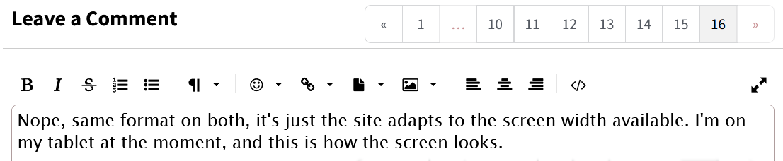 These are exactly the same as what I get on my laptop if I shrink the window to half or two thirds of the entire screen respectively. In both cases I get the minimalist style site header
 and it's only when I make my window more than about 75% of my laptop screen width that I get the more traditional style header
 That's the whole point of the update - one unified style that adapts rather than different desktop and mobile ones.1
 -
Thanks for explaining.0
-
Sponsored links:
-
This issue has carried over from previous - sometimes I start writing a comment then choose not to post. I don’t save the draft. I then go back much later and the draft is still there and way out of date?1
-
Had that, and it could be saved as a draft anyway even though you didn't save it as one, and you may have to go to your drafts and delete it?Weegie Addick said:This issue has carried over from previous - sometimes I start writing a comment then choose not to post. I don’t save the draft. I then go back much later and the draft is still there and way out of date?1 -
Drafts autosave every few minutes. I should imagine the thinking is the minor inconvenience of occasionally having to delete a draft that you no longer need is far outweighed by that of losing a post you were in the middle of writing for some reason.2
-
Perhaps it autosaves a bit too quickly? I’ve never really looked at drafts before and just discovered I have rather a lot (!) and they don’t show the thread title. As there is a facility to save drafts manually, I wonder if that is enough for most occasions when people are preparing a lengthy / considered post rather than a quick comment? Appreciate it’s a balance. And then when my phone goes flat on me mid post I’m grateful to find it’s still therealiwibble said:Drafts autosave every few minutes. I should imagine the thinking is the minor inconvenience of occasionally having to delete a draft that you no longer need is far outweighed by that of losing a post you were in the middle of writing for some reason. 0 -
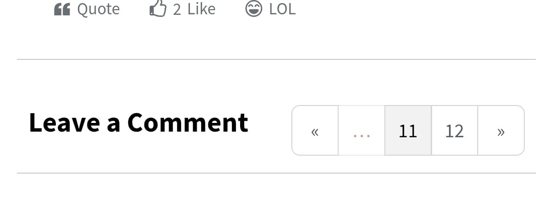
On mobile android.
Page list only offers two selectable pages and also no 'Select a page' pop up. Bit of a ball ache in this instance if you want to go back to say page 7 you have to keep tapping the left arrow.
At the very least could a couple more pages numbers be listed?1 -
carly burn said:
On mobile android.
Page list only offers two selectable pages and also no 'Select a page' pop up. Bit of a ball ache in this instance if you want to go back to say page 7 you have to keep tapping the left arrow.
At the very least could a couple more pages numbers be listed?
If you turn your phone to Landscape rather than portrait there should be a proper list of pages for you to scan back to...2 -
Even on PC it stops short - currently I can see 1, then non-clickable dots, then 10-16 as clickable pages. You can edit the URL to the page number you want, but not very user friendly.0
-
Landscape on mobile (a quick rotation of the phone) is the answer here for the pagination, at least for now. As explained, it is temporary until that part of the page is updated… there are other parts of the discussion pages that need work so it can’t be updated until all that is solved.2
-
Cheers mate. Appreciate your workLoOkOuT said:Landscape on mobile (a quick rotation of the phone) is the answer here for the pagination, at least for now. As explained, it is temporary until that part of the page is updated… there are other parts of the discussion pages that need work so it can’t be updated until all that is solved.0 -
No problem mate...😉carly burn said:
Cheers mate. Appreciate your workLoOkOuT said:Landscape on mobile (a quick rotation of the phone) is the answer here for the pagination, at least for now. As explained, it is temporary until that part of the page is updated… there are other parts of the discussion pages that need work so it can’t be updated until all that is solved.0