Nike Kit Again
Comments
-
Do you need proper kits in the lower leagues?
Cant we just go to the local school outfitters and see what theyve got hanging on the bargain rail Roland?1 -
Oh and for gawds sake put something on the shirt that resembles the actual sponsors logo. Anyone with a minute knowledge in branding will tell you that is all important. The little bit of legibility you lose is made up for in brand recognition.
 9
9 -
Nug's design would look superb! Anything would be better than last years monstrosity mind you0
-
As has been said before UoG actually requested the plain text as they felt the compass and words together would be too cluttered, the compass logo alone isn't recognisable enough to the wider audience, and their font is very thin and spindly and wouldn't be picked up on video and in photos very well.0
-
Wasn't a dig at the club, whoever changed it to Helvetica made a poor decision. Their logo could be changed in numerous ways to still reflect their identity and be legible. Not a big deal in the grand scheme of things at Charlton though.sam3110 said:As has been said before UoG actually requested the plain text as they felt the compass and words together would be too cluttered, the compass logo alone isn't recognisable enough to the wider audience, and their font is very thin and spindly and wouldn't be picked up on video and in photos very well.
2 -
Not saying its a dig at the club, just outlining why the sponsor is how it is, in case people wondered.
UoG felt the "brand" would be better off with the plain text, I agree the text could have been a better fontstyle but hey0 -
.0
-
-
Sponsored links:
-
There is literally nothing else in the teamwear selection that we could realistically go with, the other templates are either red and black, or 2/3 years old.
It's a new teamwear kit, in red and white, that's not striped, checked or hooped.
It's next seasons kit, unless we pull out of the Just Sport deal and strike up a new deal with a different supplier.
The real question is what the away kit will be.
I'm hoping one of these:
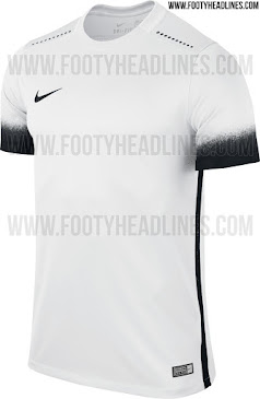
White away kit, and a yellow third kit would be great imo0 -
Pinstripes are the future!sam3110 said:There is literally nothing else in the teamwear selection that we could realistically go with, the other templates are either red and black, or 2/3 years old.
It's a new teamwear kit, in red and white, that's not striped, checked or hooped.
It's next seasons kit, unless we pull out of the Just Sport deal and strike up a new deal with a different supplier.
The real question is what the away kit will be.
I'm hoping one of these:
White away kit, and a yellow third kit would be great imo0