Attention: Please take a moment to consider our terms and conditions before posting.
The worst football kit ever
Comments
-
I made a mistake with that shirt as I think it was just used for some friendlies. As you rightly say we did wear the third kit against Peterborough but it was a different design to the one I posted.9goalswentpastperry said:
Think it was worn at PeterboroughTalal said:
I doubt it, was it even used?killerandflash said:To be fair that Hummel shirt is basically a generic top, used as an emergency 3rd kit. Was it ever sold to the public?
0 -
What about if Coventry's brown kit had a fringe like that? Would it make it better or doubly worse?
0 -

4 -
That is absolutely wank. I quite like that Colorado kit though!0
-

0 -
Like the Guinness bit.Scoham said: 1
1 -
Vile but the Man Ute one failed at its primary task so is worse.MrOneLung said: 0
0 -
Sponsored links:
-
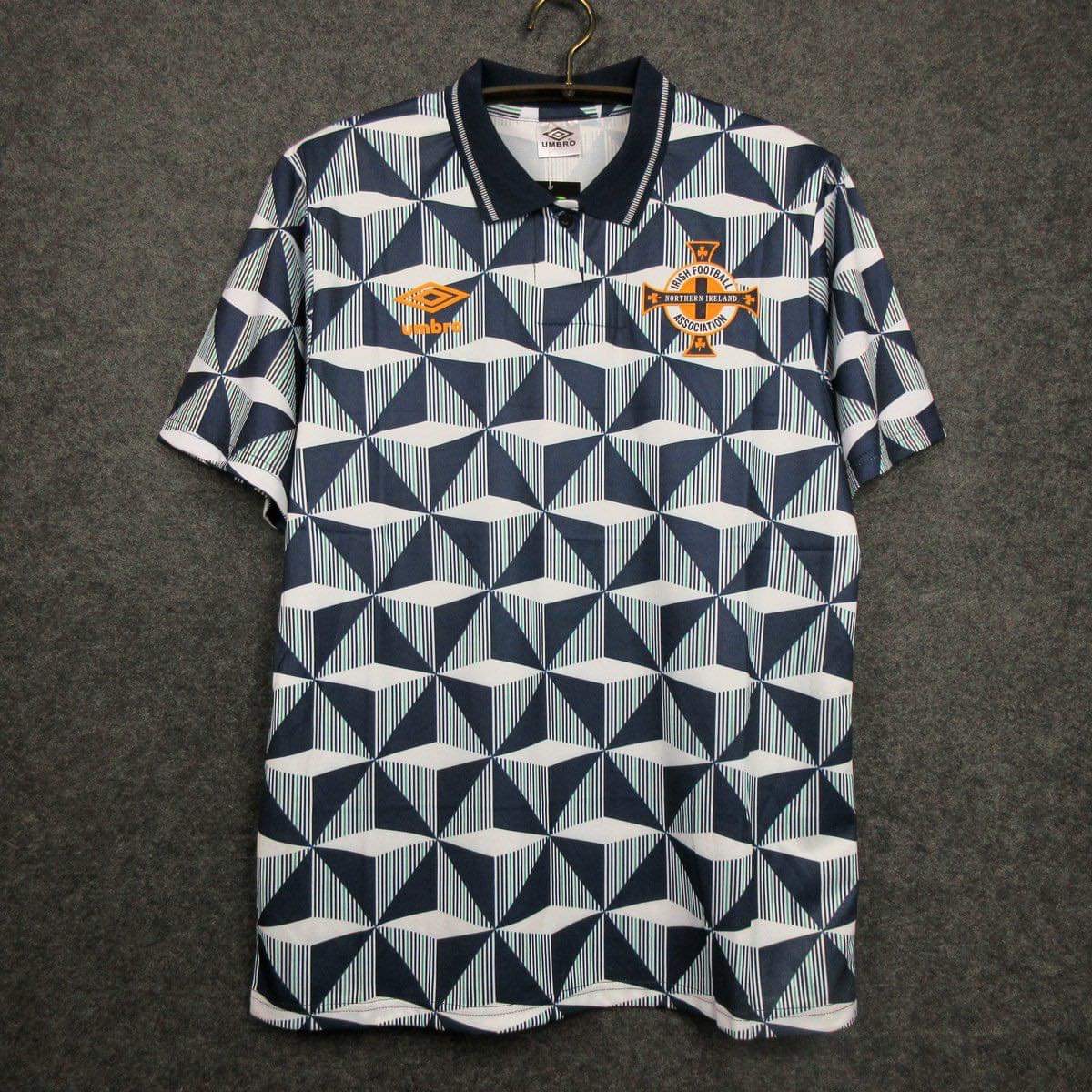
Optical illusion. Like it.CAFCTrev said: 0
0 -

5 -
-
Yeah this was only worn in pre season friendlies, I believe we did it a couple of years in a row.Talal said:
I made a mistake with that shirt as I think it was just used for some friendlies. As you rightly say we did wear the third kit against Peterborough but it was a different design to the one I posted.9goalswentpastperry said:
Think it was worn at PeterboroughTalal said:
I doubt it, was it even used?killerandflash said:To be fair that Hummel shirt is basically a generic top, used as an emergency 3rd kit. Was it ever sold to the public?
I still wish we'd worn the light blue shirt. Thought it was good, don't think we ever wore it.
Hummel has some good template kits.0 -
As the above pic shows, white stands out a lot more against blue than black!
That one was used in the league a couple of times, was a different one used for friendlies that season.0 -
SDAddick said:
Yeah this was only worn in pre season friendlies, I believe we did it a couple of years in a row.Talal said:
I made a mistake with that shirt as I think it was just used for some friendlies. As you rightly say we did wear the third kit against Peterborough but it was a different design to the one I posted.9goalswentpastperry said:
Think it was worn at PeterboroughTalal said:
I doubt it, was it even used?killerandflash said:To be fair that Hummel shirt is basically a generic top, used as an emergency 3rd kit. Was it ever sold to the public?
I still wish we'd worn the light blue shirt. Thought it was good, don't think we ever wore it.
Hummel has some good template kits. this one?
0 -
5 minutes have passed and I'm still in hysterics over the camel toeCharltonMadrid said:
 2
2 -
This is not a new line of Cambridge United leisure wear - it is, believe it or not, their new away kit. My friend, who is a season ticket holder there, tells me that it has, unsurprisingly, caused a bit of a stir.
In a sense, the Cambridge board have done their counterparts throughout the land a big favour, given that, however bad any team's new kit is, they can always point to Cambridge's. By way of analogy, it must have been like being in the Conservative Government's Cabinet alongside the great Chris Grayling.
1 -
Will look good on a summer holiday. But crap for the rest of the year.1
-
Sponsored links:
-
Spain's away kit last night was pretty tough to look at0
-

1 -
This was a shocker.CAFCTrev said: 0
0 -
That’s a Wetherspoons plateBlucher said:This is not a new line of Cambridge United leisure wear - it is, believe it or not, their new away kit. My friend, who is a season ticket holder there, tells me that it has, unsurprisingly, caused a bit of a stir.
In a sense, the Cambridge board have done their counterparts throughout the land a big favour, given that, however bad any team's new kit is, they can always point to Cambridge's. By way of analogy, it must have been like being in the Conservative Government's Cabinet alongside the great Chris Grayling. 9
9 -
He used to have a drink or two on Sunday lunchtimes in my local in Kenilworth in the late 70s. Nice bloke and quite approachable. Usually accompanied by Terry Yorath, who also enjoyed a drink or two!addickson said:Lordflashheart said: Coventry City’s brown kit - quite simply horrific
Ian Wallace - when I were a lad Dumbarton produced a jewel like him every year. Its now 27 years since we produced a home grown talent 😥
Thats why I love the Academy players Charlton produce2 -
Good sponsor, a local craft brewer. That shirt will look bizarre on a cold, wintry night.Blucher said:This is not a new line of Cambridge United leisure wear - it is, believe it or not, their new away kit. My friend, who is a season ticket holder there, tells me that it has, unsurprisingly, caused a bit of a stir.
In a sense, the Cambridge board have done their counterparts throughout the land a big favour, given that, however bad any team's new kit is, they can always point to Cambridge's. By way of analogy, it must have been like being in the Conservative Government's Cabinet alongside the great Chris Grayling. 0
0 -
Hi there,addickson said:Cheers @Mametz - what was your local? My sister stays in Kenilworth, but I've only been in the one across from the castle
The pub was the “Virgins and Castle” in the old High Street. It was a brilliant pub back in the day, with a number of small individual bars and rooms. I was last there about 5 years ago for a reunion ( I was at student at Warwick). It’s still a decent boozer but converted into one large bar.
1


