Attention: Please take a moment to consider our terms and conditions before posting.
New kit and sponsor (P108, 2021 new 3rd kit)
Comments
-
It looks like a Charlton Home kit, that will do for me4
-
not as nice at last year's .. it's ok .. it's who wears it and has great success that is important2
-
Red, white, red...fine. Looking forward to the second strip 'launch' tomorrow.1
-
Looks much better in this pic actually

9 -
Nice shirt. This season is gonna cost a fortune!0
-
Yeh, that's a fair point mate.Chris_from_Sidcup said:
Surely people buy a shirt based on whether they like it, not how many times the team will wear it?Six-a-bag-of-nuts said:Maybe I'm getting old, but I find the hype and fanfare for a 3rd kit a tad embarrassing.
Also, it's a nice top, but £50 odd for a kit that the players will wear thrice?
And after this season wearing it is not going to obviously identify you as Charlton is it. Like a Wolves top with a Charlton sword.
Still, I guess it's not really aimed at the likes of me.
But for me on the, admittedly rare, occasions I wear a replica shirt I do it to identify myself with my team - so I am going to be mainly wearing the red at home games and whatever colour is our designated away shirt at the away games.
Otherwise, with the black/gold from a distance it would be like, who the feck does he support.
But I get that it's probably just me and that people less fogey will wear them whenever it takes their fancy.
I still think it's all hideously overpriced and overhyped though1 -
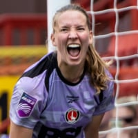
Not a fan really. Don't like the neck at all. Other than that it's alright, the picture of Sophie Quirk wearing it looks a lot better because she's covering up the weird two colour/two level neck bit. It's red though, the shorts are white and the socks are red. Whatevs.
0 -
Sponsored links:
-
I wonder how many times this season RI will get to wear it.Talal said:0 -
Love it. Plain and simple. And no hoopy socks. Yippee. Reminds me a bit of the 11-12 promotion kit.0
-
I like it, don’t love it. It’s good, not great, but I personally think the collar / shorts trim being all in white would’ve lifted it a bit more. At the end of the day, if they perform well in it and we end up promoted I’m not massively fussed either way!0
-
That top won’t get us promoted. Ipswich will have much better shirt 😜33
-
don't like all the fading in the shirt - plain red please, but then again I ain't gonna buy it so not that fussed0
-
I don't mind it – in fact I quite like it – but I'll be going for the third kit.0
-
Not a fan at all. Looks a mess. Would be interested to see the other options which were presented.Actually, I hate it. Far too busy.3
-
Nah not for me, 3rd kit will be the best seller this year I think.2
-
I don’t like it.0
-
Nice0
-
Sponsored links:
-
Nice!! Like it ....0
-

0 -
In the pantheon of Charlton home shirts it’s not one of the best, but it’s far from the worst.
Probably should have released it before the black shirt mind as that’s much nicer.5 -
Shirt looks better on second glance.Like the collar albeit it reminds me of Marcus Bent in a Charlton shirt.0
-
I like it more than I did last year's, which I thought was pretty decent.0
-
I don't really know what people expect, its very hard to come up with a groundbreaking design when you have the Colour / Badge / Sponsor set in stone, all you can really vary is the collar and what if any pattern you bung on it.4
-
I hear Oswald Boateng will supply our kits next year to meet the expectations of our fashionista fan base.6
-
With that black going into the white at the front it makes him look like a vicar who has just put a football shirt on top of his work shirtTalal said:3 -
Not a fan. Too busy and don’t like the black on the collar. Worst Hummel effort so far.
But still better than the Cabrini abomination.3 -
The sponsor should have made it all in white rather than the splash of blue again, a true supporter of our club would care more about the fashion of it😜1