Attention: Please take a moment to consider our terms and conditions before posting.
Castore kits thread (24/24\5 3rd kit page 83/84)
Comments
-
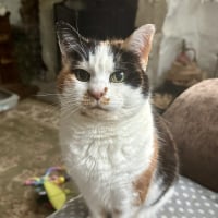
With the goalkeepers' kits being essentially just outfield shirts in a different colour this year I imagine a lot more will be sold. If you really want a shirt, you will have the choice of 6 colours this year, so can just pick your favourite.cafc4life said:I like the kits overall, but genuine question, how many fully grown men walk around wearing goalkeepers kits? Cant imagine many even though we do have a degree of weirdo's supporting us.
I'm actually looking forward to seeing the range of training/casual wear. Even in my 40s I still like a replica top, but it becomes harder and harder to justify the cost for something I wear a dozen times for 1 or 2 years and then it joins the pile of old shirts in the back of my wardrobe.1 -
The back story can fuck off - load of old bollox that an overpaid marketer has come up with to justify their fee.Like the kit, the shorts especially.2
-
first impressions I like it👍, but when’s the third kit coming out for Christ sake, the club don’t have a clue!!!! 😂0
-
A solid reliable away kit. A George Dobson.
Now for a third kit with some real flair. The, erm, DJ of the kit world?0 -
while we are able to tweak the kit for small clashes with shorts and socks, i imagine they will randomly wear the third kit to justify it's existence/sell more of them.cafc-4-life said:Those shorts would go so much better with the home kit! Now that would be a great combo!
i'd much prefer we only change what's needed and wear red shirts as much as possible (even wearing away shorts and shocks with the home shirt away at portsmouth)0 -
Pity about the black bits, I like everything else about it0
-
A touch of the Sean Connerys there my friend?,🤣,,,, have they got shocks yet?.cafcdave123 said:
while we are able to tweak the kit for small clashes with shorts and socks, i imagine they will randomly wear the third kit to justify it's existence/sell more of them.cafc-4-life said:Those shorts would go so much better with the home kit! Now that would be a great combo!
i'd much prefer we only change what's needed and wear red shirts as much as possible (even wearing away shorts and shocks with the home shirt away at portsmouth)2 -
Like it!
Although looks like the badge might be one of those cheap iron-on transfers...
1 -
The womens' shirts in the club shop are womens' sizes of the mens' team's shirts. I don't think the club's planning to sell replicas of the shirts the womens' team wear, which is what's being modelled here. So I imagine once the away shirts turn up in the shop they will all have the university on the front rather than RSK.Leeds_Addick said:
The womens home shirts on the club shop have RSK as the sponsor thoughsam3110 said:
It's the reverse of what they say for the women's kit. They have UoG as the home sponsor and RSK as the away sponsorcafc-4-life said:Don't think it does mate... .0
.0 -
The third kit will be something very bold, based on what Jayden said in his interview a few weeks ago, and given the red and white of the home and away I'd expect it to be darker in colour.

Maybe a remake based on this?5 -
Sponsored links:
-
Wouldn’t mind something like green and purple kits.sam3110 said:The third kit will be something very bold, based on what Jayden said in his interview a few weeks ago, and given the red and white of the home and away I'd expect it to be darker in colour.
Maybe a remake based on this?1 -
I think Olly said the ones used for the photoshoots were prototypes, and the ones being sold will have different badges on themRufus is a dogs name said:Like it!
Although looks like the badge might be one of those cheap iron-on transfers...3 -
It's ok. Would have been nicer without the black under the arms.The University of Greenwich logo on the front of the men's shirt looks cheap and is (imo) too big. The badges on the home and away look awful. What happened to sewn badges?0
-
Not bad. was it this one thats been hyped up or the third kit?
The sweat wicking will come in handy digging out those chalk pits.1 -
Quite like the top but love the shorts0
-
Covered here before, the photoshoot was with prototypes with ironed on 3d effect badges, the actual kit will come with the flat badge on them in a thicker materialClem_Snide said:It's ok. Would have been nicer without the black under the arms.The University of Greenwich logo on the front of the men's shirt looks cheap and is (imo) too big. The badges on the home and away look awful. What happened to sewn badges?1 -
I guess this may explain the colour clash at Sutton - they may have had an away keeper's shirt, but only with the wrong sponsor on?killerandflash said:Having separate sponsors for the home and away kit could cause issues with the GK shirts
For example when we play at home a team who plays in yellow (e.g. Burton) the keeper will presumably have to wear the blue "away" shirt, so I assume they'll have to have sets of GK kit with both sponsors on them.
Anyway, there's an easy fix - just borrow an unusually large-sized away shirt with the RSK logo off the women's team.0 -
agreed, something based on this would be my pickpaulfox said:
Wouldn’t mind something like green and purple kits.sam3110 said:The third kit will be something very bold, based on what Jayden said in his interview a few weeks ago, and given the red and white of the home and away I'd expect it to be darker in colour.
Maybe a remake based on this?
3 -
Or thiscafcdave123 said:
agreed, something based on this would be my pickpaulfox said:
Wouldn’t mind something like green and purple kits.sam3110 said:The third kit will be something very bold, based on what Jayden said in his interview a few weeks ago, and given the red and white of the home and away I'd expect it to be darker in colour.
Maybe a remake based on this?
4 -
Those fitted darts on the front of the shirt will catch a few out. Not for the average pie eater.Decent kit though and great to see the UoG on the front.0
-
Sponsored links:
-
All of the above... horrible.Scoham said:
Or thiscafcdave123 said:
agreed, something based on this would be my pickpaulfox said:
Wouldn’t mind something like green and purple kits.sam3110 said:The third kit will be something very bold, based on what Jayden said in his interview a few weeks ago, and given the red and white of the home and away I'd expect it to be darker in colour.
Maybe a remake based on this?
Purple and green are for Wimbledon ball boys/girls.2 -
cafc4life said:I like the kits overall, but genuine question, how many fully grown men walk around wearing goalkeepers kits? Cant imagine many even though we do have a degree of weirdo's supporting us.

7 -
I love it. Two great kits this year. 👍
6 -
The complaints of boring/unimaginative - I don’t know how many times you can remake red and white shirts. If you wanted a different colour, fair enough.Castore have found a way add a little touch of something different without it looking ugly… I’m looking at you away shirt 18/19, home shirt 21/22.The soft diamond pattern on the home shirt and the wavy chalk pattern on the away are just enough to add interest/depth without overpowering the rest of the shirt. For the first time in a while I’ll probably get both.3
-
I like it. Prefer the Uni sponsor look to RSK.1
-
With this kit probably best not to ask for sauce with your chips if you’ve had a few pints already1
-
Same as the first kit for me. I like the top but not sold on the shorts or socks. Only moderately whelmed by Castore so far.0
-
Very bland unimaginative kits in my opinion. Really dislike the Castore logo being so large as well.I've stopped collecting shirts so won't be buying either of them.2
-
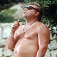
What does this man think about these kits?
 0
0 -
I think both kits so far are pretty decent3