Attention: Please take a moment to consider our terms and conditions before posting.
New 5 Year Kit Deal With Hummel (Away Kit Revealed, pg.19)
Comments
-
Sexy0
-
...and with a proper collar. ;-)Henry Irving said:
Just sayingHenry Irving said:
Imagine that in two shades of denimElfsborgAddick said:
That would be a nice away top.sam3110 said:
Smart looking Hummel shirt for Brondby
http://www.footyheadlines.com/2017/07/hummel-brondby-17-18-kit.html?m=10 -
Really nice kit0
-
-
Just can't get excited about blue. Petition to bring back the yellow...
 2
2 -
The only thing i don't like about it is the slightly different shades on the front. Why is there a lighter rectangle area below the Betdaq logo?Rufus is a dogs name said: 2
2 -
It does have a fleecy look about the material, how comfortable it is and durable is the next big questionChris_from_Sidcup said:
The only thing i don't like about it is the slightly different shades on the front. Why is there a lighter rectangle area below the Betdaq logo?Rufus is a dogs name said:0 -
"It's really nice"Callumcafc said: 1
1 -
Think that's the piece of tracing paper that you get inside new shirts showing through.Chris_from_Sidcup said:
The only thing i don't like about it is the slightly different shades on the front. Why is there a lighter rectangle area below the Betdaq logo?Rufus is a dogs name said:
I like it.1 -
Looks good in that video.Callumcafc said:
1 -
Sponsored links:
-
It's a no from me1
-
It's 'nice' apparently. The top is described as very lightweight too.Callumcafc said:2 -
Like the kit, just wish it wasn't blue0
-
Goes well with our strike force then.Dazzler21 said:
It's 'nice' apparently. The top is described as very lightweight too.Callumcafc said:3 -
I don't mind it. I just preferred the Grey one.0
-
Bit different, which I like.3
-
"To reflect the squad size, its made of super-thin material...."12
-
Quality0
-
Too tallForeverAddickted said:
Isnt that Chris Solly on the Right?Showmetheway2gohome said:Like the blond shame about kit horrible
3 -
Sillybilly said:
Think that's the piece of tracing paper that you get inside new shirts showing through.Chris_from_Sidcup said:
The only thing i don't like about it is the slightly different shades on the front. Why is there a lighter rectangle area below the Betdaq logo?Rufus is a dogs name said:
I like it.
But it looks like there's a light rectangle in the one he's wearing as well. Is it part of the shirt design? If so, it looks weird.WSS said: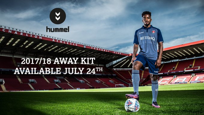
I like the overall style and colour though, at least it's something different.1 -
Sponsored links:
-
Best away kit since the blue one from 2010/110
-
2
-
Looks like something out of Burton.5
-
I like that much better than nike options.0
-
Good to see Tariq Fosu has made the rank of Staff Sergeant already.
That boy will go far.
14 -
Yeah was thinking the same. Think the women have been playing in the 2014-15 kit for the last 2-3 years.The Red Robin said:Nice work Hummel and good to the see the women involved in the launch and that they'll be wearing the same kit.
I quite like it. One thing that, for me, can ruin a Hummel kit is overdoing the chevrons but they look really nice here.1 -
3
-
Maybe the chevrons are shiny so players can be seen on foggy days?1
-
I quite like it and it makes sense to go for the leisure shirt look. Will I be buying one? No. Feel a little sorry for Hummel but if it's got anything to do with Roland and/or betting companies then I'm out.
@Henry Irving what you need now for the museum is one of the mythical orange home shirts for the "never ever worn" exhibition. Could be rarer than hens' teeth.3 -
I like it, but not enough to shell out £45.1