Attention: Please take a moment to consider our terms and conditions before posting.
Castore kits thread (24/24\5 3rd kit page 83/84)
Comments
-
Really like that kit.0
-
That's horrible1
-
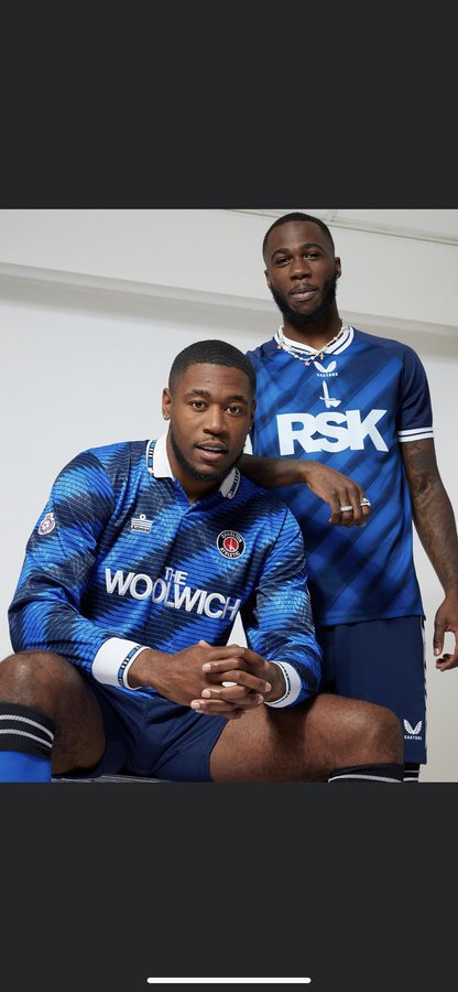
Are we now Castore Athletic then?The Castore logo is hideously too big on all the shirts. That positioning on the third shirt has ruined it in my opinion.6
-
RSK is too large on both kits. Oh well, I don’t like any of them, they lack that detail to be good kits (and collars, I’m getting old). The little one will want all of them.2
-
That was a great kit. Think they only wore it once and it was in pre-season.Lincsaddick said:new blue(ish) kit reminds me of the rarely, if ever, used Nike blue n black 3rd kit from a few years past .. a shirt I like and wear a lot
Another good but never worn one was the Hummel third kit that was like, aqua blue. Never worn during the season.
1 -
Thats the ugliest kit for a good few seasons now, what an anti climax all round with this years shirts. Home shirt for Xmas it is.0
-
Very Bermondsey blue. I want to like it, but feels wrong too.
But most of all, spacing!!!!2 -
Don’t mess with the badge.
Non-Charlton fans would look at that and probably not really know which club it even represented.2 -
I like all three Castore kits. I just don't think there's anything particularly special about any of them. They're all a bit plain. And that's not the worst thing in the world. If these were the kits we got after Nike template kits I'd probably like them a lot more. But coming after Hummel, who did bespoke kits (I know they didn't do all three bespoke kits, but their template kits were quite good) that tried something interesting and added some subtle flair, I feel like Castore just isn't as interesting.
1 -
Hate the badge. It’s so close to being really nice.1
-
Sponsored links:
-
Some like it, some don't. Some will buy it, some wont.
Roll on the fuss next summer.3 -
Not a fan but the home is decent and the away fine. The concept of a third kit is a bit of a joke so do what you want with the design.
That Admiral one is still miles better. Wish I hadn’t lost mine.
Agree about badges being in the middle of a shirt….looks wrong.0 -
Agreed. I think having the normal badge would make it a lot better and would take some of the focus away from the sponsor and Castore logos.EastStand said:Hate the badge. It’s so close to being really nice.
I'm usually against messing with the badge, even changing the color scheme on the badge. But I did think the black third kit last year with the gold sword was ace. But yeah, this kit is close but not quite.0 -
Millwall kit0
-
Love that.1
-
The nicest of the three but the badge not lining up will wind me up.2
-
Also…why is CBT wearing his nan’s twinset and pearls in all the photo’s? 😆0
-
I like the plain n simple white one the bestBedsaddick said:The nicest of the three0 -
 Too close for me4
 -
Last years black Hummel kit has the same badge and I love it.cafctom said:Don’t mess with the badge.
Non-Charlton fans would look at that and probably not really know which club it even represented.
Wearing it right now in fact.0 -
Sponsored links:
-
I like the idea of harking back to classics, but the modern version has to stand up for itself, if there was no back story,I think the kits this season would be very underwhelming . I don’t think any have improved on the originals. The away shirt gets a pass because of the new idea. Sponsors are ugly and too big.0
-
Like that a lot0
-
Not for me.0
-
1st look liked it,then LOOKED at it & sponsorship far too big & very boring font,then sword & Castore completely look out of sorts,the Millwall blue actually looks ok with the stripes but the logos & badges let it down,which obvs is the whole point of the shirt,I actually prefer the keepers tops,so will not be getting down with the Castore this season…0
-
-
2 -
Love the socks, they’re fantastic.1
-
Is there a pic of the full kit?0
-
I just wish the RSK was a bit smaller and further down. Looks cramped. Love the shirt though3
-
According to the target market for these, which is an eight year old, it’s Home, Away and third, in that order of preference
0